Increasingly I find that I have fallen into using not-really-R whilst playing around with Formula One stats data. Instead, I seem to be using a hybrid of SQL to get data out of a small SQLite3 datbase and into an R dataframe, and then ggplot2 to render visualise it.
So for example, I’ve recently been dabbling with laptime data from the ergast database, using it as the basis for counts of how many laps have been led by a particular driver. The recipe typically goes something like this – set up a database connection, and run a query:
#Set up a connection to a local copy of the ergast database
library(DBI)
ergastdb = dbConnect(RSQLite::SQLite(), './ergastdb13.sqlite')

#Run a query
q='SELECT code, grid, year, COUNT(l.lap) AS Laps
    FROM (SELECT grid, raceId, driverId from results) rg,
        lapTimes l, races r, drivers d
    WHERE rg.raceId=l.raceId AND d.driverId=l.driverId
          AND rg.driverId=l.driverId AND l.position=1 AND r.raceId=l.raceId
    GROUP BY grid, driverRef, year
    ORDER BY year'

driverlapsledfromgridposition=dbGetQuery(ergastdb,q)
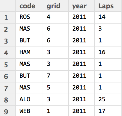
In this case, the data is table that shows for each year a count of laps led by each driver given their grid position in corresponding races (null values are not reported). The data grabbed from the database is based into a dataframe in a relatively tidy format, from which we can easily generate a visualisation of it.
The chart I have opted for is a text plot faceted by year:
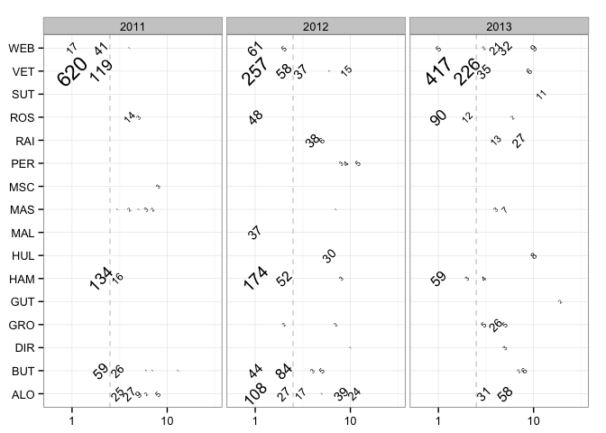
The count of lead laps for a given driver by grid position is given as a text label, sized by count, and rotated to mimimise overlap. The horizontal grid is actually a logarithmic scale, which “stretches out” the positions at the from of the grid (grid positions 1 and 2) compared to positions lower down the grid – where counts are likely to be lower anyway. To try to recapture some sense of where grid positions lay along the horizontal axis, a dashed vertical line at grid position 2.5 marks out the front row. The x-axis is further expanded to mitigate against labels being obfuscated or overflowing off the left hand side of the plotting area. The clean black and white theme finished off the chart.
g = ggplot(driverlapsledfromgridposition)
g = g + geom_vline(xintercept = 2.5, colour='lightgrey', linetype='dashed')
g = g + geom_text(aes(x=grid, y=code, label=Laps, size=log(Laps), angle=45))
g = g + facet_wrap(~year) + xlab(NULL) + ylab(NULL) + guides(size=FALSE)
g + scale_x_log10(expand=c(0,0.3)) + theme_bw()
There are still a few problems with this graphic, however. The order of labels on the y-axis is in alphabetical order, and would perhaps be more informative if ordered to show championship rankings, for example.
However, to return to the main theme of this post, whilst the R language and RStudio environment are being used as a medium within which this activity has taken place, the data wrangling and analysis (in the sense of counting) is being performed by the SQL query, and the visual representation and analysis (in the sense of faceting, for example, and generating visual cues based on data properties) is being performed by routines supplied as part of the ggplot library.
So if asked whether this is an example of using R for data analysis and visualisation, what would your response be? What does it take for something to be peculiarly or particularly an R based analysis?
For more details, see the “Laps Completed and Laps Led” draft chapter and the Wrangling F1 Data With R book.

For me, this is specially useful. For who use databases, is nice to do the queries inside R and processing them. For me, this is one of the best advantages of using R, you can do almost everything without leaving his environment. As I’m a beginner I’m not so sure, but I assume translating queries to R syntax will consume to much memory than just using R as a connection to the database. For example, I have a table in PostgreSQL which has 33.000.000 rows and 44 columns. I can make a query in pgadmin, but inside R, I can’t with RPostgreSQL library. So, I imagine how much it could be wasted in memory translating the queries to R syntax. So for me, this is really R.
SQL + ggplot rocks
And learning how to do SQL queries it isn’t as hard as learning a new programming language!
@Ariel Part of what I was thinking about was the extent to which I could do the data wrangling and shaping in SQL, rather than eg grabbing a copy of the data out of the database and into one or more R dataframes, and then processing it in R (eg using some base R functionality, or some of Hadley Wickham’s data reshaping tools) before passing it to ggplot.
As for the attractiveness of R as glue for working with other applications based on the flexibility of its tabular data/dataframe representation: yes, absolutely:-)
MonetDB/R now you get the best of both worlds (db and R)!
https://www.monetdb.org/content/embedded-r-monetdb
MonetDB is new to me.. I need to think about how that sort of thing would fit in my own workflows…
There is no ggplot2 without R. ggplot 2 per se is not that usefull. It is so great partly because it gains a lot from data preparations that can best be done in R. Granted, it comes with an embedded (domain specific) language it still lives and breathes within R. Just as every latex user is a tex user, every ggplot2 user is an R user. So for me, this is an analysis in SQL and R, but a supercharged version of R.
Everything you typed had to be correct R syntax and you could distribute it using standard R ways of distribution and if it had not worked, you could have asked in any R forum. The above is R, just not R alone.
Greets,
Bernhard
@Bernhard So my thinking here was that ggplot2 is an implementation of The Grammar of Graphics, and there are partial ports in other languages, eg yhat’s implementation of ggplot in python. If you just work from ggplot(df) down, having got the data into df, you don’t necessarily need to have many, if any, R skills – you can just work within the functionality of ggplot commands?
Similarly, within something like IPython notebooks, I can use R cell magic do do my data wrangling work in python Pandas, and then throw an appropriate data frame into an R process and work on it using ggplot eg http://nbviewer.ipython.org/gist/yoavram/5280132
So I guess I needed to refine my question, to be more along the lines of the extent to which you might claim to be using R if you donlt actually do any wrangling work in R, (ie donlt really need to know how to programme in R/any of the programming primitives – or even much syntax – of R if actually all you use it for is as glue for other applications (eg running SQL queries) or as a container for other functional namespaces (which we could at a push argue is the case for ggplot?)?
@Tony Hirst: Well, obviously you should use the right tool for the right job and it turns out, that SQL is an important tool for you. I wouldn’t put too much weight on what happens, if you don’t use R functionality apart from calling SQL and calling ggplot2. In most analyses you will sooner or later have to use additional functionality like inferential statistics or simply changing the order of factor levels, which you will do in R. Having little or no R skills will limit your access to things you can do without R use in the stricter sense and it will hold you back. With all the power of R at your fingertips I don’t think, many will refrain from using it in the long run, so I think that this uncertainty is only a transitional state.
Consider Postgres with PL/R (or the more expensive alternatives with any of the Big 3) if/when you’re ready to install analysis/graphics into an application. PL/R attaches the R engine to the RDBMS engine. Once the routine is ready for primetime in an R session connected to the RDBMS, the routine is then created as a user-defined function in the engine, and can then be called by standard SQL in the application. Seamless.
Hi Robert – that sounds really powerful, and just helps me realise a little bit more how much I really don’t know…!
one thing you might try is keeping your data in the db but using the dplyr package to fetch/aggregate it.
@Steve Yes, that’s what I was doing originally, writing simple queries and then merging, transforming and summarising in R; but increasingly I found myself putting more and more logic into the queries because it was quicker.
I used to do a lot of this with horse racing data – write a complex SQL query to return data into an R dataframe, which would then either be plotted or saved to a CSV.
Over time, I found this to be quite ineffective, because I was writing multiple SQL queries to obtain different data “views.”
Now I really try to think about all the data I’ll need for the application/script I’m working on, write the minimal likely SQL query (sometimes that is SELECT * from dbname, if there isn’t a huge amount of data) and then do all the manipulation of the data within R.
I found this way to be an overall faster way to work, as I didn’t have to “learn” new things about SQL in order to return the correct data. I just continued to learn new R methods to work with that data instead!
@PhillC I tend to sway between different approaches… some things I just can’t think through in R and find it easy to wrangle an SQL query. Other times, as you suggest, grabbing one or two flat datatables with SQL then eg merging, reshaping or summarising them in R is easier.