Machine Learning: What Story Do We Want to Tell?

A new course is in planning on machine learning, intended to be a required part of a data science qualification, driven by the Maths department. Interestingly, our data management and analysis course will not be a required course on that qualification (practical issues associated with working with data are presumably not relevant).

I also suspect that several approaches we could take to teaching machine learning related topics will be ruled as out of scope because: maths and equations

There are ways I think we can handle talking about equations. For example, Diagrams as Graphs, and an Aside on Reading Equations.

One of the distinguishing features of many OU courses is their strong narrative. In part this reflects the way in which material is presented to students: as the written word (occasionally embellished with video and audio explanations). OU materials also draw heavily on custom produced media assets: diagrams and animations, for example. We used to be a major producer of educational software applications, but as the development of web browsers has supported more interactivity, I get the feeling our courses have gone the other way. This is perhaps because of the overheads associated with developing software applications and then having to maintain them, cross-platform, for five years or more of a course’s life.

I also think OU material design, and the uniqueness of our approach, is under threat from things like notebook style interfaces being adopted and used by other providers. But that’s a subject for another post…

So in a new course on machine learning, in a world where there has been a recent flurry of text book publications (often around particular programming libraries that help you do machine learning) and an ever increasing supply of repositories on Github containing notebook based tutorials and course notes, what narrative twist should we apply to the story of machine learning to support the teaching of its underlying principles?

I typically favour a technology approach, where we use the technology to explore the technology, try to situate it in a practical context where we consider social, political, legal and ethical issues of using the technology within society, and try to make it relevant by exploring use cases and workflows. The academic component justifies the practical claims with robust mathematical models that provide explanations of how the stuff actually works and what it is actually doing. I also like historical timelines which show the evolution of ideas: sometimes ideas carry baggage with them from decisions that were made early on in the idea’s evolution that maybe wouldn’t be taken the same way today. (Sound familiar?) With a nod to advice given to PhD students going into the viva to defend their thesis, each course (thesis) should implicitly be able to answer the plaintive cry of the struggling student (or thesis examiner): “why should I care?”

So: machine learning. What story do we want to tell?

Having fallen asleep before going to bed last night, then groggily waking up from a rather intense dream in the early hours, this question had popped into my head by the time I made it into bed, took root, and got me back out of bed, wide awake, to scribble some notes. The rest of this post is based on those notes and is not necessarily very coherent…

Lines, planes and spaces

Take a look at the following chart, taken from the House of Commons Library post Budget 2018: The background in 9 charts:

It shows a couple of lines detailing the historical evolution of recorded figures for borrowing/deficit, as well predictions of where the line will go.

Prediction is one of the things we use machine learning for. But what does the machine learning do?

In the above case, we can look at the chart, say each line looks roughly like a straight line, and then create a model in the form of a simple (linear) equation to describe each line:

y = mx + c

We can then plug a year (as the independent x value) in and then get the dependent y value out from it as the modelled borrowing or surplus figure.

The following chart from the UK Met Office of climate temperatures for Southern England over several years shows periodicity, or seasonality of temperatures over months of the year.

If we were to plot temperature over several years, we’d have something like a sine wave, which again we can model as a simple equation:

y = a * sin( (b * x) + c).

Lines with more complex periodicities can be modelled by more complex equations as described by the composition of several sine waves, identified using Fourier analysis (Fourier, Laplace and z-transforms are just magical…).

But we don’t need to use machine learning to identify the equations of those lines, we can simply analyse them using techniques developed hundreds of years ago, made ever more accessible via a single line of code (example).

Some equations that define a line actually feed on themselves. If you think back to primary school days maths lessons, you may remember being set questions of the form: what is the next number in this series?

In this case, the equation iterates. For example, the famous Fibonacci sequence — 0, 1, 1, 2, 3, 5, 8, … — is defined as:

F_0=0, F_1=1, F_{n+1}=F_n + F_{n-1}

The equation eats itself.

Although we don’t need machine learning to help us match these equations to a particular data set, machines can help us fit them. For example, if we have guessed the right form of equation to fit a set of data points (for example, y = mx + c) a machine can quickly help identify the values of  m and c, or perform a Fourier analysis for us.

If we aren’t sure what equation might fit a set of data, we could use a machine to try out lots of different sorts of equation against a dataset, calculate the error on each (that is, how well it predicts data values when it is “best fit”) and then pick the one with the lowest error as the best fit equation. We could argue this as a weak form of a learning about what equation type from a preselected set best fits the data.

The aim, remember, is to come up with the equation of a line, or, where we have more than two dimensions, a plane  or surface) so that we can predict a dependent variable from one or more independent variables.

That may sound confusing, but you already have a folk mathematical sense of how this works: X is male, morbidly obese and 5 feet 6 inches tall. About how much does he weigh?

To estimate X’s weight, you might treat it as a prediction exercise and model that question in the form of an equation that predicts a ‘normal’ weight for that gender and height (two independent variables) then scales it in some way according to the label morbidly obese. If you’re a medic, you may define the morbidly obese term formally. If you aren’t, you may treat it as an arbitrary label that you associate, perhaps in a personally biased way, with a particular extent of overweightness.

There is another way you might approach the same question, and that is as something more akin to a classification task. For example, you know lots of people; you know, ish, their weights; you imagine which group of people X is most like and then estimate his weight based on the weight of people you know in that group.

Equations still have a role to play here. If you imagine the world of people as “tall and slight”, “tall and large”, “short and slight”, “short and large” and “average”, you may imagine the classification space as being constructed something like this:

Distinctions defined over each of the axes and then combined to  make the final classification. You might then associate further (arbitrary) labels with the different classifications: “short and slight” might be relabelled  “small” for example. Other categories might be relabelled “large”, “wide” and “lanky” (can you work out which they would apply to?). This relabelling is subjective and for our “benefit”, not the machine’s, to make the categories memorable. Memorable to our biases, stereotypes and preconceptions. It can also influence our thinking when we could to refer to the groups by these labels at a later stage…

So here then is another thing that we might look to machine learning for: given a set of data, can we classify items that are somehow similar along different axes and label them as a separate identifiable groupings. Firstly, for identification purposes (which group does this item belong to). Secondly, in combination with predictive models defined within those groupings, to allow us to make predictions about things we have classified in one way, and perhaps different predictions about things classified another way.

Again, we need to come up with equations that allow us to make distinctions (above the line or below the line, to the left of the line or to the right, within the box or outside the box) so we can run the data against those equations and make a categorisation.

Again, we don’t necessarily need “machine learning” to help us identify these equations, if we assume a particular classification model. For example, the k-means technique allows you to say you want to find k different groupings within a set of data and it will do that for you. For k=5, it will fit a set of equations that will group the data into five categories. But again, we might want to throw a set of possible models at the data and then pick the one that best works, which a machine can automate for us. A weak sort of learning, at best.

So what is machine learning?

It’s what you do when you don’t know what model to use. It’s what you do when you throw a set of data at a computer and say: I have no idea. You make sense of it. You find what equations to use and how to combine them. And it doesn’t matter if can’t understand or make sense of any of them. As far as I’m concerned, I’m model free and theory free. Go at it.

Of course, the machine may learn rules that are understandable, and that weren’t what you expected:

When feeding a machine, you need to be wary of what you feed it.

In telling the story of machine learning, then, do we need to do any of that ‘precursor’ stuff, of lines and planes and what we can do just anyway using ‘traditional’ mathematical techniques, perhaps with added automation so we can try lots of pre-defined models we can fit quickly? Or should we just get straight on to the machine learning bits? There is only so much time, breadth and depth available to us when delivering the course, after all.

I think we do…

Throughout the course, those foundational ideas would provide a ground truth that a student can use to anchor themselves back to the questions of: what am I (which is to say, the machine) actually trying to do? and why are we using machine learning? Don’t we have a theory about the data use a model based on that?

So what about spaces. What are they, and do we need to know about them?

When I put together the OU short course on game design and development (I knew nothing about that, either) I came across the idea of lenses, different ways of looking at a problem that bring different aspects of it into focus. Here’s a set of six lenses commonly used in news reporting: who?, what?, why?, when?, where?, how?.

When we pull together a dataset around which we want to make a set of predictions, or classifications, or classification based predictions, we define a space of inquiry within which we want to ask particular questions. In the classification example above, the space I came up with was a lazy one: something distinguishing and recognisable about people that I can identify different groupings within. Within that space I then identified a set of metrics (measurable things) that I could determine within it (height and weight). Already things are a bit arbitrary and subject to bias. Who chose the space? Why? What do they want to make those classifications for? Who chose the metrics? What population provided the data? How was the data collected? When was it collected? Where? Could any of that make a difference? (Like only using a particular machine for suspected hip fractures, and marking records urgent if there is a hip fracture evident in an x-ray, for example…) Is there, perhaps, a theory or an intuitive model we can apply to a dataset to perform a particular task that doesn’t mean we need to take the last resort of machine learning (“if machine X and marked urgent, then hip fracture”).

We might also create a space out of nowhere around the data we have. A space we can go fishing in but that we don’t really understand.

So another bedrock I think we need in a course on machine learning, another storyline we can call on, is a set of questions, a set of lenses, that we can use to identify what space our data lies in, as well as critically interrogating the metrics we impose upon it and from which we (via our machines) develop our machine learned models.

Readers who know anything about machine learning, which I don’t, really, will notice I never even got as far as talking about things like supervised learning, unsupervised learning, reinforcement learning, etc, let alone the different approaches or implementations we might take towards them. That’s the next part of the story we need to think about… This first part was more about getting a foundation stone in place that students can refer back to: “what is this thing actually trying to do?”, rather than “how is it going about it?”

PS By the by, the “lines and spaces” refrain puts me in mind of Wassily Kandinsky’s Point and Line to Plane. As it’s over 30 years ago since I last read it, and I still carry the title with me, I should probably read it again.

We Need to Talk About Geo…

Over the last couple of weeks, I’ve spent a bit of time playing with geodata. Maps are really powerful visualisation techniques, but how do you go about creating them?

One way is to use a bespoke GIS (Geographic Information System) application: tools such as the open source, cross-platform desktop application QGIS, that lets you “create, edit, visualise, analyse and publish geospatial information”.

Another is to take the “small pieces, loosely joined” approach of grabbing the functionality you need from different programming packages and wiring them together.

This “wiring together” takes two forms: in the first case, using standardised file formats we can open, save and transfer data between applications; in the second, different programming languages often have programming libraries that become de facto ways of working with particular sorts of data that are then used within yet other packages. In Python, pandas is widely used for manipulating tabular data, and shapely is widely used for representing geospatial data (point locations, lines, or closed shapes). This are combined in geopandas, and we then see tools and solutions built upon that format as the ecosystem build out further. In the R world, the Tidyverse provides a range of packages designed to work together, and again, an ecosystem of interoperable tools and workflows results.

Having robust building blocks allows higher level tools to be built on top of them designed to perform specific functions. Through working through some simple self-directed (and self-created) problems (for which read: things I wanted to try to do, or build, or wondered how to do), it strikes me once again that the quite ambitious sounding tasks can be completed quite straightforwardly if you can imagine a way of decomposing a problem into separate, discrete parts, looking for ways of solving those parts, and then joining the pieces back together again.

For example, here’s a map of the UK showing Westminster constituencies coloured by the party of the MP as voted for at the last general election:

How would we go about creating such a map?

The answer is quite straightforward if we make use of a geodataset that combines shape information (the boundary lines that make up each constituency, suitably represented) with information about the election result. Data such as that made available by Alasdair Rae, for example.

First things first, we need to obtain the data:

#Define the URL that points to the data file
electiondata_url = 'http://ajrae.staff.shef.ac.uk/wpc/geojson/uk_wpc_2018_with_data.geojson'

#Import the geopandas package for working with tabular and spatial data combined
import geopandas

#Enable inline plotting in Jupyter notebooks
#(Some notebook installations automatically enable this)
%matplotlib inline

#Load the data from the URL
gdf = geopandas.read_file(electiondata_url)

#Optionally preview the first few rows of the data
gdf.head()

That wasn’t too hard to understand, or demonstrate to students, was it?

  • make sure the environment is set up correctly for plotting things
  • import a package that helps you work with a particular sort of data
  • specify the location of a data file
  • automatically download the data into a form you can work with
  • preview the data.

So what’s next?

To generate a choropleth map that shows the majority in a particular constituency, we just need to check the dataframe for the column name that contains the majority values, and then plot the map:

gdf.plot(column='majority')

To control the the size of the rendered map, I need to do a little bit more work (it would be much better if the geopandas package let me do this as part of the .plot() method):

#Set the default plot size
from matplotlib import pyplot as plt
fig, ax = plt.subplots(1, figsize=(12, 12))

ax = gdf.plot(column='majority', ax=ax)

#Switch off the bounding box drawn round the map so it looks a bit tidier
ax.axis('off');

To plot the map coloured by party, I just need to change the column used as the basis for colouring the map.

fig, ax = plt.subplots(1, figsize=(12, 12))

ax = gdf.plot(column='Party' , ax=ax)
ax.axis('off');

You should be able to see how the code is more or less exactly the same as the previous bit of code except that I don’t need to import the pyplot package (it’s already loaded) and all I need to change is the column name.

The colours are wrong though — they’re set by default rather than relating to colours we might naturally associated with the parties.

So this is the next problem solving step — how do I associate a colour with a party name?

At the moment this is a bit fiddly (again, geopandas could make this easier), but once I have a recipe I should be able to reuse it to colour other columns using other column-value-to-colour mappings.

from matplotlib.colors import ListedColormap

#Set up color maps by party
partycolors = {'Conservative':'blue',
               'Labour':'red',
               'Independent':'black',
               'Liberal Democrat':'orange',
               'Labour/Co-operative':'red',
               'Green':'green' ,
               'Speaker':'black',
               'DUP':'pink',
               'Sinn Féin':'darkgreen',
               'Scottish National Party':'yellow',
               'Plaid Cymru':'brown'}

#The dataframe seems to assign items to categories based on the selected column sort order
#We can define a color map with a similar sorting
colors = [partycolors[k] for k in sorted(partycolors.keys())]

fig, ax = plt.subplots(1, figsize=(12, 12))

ax = gdf.plot(column='Party', cmap = ListedColormap(colors), ax=ax)
ax.axis('off');

In this case, I load in another helpful package, define a set of party-name-to-colour mappings, use that to generate a list of colour names in the correct order, and then build and use a cmap object within the plot function.

If I wanted to do a similar thing based on another column, all I would have to do is change the partycolors = {} definition and the column name in the plot command: the rest of the code would be reusable.

When you have a piece of code that works, you can wrap it in a function and reuse it, or share it with other people. For example, here’s how I use a function I created for displaying a choropleth map of a particular deprivation index measure for a local authority district and its neighbours (I’ll give the function code later on in the post):

plotNeighbours(gdf,
               'Portsmouth',
               'Education, Skills and Training - Rank of average rank')

Using pandas and geopandas we can easily add data from one source, for example, from an Excel spreadsheet file, to a geopandas dataset. For example, let’s download some local authority boundary files from the ONS and some deprivation data:

import geopandas

#From the downloads area of the page, grab the link for the shapefile download
url='https://opendata.arcgis.com/datasets/7ff28788e1e640de8150fb8f35703f6e_2.zip?outSR=%7B%22wkid%22%3A27700%2C%22latestWkid%22%3A27700%7D'
gdf = geopandas.read_file(url)

#Import pandas package
import pandas as pd

#https://www.gov.uk/government/statistics/english-indices-of-deprivation-2015
#File 10: local authority district summaries
data_url = 'https://assets.publishing.service.gov.uk/government/uploads/system/uploads/attachment_data/file/464464/File_10_ID2015_Local_Authority_District_Summaries.xlsx'

#Download and read in the deprivation data Excel file
df = pd.read_excel(data_url, sheet_name=None)

#Preview the name of the sheets in the data loaded from the Excel file
df.keys()

We can merge the two data files based on a common column, the local authority district codes:

#Merge in data
gdf = pd.merge(gdf, df['Education'],
               how='inner',  #The type of join (what happens if data is in one dataset and not the other)
               left_on='lad16cd', #Column we're merging on in left dataframe
               right_on='Local Authority District code (2013)'#Column we're merging on in right dataframe
              )

And plot a choropleth map of one of the deprivation indicators:

ax = gdf.plot(column='Education, Skills and Training - Average rank')
ax.axis('off');

Just by the by, plotting interactive Google style maps is just as easy as plotting static ones. The folium package helps with that, for example:

import folium

m =  folium.Map(max_zoom=9, location=[54.5, -0.8])
folium.Choropleth(gdf.head(), key_on='feature.properties.lad16cd',
                  data=df['Education'],
                  columns=['Local Authority District code (2013)',
                           'Education, Skills and Training - Rank of average rank'],
            fill_color='YlOrBr').add_to(m)
m

I also created some magic some time ago to try to make folium maps even easier to create: ipython_magic_folium.

To plot a choropleth of a specified local authority and its neighbours, here’s the code behind the function I showed previously:

#Via https://gis.stackexchange.com/a/300262/119781

def plotNeighbours(gdf, region='Milton Keynes',
                   indicator='Education, Skills and Training - Rank of average rank',
                   cmap='OrRd'):
    ''' Plot choropleth for an indicator relative to a specified region and its neighbours. '''

    targetBoundary = gdf[gdf['lad16nm']==region]['geometry'].values[0]
    neighbours = gdf.apply(lambda row: row['geometry'].touches(targetBoundary) or row['geometry']==targetBoundary ,
                           axis=1)

    #Show the data for the selected area and its neighbours
    display(gdf[neighbours][['lad16nm',indicator]].set_index('lad16nm'))

    #Generate choropleth
    ax = gdf[neighbours].plot(column=indicator, cmap=cmap)
    ax.axis('off');

One thing this bit of code does is look for boundaries that touch on the specified boundary. By representing the boundaries as geographical objects, we can use geopandas to manipulate them in a spatially meaningful way.

If you want to try a notebook containing some of these demos, you can launch one on MyBinder here.

So what other ways can we manipulate geographical objects? In the notebook Police API Demo.ipynb I show how we can use the osmnx package to find a walking route between two pubs, convert that route (which is a geographical line object) to a buffered area around the route (for example defining an area that lies within 100m of the route) and then make a call to the Police API to look up crimes in that area in a specified period.

The same notebook also shows how to create a Voronoi diagram based on a series of points that lay within a specified region; specifically, the points were registered crime location points within a particular neigbourhood area and the Voronoi diagram then automatically creates boundaried areas around those points so they can be coloured as in a choropleth map.

The ‘crimes with an area along a route’ and the Voronoi mapping, which are both incredibly powerful ideas and incredibly powerful techniques can be achieved with only a few lines of code. And once the code recipe has been discovered once, it can often be turned into a function and called with a single line of code.

One of the issues with things like geopandas is that the dataframe resides in computer memory. Shapefiles can be quite large, so this may have an adverse affect on your computer. But tools such as spatialite allow you to commit large geodata files to a simple file based SQLite database (no installation or running servers required) and do geo operations on it directly: such as looking for points within a particular boundaried area.

At the moment, SpatiaLite docs leave something to be desired, and finding handy recipes to reuse or work from can be challenging, but there are some out there. And I’ve also started to come up with my own demos. For example, check out this notebook of LSOA Sketches.ipynb that includes examples of how to look up an LSOA code from latitude and longitude co-ordinates. The notebook also shows how to download a database of postcodes into the same database as the shapefiles and then use postcode centroid locations to find which LSOA boundary contains the (centroid) location of a specified postcode.

Grabbing Screengrab Images Using Selenium (Also Works in MyBinder)

It being roundy-roundy motorsport season again, here’s a recipe for grabbing a screenshot of a live timing screen and then emailing it to one or more people.

One of the reasons for using Selenium is that timing screen pages are often updated using data received over a live websocket. There’s no real need to keep shipping all the timing data, just the bits that change. Using a browser to grab the screenshot rather than having to try to figure out the data can make life easier if you don’t want to manipulate the data at all. For some background about such Javascript rendered pages, see here. Of course, we could also use selenium to give us access to the “innerHTML” as rendered by the Javascript. I’ll maybe have a look at that in a future post…

The recipe uses a headless version Firefox automated using selenium and can run in a MyBinder container.

A Dockerfile that can load in the necessary bits looks like this:

#Use a base Jupyter notebook container
FROM jupyter/base-notebook

#We need to install some Linux packages
USER root

#Using Selenium to automate a firefox or chrome browser needs geckodriver in place
ARG GECKO_VAR=v0.23.0
RUN wget https://github.com/mozilla/geckodriver/releases/download/$GECKO_VAR/geckodriver-$GECKO_VAR-linux64.tar.gz
RUN tar -x geckodriver -zf geckodriver-$GECKO_VAR-linux64.tar.gz -O > /usr/bin/geckodriver
RUN chmod +x /usr/bin/geckodriver
RUN rm geckodriver-$GECKO_VAR-linux64.tar.gz

#Install packages required to allow us to use eg firefox in a headless way
#https://www.kaggle.com/dierickx3/kaggle-web-scraping-via-headless-firefox-selenium
RUN apt-get update \
    && apt-get install -y libgtk-3-0 libdbus-glib-1-2 xvfb \
    && apt-get install -y firefox \
    && apt-get clean
ENV DISPLAY=":99"

#Copy repo files over
COPY ./notebooks ${HOME}/work
#And make sure they are owned by the notebook user...
RUN chown -R ${NB_USER} ${HOME}

#Reset the container user back to the notebook user
USER $NB_UID

#Install Selenium python package
RUN pip install --no-cache selenium

With everything installed, we can create a headless Firefox browser as follows:

from selenium import webdriver
from selenium.webdriver.firefox.options import Options

options = Options()
options.headless = True

driver = webdriver.Firefox(options=options)

In the page I am interested in, a spnny thing is displayed in an HTML tag with id loading whilst a web socket connection is set up and the timing data is loaded for the first time.

undesiredId = 'loading'

I also create a dummy filename into which to save the screenshot:

outfile = 'screenshot.png'

Grabbing a screenshot of a page at a particular URL can be achieved using the following sort of approach, which waits for the spinny thing tag to disappear before grabbing the screenshot.

from selenium.webdriver.support.ui import WebDriverWait
from selenium.webdriver.support import expected_conditions as EC
from selenium.webdriver.common.by import By

#Set a default screensize...
#There are other ways of setting up the browser so that we can grab the full browser view,
#even long pages that would typically require scrolling to see completely
#For example: https://blog.ouseful.info/2019/01/16/converting-pandas-generated-html-data-tables-to-png-images/
driver.set_window_size(800, 400)

#Load a webpage at a specified URL
driver.get( URL )

#Handy bits...
#EC.visibility_of_element_located
#EC.presence_of_element_located
#EC.invisibility_of_element_located

#Let's wait for the spinny thing to disappear...
element = WebDriverWait(driver, 10).until( EC.invisibility_of_element_located((By.ID, undesiredId)))

#Save the page
driver.save_screenshot( outfile )
print('Screenshot saved to {}'.format(outfile))

If I need to select a particular tab in a tabbed view, I can also do that. In the screen I am interested, the different tabs have different HTML tag id values:

tabId = "Classification"

element = browser.find_element_by_id(tabId)
element.click()
element = WebDriverWait(browser, 10).until( EC.visibility_of_element_located((By.ID, tabId)))

I can then grab the screenshot…

Having saved an image, I can then email it.

If you have a Gmail account, sending an email is quite straightforward because we can use the Gmail SMTP server:

import smtplib, ssl, getpass

port = 465  # For SSL

sender_email = input("Type your GMail address and press enter: ")
sender_password =  getpass.getpass(prompt='Password: ')

# Create a secure SSL context
context = ssl.create_default_context()

receiver_email = "user@example.com"  # Enter receiver address
message = """\
Subject: Timing Screen

Here's some email; but what about the attachment?"""

with smtplib.SMTP_SSL("smtp.gmail.com", port, context=context) as server:
    server.login(sender_email, sender_password)
    server.sendmail(sender_email, receiver_email, message)

A recipe I found here describes how to add an image file as an attachment to an email; and one I found here describes how to use images embedded in an HTML email.

A copy of a notebook associated with this recipe, along with the example email’n’images code, as applied to TSL live timing, can be found here.

What I need to do next is a bit more selenium scraping to pull out metadata from the timing screen itself, such as the race it applies to. It would also make sense to grab all the screen tabs on a particular timing screen.

The next step would be to set something running so that the script could watch the timing screen and then email out the final results screen for each race. I’m not sure if the selenium browser is continually updated by the socket connection that drives the timing screen page, and whether it can watch for the race status to change to FINISHED, and then away from it to reset the script so it is ready to email out the next final classification.

But I can’t try that or test it right now. The timing screens have shut down for the day, and I’ve also spent the whole of this beautiful day in front of a screen rather than in the garden. Bah…:-(

PS By the by, we could also load the geckodriver in directly from a Python script:

#By the by, there is also a Python package for installing geckodriver
! pip install --no-cache webdriverdownloader
#This can be used as follows within a notebook
from webdriverdownloader import GeckoDriverDownloader
gdd = GeckoDriverDownloader()
geckodriver, geckobin = gdd.download_and_install("v0.23.0")

#If required, the path to the drive can be set explicitly:
from selenium import webdriver
browser = webdriver.Firefox(executable_path=geckobin, options=options)

Customisation vs. Personalisation in Course Offerings

According to the Cambridge English Dictionary, customisation and personalisation are defined as follows:

  • customize: verb [ T ] uk usually customise UK — to make or change something according to the buyer’s or user’s needs
  • personalize: verb [ T ] uk usually personalise UK —​ to make something suitable for the needs of a particular person. If you personalize an object, you change it or add to it so that it is obvious that it belongs to or comes from you.

In this post, I’m going to take a more extreme position, contrasting them as:

  • customisation: the changes a vendor or service provider makes;
  • personalisation: the changes a user makes.

Note that a user may play a role in customisation. For example, when buying a car, or computer, a buyer might customise it during purchase using a configurator that lets them select various options: the customisation is done by the vendor, albeit under the control of the buyer. They may then personalise it when they receive it by putting stickers all over it.

One of the things I’ve been pondering in the context of how we deliver software to students is the extent to which we offer them customised and personalisable environments.

In the second half of the post Fragment — Some Rambling Thoughts on Computing Environments in Education I decompose computing environments into three components (PLC): a physical component (servers); a logical component (computing environment: operating system, installed packages, etc); and a cultural component (personal preference text editors, workflows, etc.).

When we provide students with a virtual machine, we provide them with a customised environment at the course (module) level. Each student gets the same logical virtual machine.

The behaviour of the machine in a logical sense will be the same for each student. But students have different computers, with different resource profiles (different processor speeds, or memory, for example).

So their experience of running the logical machine on their personal computer will be a personalised one.

As personalisation (under my sense of the term) it is outside our control.

If we offer students access to the logical machine running on our servers, we customise the physical layer in terms of compute resource, but students will still experience a personalised experience based on the speed and latency of their network connection.

At this point, I suggest that we can control what students receive in terms of the logical component (customisation), and we can suggest minimum resource requirements to try to ensure a minimum acceptable experience, if not parity of experience, in terms of the physical component.

But there is then a tension about the extent to which we tell students how they can personalise their physical component. If we are shipping a VM, should we tell students with powerful computers how to increase the memory size, or number of cores, used by the virtual machine? The change would be a personalisation implemented at the logical layer (changing default settings) that exploits personalisation at the lower physical layer. Or would that be unfair to students with low specced machines who cannot make changes at the logical layer that other students might be able to make at the logical layer?

If it takes the student with the lowest specced machine an hour to run a particularly expensive computation, should every student have to take an hour? Or should we tell students who are in a position to run the computation on their higher specced machine how to change the logical layer to let them run the activity in 5 minutes?

At the cultural layer, I would contend that we should be encouraging students to explore personalisation.

If we are running a course that involves an element of programming using a particular set of programming libraries, we can provide students with a logical environment containing all the required libraries. But should we also control the programming editor environment, particularly if the student is a seasoned developer, perhaps in another language, with a pre-existing workflow and a highly tuned, personalised editing environment?

In our TM351 Data Management and Analysis course, we deliver material to students using a virtual machine and Jupyter notebooks. To complete the course assessment, we require students to develop some code and present a data investigation in a notebook. For seasoned developers, the notebook environment is not necessarily the best environment in which to develop code, so when one student who lived in a Microsoft VS Code editor at work wanted to develop code in that personalised environment using our customised logical environment, that seemed fine to me.

Reflecting on this, it seems to me that at the cultural level we can make recommendations about what tools to use and manage our delivery of the experience in terms of: this is how to do this academic thing we are teaching in this cultural environment (a particular editor, for example) but if you want to personalise the cultural environment, that is fine (and perhaps more than that: it is right and proper…).

To riff on TM351 again, the Jupyter notebook environment we provide is customised (preconfigured) at the logical level with preinstalled extensions and customised at the cultural layer with certain of the extensions pre-enabled (a spell checker is enabled, for example, and a WYSIWYG markdown editor). But students are also free to personalise the notebook environment at the cultural level by enabling their own selection of preinstalled notebook extensions. They can also go further, and personalise the logical component by installing additional extensions that can facilitate personalisation at the cultural level, with the caveat that we only guarantee that things work using the logical component we provided students with.

PS I originally started pondering customisation vs personalisation as a rant against “personalisation” in education. I’d argue that it is actually “customisation” and an example of the institution imposing different customised offerings at the individual student level.

Fragment — Some Rambling Thoughts on Computing Environments in Education

One of the challenges that faces the distance educator, indeed, any educator, in delivering computing related activities is how to provide students with an environment in which they can complete practical computing related teaching and learning activities.

Simply getting the student to a place where the code you want them to work on, and run, is far from trivial.

In a recent post on Creating gentle introductions to coding for journalists… (which for history of ideas folk, and my own narrative development timeline, appeared sometime after most of this post was drafted, but contextualises it nicely), journalism educator Andy (@digidickinson) Dickinson describes how in teaching MA students a little bit of Python he wanted to:

– Avoid where possible, the debates – Should journalists learn to code? Anyone?
– Avoid where possible too much jargon – Is this actually coding or programming or just html
– Avoid the issue of installing development environments – “We’ll do an easy intro but, first lets install R/python/homebrew/jupyter/anaconda…etc.etc.”
– Not put people off – fingers crossed

The post describes how he tried to show a natural equivalence between, and progression from, from Excel formulas to Python code (see my post from yesterday on Diagrams as Graphs, and an Aside on Reading Equations which was in part inspired by that sentiment).

But that’s not what I want to draw on here.

What I do want to draw on is this:

The equation `Tech + Journalists=` is one you don’t need any coding experience to solve. The answer is stress.

Experience has taught me that as soon as you add tech to the mix, you can guarantee that one person will have a screen that looks different or an app that doesn’t work. Things get more complicated when you want people to play and experiment beyond the classroom. Apps that don’t install; or draconian security permissions are only the start. Some of this stuff is quite hardcore for a user who’s never used notepad before let alone fired up the command prompt. All of this can be the hurdle that most people fall at. It can sap your motivation.

Andy declares a preference for Anaconda, but I think that is… I prefer alternatives. Like Docker. This is my latest attempt at explaining why: This is What I Keep Trying to Say….

Docker is also like a friendly way in to the idea of infinite interns.

I first came across this idea — of infinite interns — from @datamineruk (aka Nicola Hughes), developed, I think, in association with Daithí Ó Crualaoich (@twtrdaithi, and by the looks of his Twitter stream, fellow Malta fan:-)

As an idea, I can’t think of anything that has had a deeper or more profound effect on my thinking as regards virtual computing than infinite interns.

Here’s how the concept was originally described, in a blog post that I think is now only viewable via the Internet Archive Wayback Machine — DataMinerUK: What I Do And How:

I specialise in the backend of data journalism: investigations. I work to be the primary source of a story, having found it in data. As such my skills lean less towards design and JavaScript and more towards scraping, databases and statistics.

I work in a virtual world. Literally. The only software I have installed on my machine are VirtualBox and Vagrant. I create a virtual machine inside my machine. I have blueprints for many virtual machines. Each machine has a different function i.e. a different piece of software installed. So to perform a function such as fetching the data or cleaning it or analysing it, I have a brand new environment which can be recreated on any computer.

I call these environments “Infinite Interns“. In order to help journalists see the possibilities of what I do, I tell then to think about what they could accomplish if they had an infinite amount of interns. Because that’s what code is. Here are a couple of slides about my Infinite Interns system:

And here are the slides, used without permission…

Let’s go back to Andy…

There are always going to be snags and, by the time we get to importing libs like pandas [a Python package for working with tabular data], things are going to get complicated – it’s unavoidable. But if the students come away knowing that code isn’t tricky at least in principle, that at a low level the basic structures and ideas are pretty simple and there’s plenty of support out there. Well, that’ll be a win. Fingers crossed.

What you really need is an infinite intern

Which is to say, what you really need is an easy way to tell students how to set up their computing environment.

Which is to say, you really need an easy way for students to tell their computers what sort of environment they’d like to work in.

Want a minimal Jupyter notebook?

docker run --rm -p 8877:8888 -e JUPYTER_TOKEN=letmein jupyter/minimal-notebook

and look to http://localhost:8877 then login with token letmein.

Need a scipy stack in there? Use a different intern…

docker run --rm -p 8877:8888 -e JUPYTER_TOKEN=letmein jupyter/scipy-notebook

And so on…

And if you can’t install Docker on your machine, you can still run (notebook running) containers in the cloud: for example, Running a Minimal OU Customised Personal Jupyter Notebook Server on Digital Ocean.

There’s also tooling to build containers from build specs in Github repos, such as repo2docker. This tool can automatically add in a notebook server for you. That same application is used to build containers that run on the cloud from a Github repo, at a single click: MyBinder (docs).

What this shows, though, is that installing software actually masks a series of issues.

If a student, or a data journalist, is on a low spec computer, or a computer that doesn’t let you install desktop software applications, or a computer that has a different operating system than the one required by the application you want to run, what are you to do?

What is the problem we are actually trying to solve?

I see the computing environment as made up of three components (PLC):

  • a physical component;
  • a logical component;
  • a cultural component.

The Physical Component

The physical component, (physical environment, or physical layer) corresponds to the physical (hardware) resource(s) required to run an activity. This might be a student’s own computer or it might be a remote server. It might include the requirement for a network connection with minimum bandwidth or latency properties. The physical resource maps onto the “compute, storage and network” requirements that must be satisfied in order to complete any given activity.

In some respects, we might be able to abstract completely away from the physical. If I am happy running a “disposable” application where I don’t need to save any files for use later, I can fire up a server, run some code, kill the server.

But if I want to save the files for use an arbitrary amount of time later, I need some persistent physical storage somewhere where I can put those files, and from where I can retrieve them when I need them. Persistence of files is one of the big issues we face when trying to think of how best to support our distance education students. Storage can be problematic.

How individuals connect to resources is another issue. This is the network component. If a student has a low powered computer (poor compute resource) we may need to offer them access to a more powerful remote service. But that requires a network connection. Depending on where files are stored, there are two network considerations we need to make: how does a student access files to edit them, and how do files get to compute so they can be processed.

The Logical Component

The logical component (logical layer; logical environment) might also be referred to as the computational environment. This includes operating system dependencies (for example, the requirement for a particular operating system), application or operating system dependencies (for example, we might require a particular application such as Scratch to be available, or a particular operating system package dependency that is required by a programming language package), programming language dependencies (for example, in a Python environment we might require a particular version of pandas to be installed, or a particular version of Java).

The Cultural Component

The cultural component (cultural layer; cultural environment) incorporates elements of the user environment and workflow. At one extreme, the adoption of a particular programming editor is an example of a cultural component (the choice of editor may actually be irrelevant as far as the teaching except insofar a student needs access to a code editor, not any particular code editor). The workflow element is more complex, covering workflows in both abstract terms (eg using a test driven approach, or using a code differencing and checkin management process) as well as practical terms (for example, using git and Github, or a particular testing framework).

For example, you could imagine a software design project activity in a computing course that instructs students to use a test driven approach and code versioning, but not specify the test framework, version control environment, or even programming language / computational environment.

This cultural element is one that we often ignore when it comes to HE, expecting students to just “pick up” tools and workflows, and one whose deficit makes graduates less than useful when it comes to actually doing some work when they do graduate. It’s also one that is hard to change in an organisation, and one that is hard to change at a personal level.

If you’ve tried getting a new technology into a course created by a course team, and / or into your organisation, you’ll know that one of the biggest blockers is the current culture. Adopting a new technology is really hard because if it really is new, it will lead to, may even require, new workflows — new cultures — for many, indeed any, of the benefits to reveal themselves.

Platform Independent Software Distribution – Physical Layer Agnosticism

Reflecting on the various ways in which we provide computing environments for distance education students on computing courses, one of my motivations is to package computational support for our educational materials in a way that is agnostic to the physical component. Ideally, we should be able to define a single logical environment that can be used across a wide range of physical environments.

Virtualisation has a role to play here: if we package software in virtualised environments, we have great flexibility when it comes to where the virtual machine physically runs. It could be on the student’s own computer, it could be on an OU server, it could be on a “bring your own server” basis.

Virtualisation essentially allows us to abstract away from much of the physical layer considerations because we can always look to provide alternative physical environments on which to run the same logical environment.

However, in looking for alternatives, we need to be mindful that (compute, storage, network) triple provides a set of multi-objective constraints that need to be satisfied and that may lead to certain trade-offs between them being required.

This is particularly true when we think of extrema, such as large data files (large amount of storage and/or large amount of bandwidth/network connectivity) and/or processes that require large amounts of computation (these may be associated with large amounts of data, or they may not; an example of the latter might be running a set of complex equations over multiple iterations, for example).

My preference is also that we should be distributing software environments and services that also allow students to explore, and even bring to bear, their own cultural components (for example, their favourite editor). I’ll have more to say about that in a future post…

Related: Fragment – Programming Privilege. See also This is What I Keep Trying to Say… where a few very short lines of configuration code let me combine / assemble pre-existing packages in new and powerful ways, without really having to understand anything about how the pieces themselves actually work.

This is What I Keep Trying to Say…

Small pieces loosely joined…

Last week, I learned that students on a level 3 course were being asked to install Docker so that they could run a particular application (Genie, a climate simulation tool) distributed via a Docker container image.

RESULT :-)

Two things follow from this:

  1. with Docker installed, giving students access to additional software applications also packaged as Docker containers becomes trivial: just tell them to run a different Docker container;
  2. we can start to join small pieces together in more integrated environments.

Here’s an example of joining pieces together:

There are a couple of tricks involved here.

Trick the first is to use the Genie container image distributed to students as the first part of a Docker multistage build. The useful part of the container distributed to students essentially boils down to three parts:

  1. a built application in a specified directory;
  2. a node.js run time to run the application;
  3. a start command to start the application server.

In a multistage build, I can:

  • pull in the original application container;
  • reset the base layer of the container to a base layer from which *I* want to build (for example, a branded notebook server image);
  • copy over the application files from the original application server container into my container;
  • install a node.js runtime required to run the copied application;
  • install nbserverproxy`jupyter-server-proxy`;
  • create a simple server proxy config file to run the application.

Here’s what the Dockerfile for such a multistage build looks like:

#Demo - multistage build

#From a genie application container
#copy the application into an OU customised notebook container
#and use nbserverproxy to run the genie application

FROM $GENIE_APP
# This loads in the original GEnie application image
# that can run on it's own to serve the Genie app

#But we can also copy the application from that image
# into another container...

FROM ousefulcoursecontainers/oubrandednotebook
#Alternatively, use a notebook container seeded with notebooks

#Install node
USER root
RUN apt update \
&& apt-get install -y curl \
&& curl -sL https://deb.nodesource.com/setup_8.x | bash - \
&& apt-get install -y nodejs

USER $NB_USER

WORKDIR $HOME

#Grab the application files from the originally distributed container
COPY --from=0 /home/genie/node_app ./genie/

#Server proxify the application
RUN pip install --no-cache jupyter-server-proxy
RUN mkdir -p $HOME/.jupyter/
ADD jupyter_notebook_config.py $HOME/.jupyter/

Trick the second is in using juputer-server-proxy (e.g. OpenRefine Running in MyBinder, Several Ways…). This allows you to add a start command to the Jupyter notebook New menu and launch a URL proxied application from it.

nbGenie_png

For completeness, the proxy server config is quite straightforward:

# Traitlet configuration file for jupyter-notebook.
#jupyter_notebook_config.py

c.ServerProxy.servers = {
  'Genie': {
    'command': ['node', 'genie/genie_app.js'],
    'port': 3000,
    'timeout': 120,
    'launcher_entry': {
    'title': 'Genie'
    },
  },
}

Rather than just ship the application container, we can ship the application container in a more general “student workbench” context such as the above. Rather than tell the students to run the original application container, we can get them to launch a more general course environment. This is no harder to do — the blockers and hard work required to install in the Docker environment to run the original application container have already been negotiated. The playing field is now wide open to getting arbitrary applications onto student desktops once Docker is installed.

In the above example, I took the liberty of reworking one of the optional course activities as a Juptyer notebook. The original Word file was a simple derivation of the logistic equation (I seem to have oopsed the filename… doh!), but it wasn’t hard to make a simple interactive around that:

If students have the means to access the interactive environment to hand, we might as well use it if it helps support their learning, right?

Poking around the student forums (keeping an eye out for emerging support issues), I noticed one student referring to an issue with another piece of course software. That particular application was a Java application, and required students to install Java on their computer to run the application.

Hmm… so… students have Docker, we can run Java in a Docker, so why should students have to clutter their computer with a Java install? (Note that the release of the docker application has actually appeared for the first time late in the course presentation, so it wasn’t available at the start of the course. I’m not criticising any of the module production team here, just pointing out a little of what’s possible to try to smooth things for students in the next presentation of the course.)

Is there a workaround?

One of the other small pieces I’ve been exploring is how to expose desktops to students. As posted previously, we can do this via a browser using XPRA or we can use RDP.

So suppose we also get students to download and install the cross-platform Microsoft RDP client.

I can download the Java application files from the VLE, and build my own containerised runner for it using a simple Dockerfile like this:

#Grab an XRDP base container
FROM danielguerra/ubuntu-xrdp

#Install Java runtime
RUN apt-get update && apt-get install -y default-jre && apt-get clean

#Make a directory for the app and copy the application files over
RUN mkdir -p /S397/daisyworld
COPY daisy_1/ /S397/daisyworld/

#Optionally create a directory that we can mount onto from the desktop
#so we can share files in from the desktop if we want to.
RUN mkdir -p /S397/share

In case you’re wondering, when folk say: “everyone should learn to code”, I’d say being able to come up with something like that Dockerfile counts as being able to code.

We can now build and run that container, push it to Dockerhub, and again let students run it with a single docker command (possibly hidden in a shortcut, or maybe launched more simply via Kitematic or docker-compose).

docker run --rm -d --name daisyworld --hostname OU-S397 --shm-size 1g -p 3399:3389 --volume ~/S397/daisyshare:/S397/share $DAISYWORLDCONTAINER

I can now create a remote desktop onto that connection:

login with a default username, and launch the application via the remote desktop:

With a bit of fettling, I wonder if I could customise the desktop a little and perhaps autolaunch the application? Or even, rather then expose the whole desktop, autorun the application and automatically run it full window? (I think way back when I explored a small amount of Linux desktop customisation in a VM here?)

Yes, this is at the overhead of running Java in a container, but it also means we don’t require students to install Java and the application itself.

Next on my to do list is a simple notebook container that bundles XPRA so that we can run desktops over http via jupyter-server-proxy. (CoCalc can do this already… Does anyone have a working Jupyter demo that implements something similar?) With that in place, we could ship a single container that would allow students to run notebooks, the Genie web UI application, and the DaisyWorld Java application via a browser viewable desktop from a single container and via a single UI.

That’s the sort of thing I keep trying to talk about…

That’s why we should be doing this…

PS for Docker on the student desktop, students could equally be accessing the browser based services from docker containers running in the cloud, either on institutionally hosted servers or self-service servers. Running your own docker container instances in the cloud is not difficult: Running a Minimal OU Customised Personal Jupyter Notebook Server on Digital Ocean.

Diagrams as Graphs, and an Aside on Reading Equations

I woke up this morning thing about the mechanics (?!) of creating trolley diagrams and the like using TikX / LaTeX:

These diagrams can be made up from single blocks, or multiple blocks…

In the experiments I tried creating these documents, the LaTex is a bit fiddly and still too hard to “just write”.

I quickly discounted trying to come up with a graphical editor to assemble blocks and generate the LaTex (GUI / canvas coding is still one of the things I don’t know really know how to do at all) and then pondered an object model. Perhaps writing something like:

wall.add('trolley', by=['spring','damper']).add('right_arrow'), orient='LR'

that would build up a list of assets (wall, spring, damper, trolley) to include in the diagram, construct a Tikz script based on the assets and how they join together (the hard part…) then maybe generate a __repr_html__ output to render the output in a notebook.

But I think the wiring the blocks together sensibly using an arbitrary number of connections could be challenging.

This all got me thinking about the grammar of the diagram, in part in the sense of Leland Wilkinson’s The Grammar of Graphics, but also in the sense of grammars that can be used to write electrical circuit diagrams and then reason about them (that is, generate mathematical systems that can be calculated as well as graphical ones that can be displayed). Things like the lcapy package for creating a Circuit, for example.

In turn, this got me thinking that the trolley diagrams are graphs. For example, probably abusing Graphviz dot notation, we could write something like:

T = trolley[label=m]
W = wall[vertical]
S = spring[horizontal]
D = damper[horizontal]
A = arrow[right] #Or should that be: F = force[right]
W - S - T
W - D - T
T - A

In terms of layout, there’ d still be the issue of locating the registration points of the connectors, but assembling the equations should be straightforward. For example, cribbing some notes on the Free vibration of a damped, single degree of freedom, linear spring mass system from an Introduction to Dynamics and Vibrations course from the School of Engineering at Brown University:

we see how the mathematical model can be built up from the graphical model: each connection, each edge in the diagram graph, represents a separate component in the mathematical model.

This is good for teaching and learning too, because learning to read (and write) the diagram also helps us learn to read (and write) the mathematical model.

I think learners often underappreciate that in many cases what look like complex mathematical models are actually constructed from smaller parts (grouped terms and +/- signs are often a giveaway that the equation comprises multiple components and that you can often read the equation as a statement of what physical components each corresponds to). If you can see an equation as an assembly of component parts, it often makes it easier to read.

For example:

k(s-L_0)+\lambda\frac{ds}{dt} = ma

may look scary but it follows from the diagram:

spring + damper = force

in which we model the spring as:

spring \sim k(s-L_0)

which is to say, a constant (k
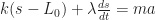
) times the amount the spring has stretched ((s-L_0)), which is to say the difference (-) between the distance between the wall and the trolley (s) and the original length of the spring (L_0).

And the damper as:

damper \sim \lambda\frac{ds}{dt}

You can also read into the component parts of that too, of course: \frac{ds}{dt} 
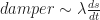
presumably reads as something like the rate at which the distance between the wall and the trolley changes or the speed with which the trolley moves towards and away from the wall. And \lambda (greek symbol, pronounced as lambda) is another constant material property of the damper.

People know this stuff…  They get the idea of constants, but they don’t realise it. Rubber balls are squeezy in the way that bricks aren’t. Squeeziness is a constant, and the ball and the brick have different values, peculiar to them, that are both associated with that same notion, that same constant, same property, of squeeziness. Similarly, folk know speed is something to do with the relationship between distance and time, and may even know that speed is distance over time, but they don’t know how to see it and read it (don’t know how to spot it or recognise it) as such when presented with an equation…

We don’t teach people how to read equations…

…nor do we teach them how to read diagrams and charts…

[Scurries away quickly in case I read the spring-damper equation incorrectly…!;-)]

Anyway, like I said, I need to think about representing stuff as graphs a bit more… A lot more…

PS I hadn’t appreciated before now that WordPress lets you write simple LaTex, albeit at the non-accessible expense of generating a PDF of the resulting expression… h/t @econproph for pointing that out…

Warning — May Contain Traces of AI

A recent flurry of announcements by Google demonstrate how tensorflow co-processors and statistical models, rather than rule based ones, may soon be coming to a device near you.

Getting on for three years ago, Google announced they had developed a Tensorflow Processing Unit, a co-processor designed to speed up the training of deep-learning models. A year later — so two years ago — they announced cloud availability of TPUs, along with an “in-depth look at Google’s first Tensor Processing Unit (TPU)”.

You can check out TPU availability on Google Cloud services here. Since September 2018 (?), access to limited free TPU support has been available via Google Colab. A minimal ‘get started’ notebook can be found here.

The next step, recently announced among a flurry of announcements at the Tensorflow Developer Summit, 2019 (review), is to provide TPUs you can run at home: Coral Edge TPU Devices. These come in a couple of flavours:

  • Coral Dev-Board, a wireless development board with 1GB of RAM and 8GB of Flash memory, micro-SD slot, gigabit Ethernet, audio jack, and HDMI connectors, dual microphone, and onboard CPU, GPU  and “ML [machine learning] accelerator” Google Edge TPU coprocessor; (seems like a Raspberry Pi on steroids?)
  • USB accelerator, a TPU on a stick that you can plug into your Linux laptop or Raspberry Pi to give it a bit of extra oomph…

Some other things to watch out for…

Pete Warden reports how tensorflow models may soo be coming to a micro-controller near you: Launching TensorFlow Lite for Microcontrollers (repo); ported versions for several microcontrollers are already availaible. It seems he gave a demo of a microcontroller responding to a particular voice activation command:

So why is this useful? First, this is running entirely locally on the embedded chip, with no need to have any internet connectivity, so it’s good to have as part of a voice interface system. The model itself takes up less than 20KB of Flash storage space, the footprint of the TensorFlow Lite code is only another 25KB of Flash, and it only needs 30KB of RAM to operate.

Lest you think this is just in the realm of demoware, Google are also releasing an all-neural on-device speech recognizer:

… a model trained using RNN [recurrent neural network] transducer (RNN-T) technology that is compact enough to reside on a phone. This means no more network latency or spottiness — the new recognizer is always available, even when you are offline. The model works at the character level, so that as you speak, it outputs words character-by-character, just as if someone was typing out what you say in real-time, and exactly as you’d expect from a keyboard dictation system.

Just reflect on that naming for a moment: Recurrent Neural Network Transducer. I normally thing of transducers as physical sensors (eg things that continuously convert sound, or light, or pressure, or temperature to an electrical signal). Here, we have the notion of a software transducer that turns a signal into a set of meaningful symbols in a real-time conversion stream:

RNN-Ts are a form of sequence-to-sequence models that do not employ attention mechanisms. Unlike most sequence-to-sequence models, which typically need to process the entire input sequence (the waveform in our case) to produce an output (the sentence), the RNN-T continuously processes input samples and streams output symbols, a property that is welcome for speech dictation. In our implementation, the output symbols are the characters of the alphabet. The RNN-T recognizer outputs characters one-by-one, as you speak, with white spaces where appropriate. It does this with a feedback loop that feeds symbols predicted by the model back into it to predict the next symbols…

We can haz all ur devices R listen 4 uz…

By the by, I note that the Tensorflow Hub (about) provides a range of (partial) models to build from / retrain in your own solution. Amazon Sagemaker also offers pretrained ML models in their AWS Sagemaker Marketplace. At the moment, I don’t think any of these come with health warnings along the lines of may contain bias or bias inside… Which they should…

However, tools for helping probe the various levels of feature detection embedded within a network are starting to appear. For example, Google announced a technique they’re calling activation atlases:

Activation atlases provide a new way to peer into convolutional vision networks, giving a global, hierarchical, and human-interpretable overview of concepts within the hidden layers of a network. We think of activation atlases as revealing a machine-learned alphabet for images — an array of simple, atomic concepts that are combined and recombined to form much more complex visual ideas.

An example is given of activation atlases for a convolutional image classification network:

In general, classification networks are shown an image and then asked to give that image a label from one of 1,000 predetermined classes — such as “carbonara“, “snorkel” or “frying pan“. … One neuron at one layer might respond positively to a dog’s ear, another at an earlier layer might respond to a high-contrast vertical line.

An activation atlas is built by collecting the internal activations from each of these layers of our neural network from one million images. These activations, represented by a complex set of high-dimensional vectors, is projected into useful 2D layouts …

[A]ll the activations are too many to consume at a glance [so] we draw a grid over the 2D layout we created. For each cell in our grid, we average all the activations that lie within the boundaries of that cell, and use feature visualization to create an iconic representation.

In certain respects, this reminds me a little bit of Andy Wuensche’s basins of attractions in discrete dynamical networks from way back when…

In that case, the idea was to try to represent how all possible states of a network were connected to see where any given initial state might lead a network to and then find a way to meaningfully visualise that. In this case, it seems that the idea is to to try to identify what features and given node might be sensitive to (i.e. plot all the grandmother cells (lite background)).

Running a Minimal OU Customised Personal Jupyter Notebook Server on Digital Ocean

In words and pictures, how to create a simple throwaway server, on a cheap, commercial web host, that automatically runs a personal Jupyter notebook server, with a light covering of OU branding., via a prebuilt Docker container image… (More significant customisations are, of course, possible…)

Step 1 (you only need to do this once)

Get a Digital Ocean account.

A downside of this is that you probably have to give you credit card details to get an account. The upside is that this link should get you $100 free credit that you won’t ever get round to spending anyway.

At this point, I realise many people won’t get past this step… If you’re in HE, your institution should really be able to give you access to online servers that can spin up as required. If they don’t, hassle the Library, because they should be providing you access to this sort of environment if your department can’t or won’t.

[I speak in terms of ideals, of course, which is why I am using a personal Digital Ocean account…]

There are alternative routes, exemplified in posts throughout this blog, but naysayers will just pick grief with those too… At the end of the day, things like Digital Ocean offer commodity compute, and folk in computing education at least should be aware of them, what sorts of thing they offer, and how to work with them in general…

Step 2

Select your own Docker server environment type. Digital Ocean calls servers droplets and the Docker server can be found in the marketplace:

Pedants I work with would probably claim that’s four steps and that it’s already too hard.

Step 3

Select the server size. Some applications require grunt, but for now let’s be a cheapskate with something that approximates an OU min spec machine. (This sort of discipline is also good for academics with fast/whizzy machines so they can see how the rest of the world has to get by…)

Step 4

Select where in the world you want your server to start up.

Step 5

We’re going to get our server to automatically download and run a very lightly customised Jupyter notebook server:

Copy and paste both the following lines into the user data area.

The first one tells the start-up-er-er what sort of script it is. If you have trouble remembering the order of symbols at the start, it reads hash (#) bang (!). The /bin/bash says it’s a bash script.

#!/bin/bash
​​​​​​​​​​​​docker run -p 80:8888 -e JUPYTER_TOKEN=MyP45SwerD ousefulcoursecontainers/oubrandednotebook

The second line is a Docker run command. What it does is download a minimally branded, basic Jupyter notebook server Docker image (ousefulcoursecontainers/oubrandednotebook) and launch a container from it, exposing it to the default http port 80.

If you have Docker installed on your own computer, you should be able to run something like: ​​​​​​​​​​​​​docker run -p HOSTPORT:8888 -e JUPYTER_TOKEN=MyP45SwerD ousefulcoursecontainers/oubrandednotebook ​ , where  HOSTPORT is the port number on host you want to visit the notebook server on in your browser at http://localhost:HOSTPORT or http://127.0.0.1:HOSTPORT.

As part of the command, we specify a default plain text password like token that will add a small level of security. In this case, I’m setting the token to MyP45SWerD.

Step 6

Optionally set a server name and then create your server:

Step 7

Wait for the server to boot…

When the server is launched, you should see a public IP address for it that you can copy if you hover your mouse cursor over it…

It’s probably not quite ready to use yet, though… It will need a minute or two to download the Docker container we told it to start up with…

Step 8

In your browser, paste in the server IP address. If you don’t get a response, it’s still sorting its bits out. Refresh the browser page every so often if the page load appears to stop.

After a minute or two, you should see your notebook login page:

Log in to the server using the password you set in the user data area (for example, MyP45SwerD). You can either use the token to set a browser cookie on the notebook to let you in, or use it set a new password on the notebook.

Step 9

Play with your notebook…

Step 10

When you’re done playing, you can delete the kill the server / droplet so you don’t keep paying for it (it’s metered by the hour or part thereof).

You’ll lose everything inside the server, so the confirmation prompt is in your own best interest…


And that’s it…

If we want to create custom notebook environments, seeded with notebooks and with a more complex environment installed (specific Python packages, for examples, or other servers we want running, we can create another container on top of our minimal container and launch that. (You can see the repo that adds the basic OU branding to the official Jupyter base notebook image here.)

We can also version containers (for example, for specific modules, modules presentations, tutorials, etc).

And as I demonstrated in the previous blogpost, we can also use a similar technique to provide a view of a desktop application via a browser or remote desktop connection.

Running Microsoft VS Code Remotely – In a Browser Using XPRA and Via a Remote Desktop Application Using RDP

If you’re a new student with a bright new Chromebook or other netbook style computer, what do you do other than panic, or cry, when you’re expected to download and install a desktop application — even a cross-platform one — when you start your course?

A month or so ago I posted some notes on Viewing Dockerised Desktops via an X11 Bridge, novnc and RDP, Sort of… where I found a recipe for running a graphical application running in one container via a browser using a “bridge” application in another container.

(The bridge application container exposed a graphical desktop using http via a browser. The bridge connected to the application container via an X11 connection and then exposed the graphical UI using X11.)

As a building block, this is useful in a couple of ways:

  • the application can be remotely hosted and used to expose a graphical application via a browser (so no installation required);
  • the same recipe can be used to set up a “hub” on a local machine to let you run arbitrary graphical applications on your own computer and access them via a browser.

It can be a bit fiddly though and requires plumbing the application container to the bridge, although Docker Compose can handle that for you.

But it’s still one more thing to go wrong.

And it doesn’t help the student with a Chromebook and no local installation route (let’s set aside the ability to run containers on a Chromebook – the same is probably not true of other netbooks, plus it requires a good spec Chromebook).

One of the problems I’ve found with the browser based approach is that you don’t necessarily get sound… So for our student hoping to rely on accessing an application via a remote server, that could be an issue too…

So here are a couple more recipes for creating simple containerised applications that can be used to provide access to remote desktops, whether they’re remote over the internet, or running “remotely” in a container on your own machine.

To demonstrate, I’ll use the Microsoft VSCode application. This electron app will run cross platform, but that doesn’t directly help if you need to access it remotely…

Method the First: An XPRA Container

Via lanrat/docker-xpra-html5, a base container that includes an XPRA server.

That repo has been archived, perhaps because among other things it was using an old version of Linux. I’ve done an update here — https://github.com/ouseful-backup/docker-xpra-html5 — with a Docker image here — ousefuldemos/docker-xpra-html5 — but still need to check it continues to work as the old one did.

Via the CoCalc Docker container recipe, I cribbed this Dockerfile installation command for VSCode that needs to be added in to the Dockerfile:

#From cocalc-docker
# Microsoft's VS Code
RUN apt-get update && apt-get install -y curl && apt-get clean && \
     curl https://packages.microsoft.com/keys/microsoft.asc | gpg --dearmor > microsoft.gpg \
  && install -o root -g root -m 644 microsoft.gpg /etc/apt/trusted.gpg.d/ \
  && sh -c 'echo "deb [arch=amd64] https://packages.microsoft.com/repos/vscode stable main" > /etc/apt/sources.list.d/vscode.list' \
  && DEBIAN_FRONTEND=noninteractive apt-get install -y apt-transport-https \
  && apt-get update \
  && DEBIAN_FRONTEND=noninteractive apt-get install -y code

We can use a simple Dockerfile bootstrapped with FROM lanrat/docker-xpra-html5) and then add in the VSCode layer, or we can add it to a cloned copy of the original repository Dockerfile and build our own container from scratch.

I also made a couple of other tweaks to the Dockerfile so that it could use my own command file. But first, we need to create another file (vscode.sh) for our own start command that will launch VSCode, rather than the infinityTerminal, on start:

#! /usr/bin/env bash

#Start the VSCode app
code

#Keep the container running...
tail -f /dev/null

Then copy the file into the container, and set the permissions, via these Dockerfile instructions:

ADD vscode.sh /usr/local/bin/vscode
RUN chmod +x /usr/local/bin/vscode

I also made a change to the CMD, replacing --start-child=infinityTerm with the --start-child=vscode value and using the new CMD line in my Dockerfile:

CMD xpra start --bind-tcp=0.0.0.0:10000 --html=on --start-child=vscode --exit-with-children --daemon=no --xvfb="/usr/bin/Xvfb +extension Composite -screen 0 1920x1080x24+32 -nolisten tcp -noreset" --pulseaudio=no --notifications=no --bell=no

If you’re creating your own Dockerfile bootstrapped from the original Docker image, rather than built from the raw Dockerfile, you’ll need to add the revised CMD command in too. (The CMD statement also looks to have a wide range of other settings that could be useful and that may provide a better experience.)

Building a local copy of the container with docker build -t psychemedia/xpra-vscode . (yes, the . is part of that: it tells the builder to look in the local (.) directory for the Dockerfile) and running it with docker run --rm -d -p 8822:10000 psychemedia/xpra-vscode, the fan on my laptop goes in to overdrive but I can now work in VSCode via my browser:

So that seems to work…

(I also pushed the image to Dockerhub, so you should be able to run the docker run command directly yourself… Alternatively, you can run the command in a new Digital Ocean Docker droplet (see steps 1-5 of the recipe here).)

Method the Second: An RDP Container

In this second example, let’s add the VSCode editor to an image published at danielguerra69/ubuntu-xrdp. Bootstrapping from that container, all we need to do is pull in a VSCode layer:

FROM danielguerra/ubuntu-xrdp

RUN apt-get update && apt-get install -y curl && apt-get clean

RUN curl https://packages.microsoft.com/keys/microsoft.asc | gpg --dearmor > microsoft.gpg \
  && install -o root -g root -m 644 microsoft.gpg /etc/apt/trusted.gpg.d/ \
  && sh -c 'echo "deb [arch=amd64] https://packages.microsoft.com/repos/vscode stable main" > /etc/apt/sources.list.d/vscode.list' \
  && DEBIAN_FRONTEND=noninteractive apt-get install -y apt-transport-https \
  && apt-get update \
  && DEBIAN_FRONTEND=noninteractive apt-get install -y code

Building this with docker build -t psychemedia/rdp-vscode . and then running it with docker run --rm -d --name uxrdp --hostname terminalserver --shm-size 1g -p 3399:3389 psychemedia/rdp-vscode I can now connect to it on localhost:3399 using a Microsoft Remote Desktop app (available for Windows, Android, iOS and macOS) and login with default credentials (user: ubuntu, password: ubuntu) and access it via a remote desktop window.

(One issue is that resizing the RDP app window doesn’t resize the desktop to fit; there’s perhaps a setting I’m missing somewhere that might help with that…?)

(As before, I also pushed the image to Dockerhub, so you should be able to run the docker run command directly yourself…)

Looking at the Dockerfile, it also looks as if something is exposed on port 9001. If we add -p 9001:9001 (remember, the pattern is -p HOST_PORT:PORT_INSIDE_CONTAINER into the docker start command, and then go to the mapped port, we see a supervisor control panel:

Supervisor_Status

Something like that could be a handy thing to add in to the TM351 VM… Here’s the corresponding supervisor.d config file… (Looks like we can use it as a basis for further monitoring, eg of memory usage. See here.)

I can also confirm that audio (as well as video) works…

Sort of…

Launching a 2GB Digital Ocean Docker droplet with the following user data / startup command:

When I connected to the public IP address for the droplet with port 3389, the RDP worked fine but when I tried to play a Youtube video in Firefox, the buffering garbled the audio really badly. (Maybe a larger droplet instance would have been better…)

Summary

These two simple recipes provide a way for sharing simple GUI apps either via a browser (without audio) or via RDP, with sound available if required. Microsoft provide cross-platform clients for Windows, Mac, Android and IoS.

If the Android client in the Google Play store works for Chromebooks, then a student with a Chromebook should be able to fully access a remotely hosted application over RDP, including support for audio and video.

There is a huge gulf, of course, between being able to get things working, sort of, and getting them working at scale in an educational environment.

The experience may be a bit ropey at times, but if we have one or two students with real issues getting software working, I don’t see why we can’t try to pull together a homebrew solution to provide them with a remotely hosted software environment, albeit perhaps a temporary one.

And each time we try, we’ll maybe figure out a way to smooth it out and improve the experience a bit more.

Or we could teach folk how to launch their own remote server instances  which could be kept running with some sort of file persistence over the life of a course, whether by leaving the server switched on or mounting user files to a storage volume somewhere . (We’d probably have to improve the security layer a bit, at least by showing students how to create their own user credentials. But that’s a problem we’d only have to figure out a recipe for once.)

What keeps winding me up is how folk are so resistant to using computers to do computery things…

PS here’s something else I learned today, ish via @mickaelistria on the Twitterz. The original tweet pointed to a repo that provides access to an Eclipse IDE via a browser: https://github.com/ws-skeleton/eclipse-broadway/ From which I then learned that the GDK Broadway backend provides support for displaying GTK+ applications in a web browser, using HTML5 and web sockets. So that’s another route?

Also via Twitter, @olberger pointed me to https://janitor.technology/ https://github.com/JanitorTechnology/janitor, which looks like it provides an online development environment built around https://github.com/theia-ide/theia .

I’m thoroughly out of my depth with this development environment stuff…

All I’m trying to do is identify the small pieces that can be used to make applications available to students.

For two reasons…

Firstly, so I can experiment with the pieces and get a feel for how they work / what their limitations are / what sorts of richer environments might come to be built on their foundations.

Secondly, so when folk pitch whizzy start-up solutions to us at “only” $X per student seat, I have some mental filters in place so that I can filter out the shiny glare and get a feeling for what’s actually being offered, and maybe what technology it’s built on (or at least, seed me questions so I can try to figure out what it’s built on). And from that, what the limitations and benefits might be. We generally don’t get to hear, make time for, or understand detailed technical sales pitches, but at the end of the day, the tech is a large part of what you’re buying, wrapped up in user experience chrome.

PS here’s an online service that looks like it’s over a ‘native’ web hosted version of VS Code:  StackBlitz; and here’s another, coder.com , with a repo: codercom/code-server.

PPS By the by, VS Code looks like it’s built using this browser based text editor from Microsoft: Monaco.

PPPS @betatim show’s how it’s done… the codercom/code-server running in a Binder container proxied in a Jupyer notebook environment using jupyter-server-proxy: https://github.com/betatim/vscode-binder.