At the start of the year, I was planning on spending free time tinkering with rally data visualisations and trying to pitch some notebook originated articles to Racecar Engineering. The start of lockdown brought some balance, and time away from scrren and keyboard in the garden, but then pointless made up organisational deadlines kicked in and my 12 hour plus days in the front of the screen kicked back in. As Autumn sets in, I’m going to try to cut back working hours, if not screen hours, by spending my mornings playing with rally data.
The code I have in place at the moment is shonky as anything and in desperate need of restarting from scratch. Most of the charts are derived from mutliple separate steps, so I’m thinking about pipeline approaches, perhaps based around simple web services (so a pipeline step is actually a service call). Thiw will give me an opportunity to spend some time seeing how production systems actually build pipeline and microsservice architectures to see if there is anything I can pinch.
One class of charts, shamelessly stolen from @WRCStan of @PushingPace / pushingpace.com, are pace maps that use distance along the axis and a function of time on the y-axis.
One flavour of pace map uses a line chart to show the cumulative gap between a selected driver and other drivers. The following chart, for example, shows the progress of Thierry Neuville on WRC Rally Italia Sardegna, 2020. On the y-axis is the accumulated gap in seconds, at the end of each stage, to the identified drivers. Dani Sordo was ahead for the whole of the rally, building a good lead over the first four stages, then holding pace, then losing pace in the back end of the rally. Neuville trailed Seb Ogier over the first five stages, then after borrowing from Sordo’s set-up made a come back and a good battle with Ogier from SS6 right until the end.

The different widths of the stage identify the stage length; the graph is thus a transposed distance-time graph, with the gradient showing the difference in pace in seconds per kilometer.
The other type of pace chart uses lines to create some sort of stylised onion skin histogram. In this map, the vertical dimension is seconds per km gained / loat relative to each driver on the stage, with stage distance again on the x-axis. The area is thus and indicator of the total time gained / lost on the stage, which marks this out as a histogram.
In the example below, bars are filled relative to a specific driver. In this case, we’re plotting pace deltas relative to Thierry Neuville, and highlighting Neuville’s pace gap to Dani Sordo.

The other sort of chart I’ve been producing is more of a chartable:
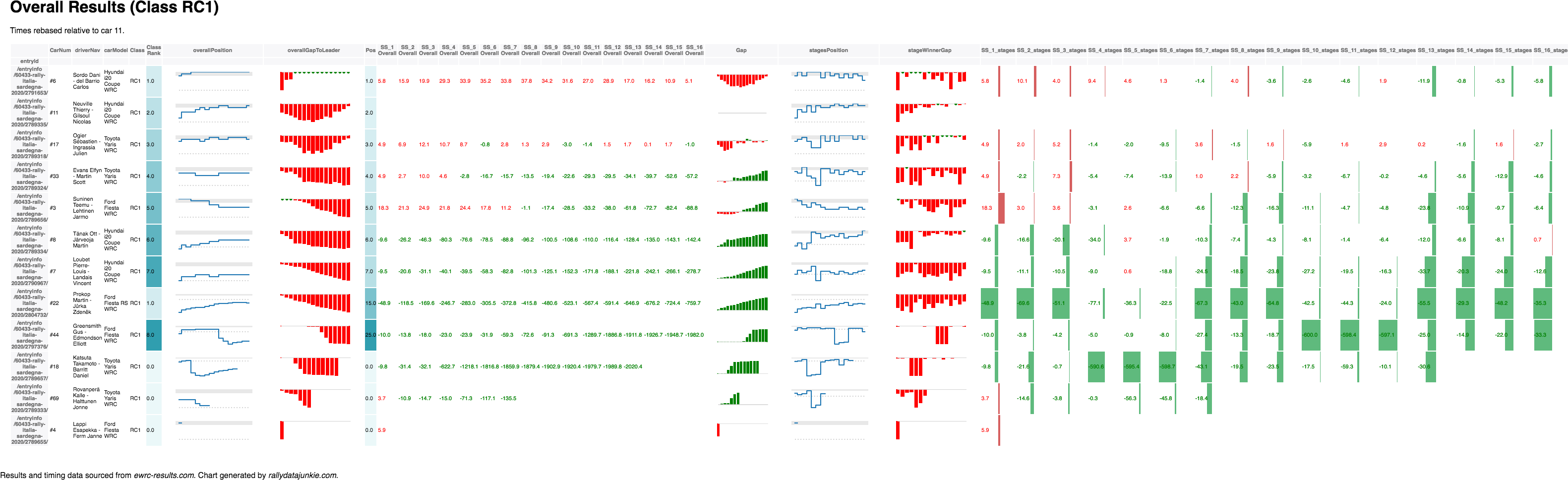
This view combines tabular chart, with in-cell bar charts and various embedded charts. The intention was to combine glanceable visual +/- deltas with actual numbers attached as well as graphics that could depict trends and spikes. The chart also allows you to select which driver to rebase the other rows to: this allows you to generate a report that tells the rally story from the perspective of a specified driver.
My thinking is that to create the Rally Review chart, I should perhaps have a range of services that each create one component, along with a tool that lets me construct the finished table from component columns in the desired order.
Some columns may contain a graphical summary over values contained in a set of neighbouring columns, in which case it would make sense for the service to itself be a combination of services: one to generate rebased data, others to generate and return views over the data. (Rebasing data may be expensive computationally, so if we can do it once, rather than repeatedly, that makes sense.)
In terms of trasnformations, then, there are are least two sorts of transformation service required:
- pace transformations, that take time quantities on a stage and make pace out them by taking the stage distance into account;
- driver time rebasing transformations, that rebase times relative to a specified driver.
Rummaging through other old graphics (I must have the code somewhere bit not sure where; this will almost certainly need redoing to cope with the data I currently have in the form I have it…), I also turn up some things I’d like to revisit.
First up, stage split charts that are inspired by seasonal subseries plots:

These plots show the accumulated delta on a stage relative to a specified driver. Positions on the stage at each split are shown by overplotted labels. If we made the x-axis a split distance dimension, the gradient would show pace difference. As it is, the subseries just indicate trend over splits:

Another old chart I used to quite like is based on a variant of quantised slope chart or bump charts (a bit like postion charts.

This is fine for demonstrating changes in position for a particular loop but gets cluttered if there are more than three or four stages. The colour indicates whether a driver gained or lost time realtive to the overall leader (I think!). The number represents the number of consecutive stage wins in the loop by that driver. The bold font on the right indicates the driver improved overall position over the course of the loop. The rows at the bottom are labelled with position numbers if they rank outside the top 10 (this should really be if they rank lower than the number of entruies in the WRC class).
One thing I haven’t tried, but probably should, is a slope graph comparing times for each driver where there are two passes of the same stage.
I did have a go in the past at more general position / bump charts too but these are perhaps a little too cluttered to be useful:

Again, the overprinted numbers on the first position row indicate the number ofconsecutive stage wins for that driver; the labels on the lower rows are out of top 10 position labels.
What may be more useful would be adding the gap to leader of diff to car ahead, either on stage or overall, with colour indicating either that quantity, heatmap style, or for the overall case, whether that gap / difference increased or decreased on the stage.

Visualizations like this are interesting. I always wonder, which one is optimized for which type of audience. Team Manager, Driver, officials trying to prevent teams from taking advantage, sponsors for teams, etc. Some are better suited for a task than others.
I create charts to try to help me understand what went on and to help me look for stories within the data…