We’re all familiar with line charts and pie charts, but how might we create new ways of visualising data. One way, is to play…
Over the weekend, I was doodling with an online, GUI driven hosted version of the ggplot graphing library for the statistical analysis language R: Jeroen C.L. Ooms (2010). yeroon.net/ggplot2: A web interface for the R package ggplot2
This service lets you upload a file and then using a handful of menu options create a wide variety of chart types. It also generates the corresponding ggplot/R commands so you can recreate the charts in your own R environment.
Because R is built for doing stats, ggplot has access to a powerful set of data transforming routines that can be applied to the data set you want to visualise. This includes being able to group data elements, plot different facets on different charts in a lattice style display, colour and size nodes according to a particular column and so on:
The data set I had was of the form related to (no surprises) F1 timing data. The columns included things like the driver name, car number, lap number and lap time, and stint number (each stint for a car is separated by a pitstop). Each row corresponded to data from a single lap for a single car. Which is to say, looking down the rows, we see driver names repeat (once for each lap they completed); or looking down the stint column, we can filter out rows that just correspond to the first or second stint for each driver. Which is to say: the data has structure, and can be viewed in a variety of ways.
So for example, in the following chart, we can plot for each driver (each separate graph, specified by treating the car number as a facet) their fuel corrected laptimes (y-axis) over the course of the race (lap number on x-axis). The colour of each point is determined by the pitstop column value which identifies whether a car has pitted on that lap:
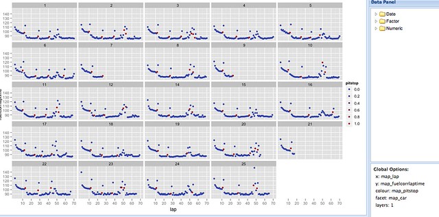
The chart was created in six steps: one to upload the data, one to create a scatterplot layer and four menu selections (x, y, facet, colour).
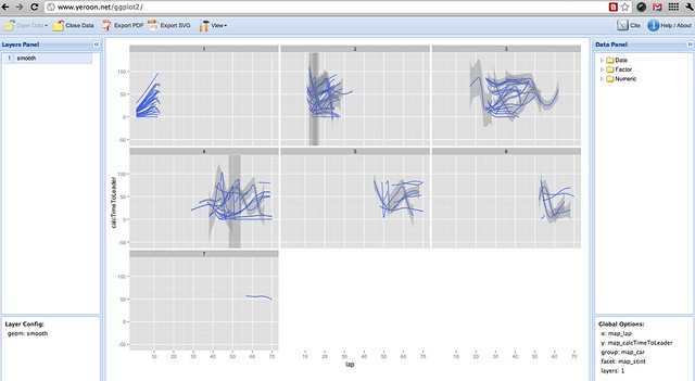
As well as specifying facets, we can also group data rows to display them on the same faceted graph. Here, I group the data by car (so we will see a separate line for each car), and facet by stint:
Hopefully, you’ll see how it’s possible to explore a wide range of views over the data, cutting it up in all sorts of ways, quite easily. At a glance, we can get a view of different aspects of the whole data set, and start looking for surprising features that might be worth closer investigation. Because it’s quick to create different views over the data, we can quickly get an overall picture of how the data values are arranged.
There are issues of course: whilst the facet and group options provide one way of arranging the data, I don’t think there’s a way of filtering the data using the web interface (for example, to show the times by stint for cars 1 to 5). Adding support for filters (that is, data/subset operations) would make the web interface far more powerful as an interactive visual analysis tool, methinks, for example using the sort of dialogue used to specify filters in Gephi.
That said, I’ve now added Ooms’ ggplot web interface to the list of visualisation sites (along with IBM Many Eyes, for example), that I can use for getting a visual overview of a dataset quickly and easily. If you want to give it a go, you can find it at: http://www.yeroon.net/ggplot2/
Here’s a quick video overview if you need more convincing:

It’s a great tool, but lacks te filtering functionality. The filter should be done previously via Excel/Other Spreadsheet/Data base. Anyhow, the visualization power of ggplot is awesome!