Seven Graphical Interfaces to Docker

From playing with docker over the last few weeks, I think it’s worth pursuing as a technology for deploying educational software to online and distance education students, not least because it offers the possibility of using containers as app runners than can run an app on your own desktop, or via the cloud.

The command line is probably something of a blocker to users who expect GUI tools, such as a one-click graphical installer, or double click to start an app, so I had a quick scout round for graphical user interfaces in and around the docker ecosystem.

I chose the following apps because they are directed more at the end user – launching prebuilt apps, an putting together simple app compositions. There are some GUI tools aimed at devops folk to help with monitoring clusters and running containers, but that’s out of scope for me at the moment…

1. Kitematic

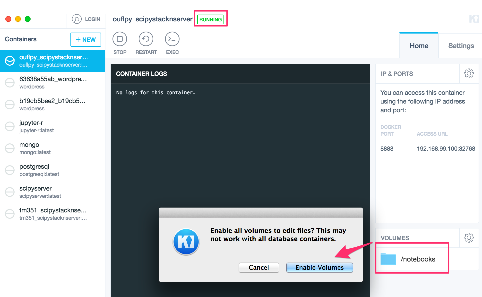
Kitematic is a desktop app (Mac and Windows) that makes it one-click easy to download images from docker hub and run associated containers within a local docker VM (currently running via boot2docker?).

I’ve blogged about Kitematic several times, but to briefly summarise: Kitematic allows you to launch and configure individual containers as well as providing easy access to a boot2docker command line (which can be used to run docker-compose scripts, for example). Simply locate an image on the public docker hub, download it and fire up an associated container.

Kitematic_and_Pinboard__bookmarks_for_psychemedia_tagged__docker_

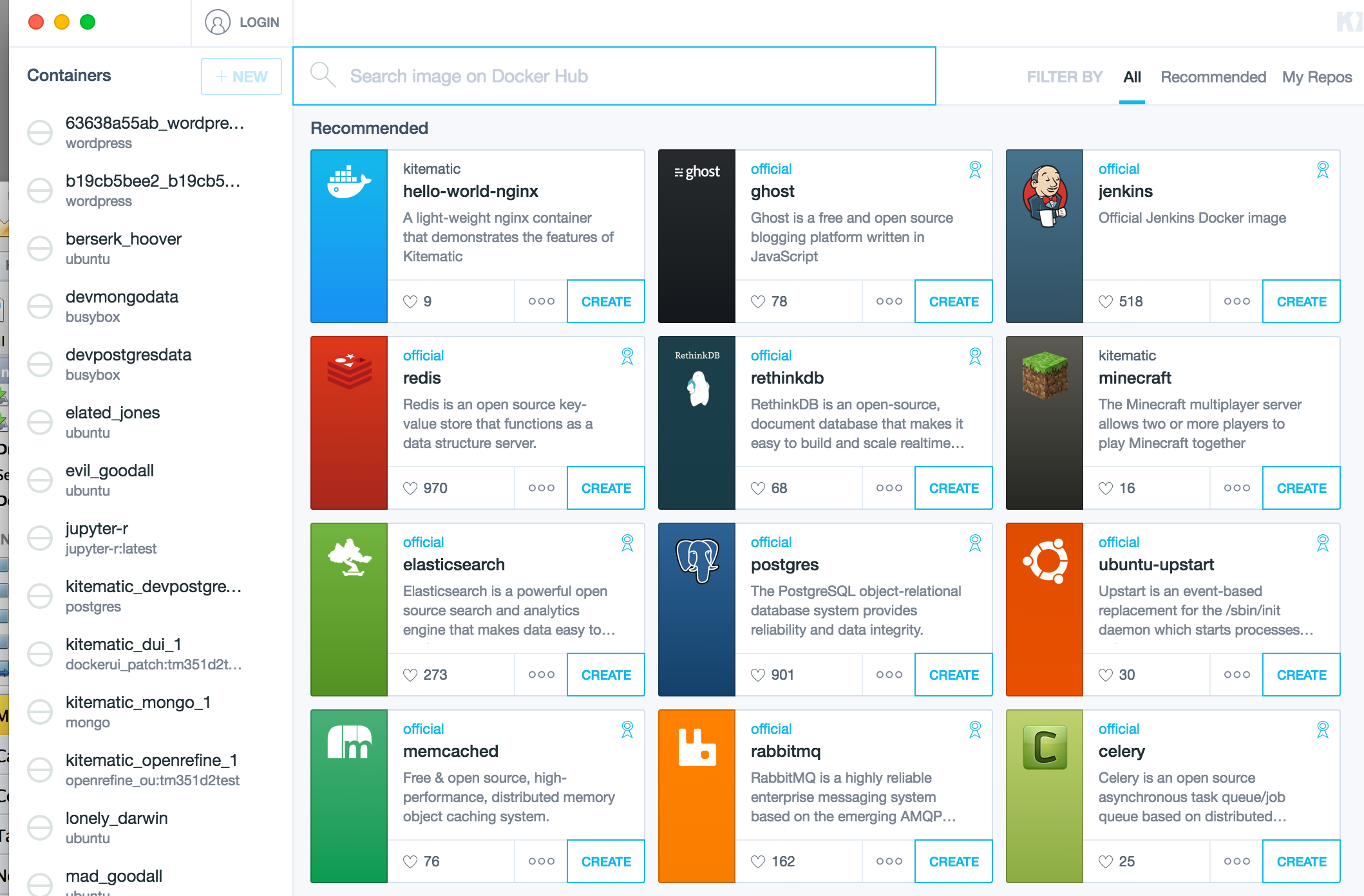
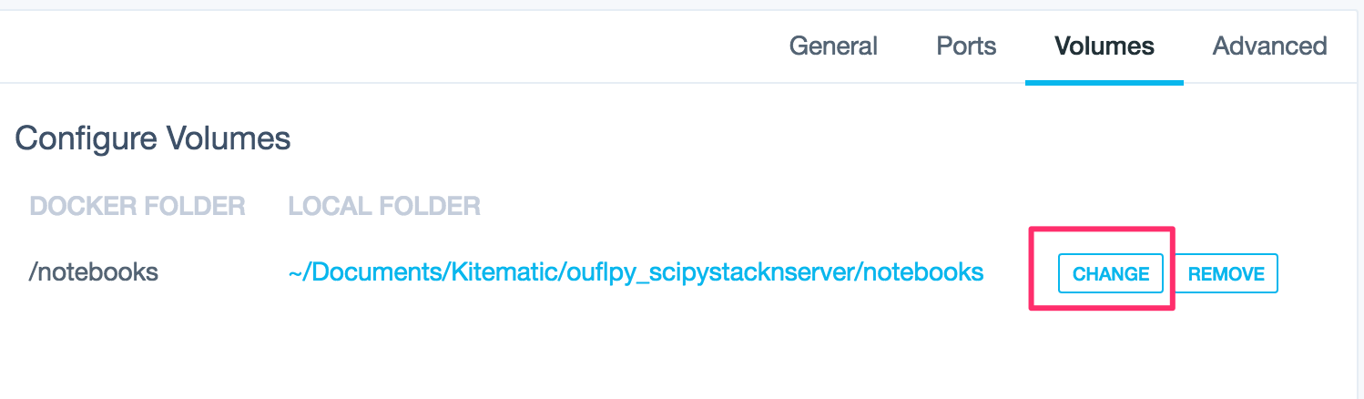
Where a mount point is defined to allow sharing between the container and the host, you can simply select the desktop folder you want to mount into the container.

At the moment, Kitematic doesn’t seem to support docker-compose in a graphical way, or allow users to deploy containers to a remote host.

2. Panamax

panamax.io is a browser rendered graphical environment for pulling together image compositions, although it currently needs to be started from the command line. Once the application is up and running, you can search for images or templates:

Panamax___Search

Trying to install it June 2107 using homebrew on a Mac, and it seems to have fallen out of maintenance…

Templates seem to correspond to fig/docker compose like assemblages, with panamax providing an environment for running pre-existing ones or putting together new ones. I think the panamax folk ran a competition some time ago to try to encourage folk to submit public templates, but that doesn’t seem to have gained much traction.

Panamax___Search2

Panamax supports deployment locally or to a remote web host.

Panamax___Remote_Deployment_Targets

When I first came across docker, I found panamax really exciting becuase of the way it provided support for linking containers. Now I just wish Kitematic would offer some graphical support for docker compose that would let me drag different images into a canvas, create a container placeholder each time I do, and then wire the containers together. Underneath, it’d just build a docker compose file.

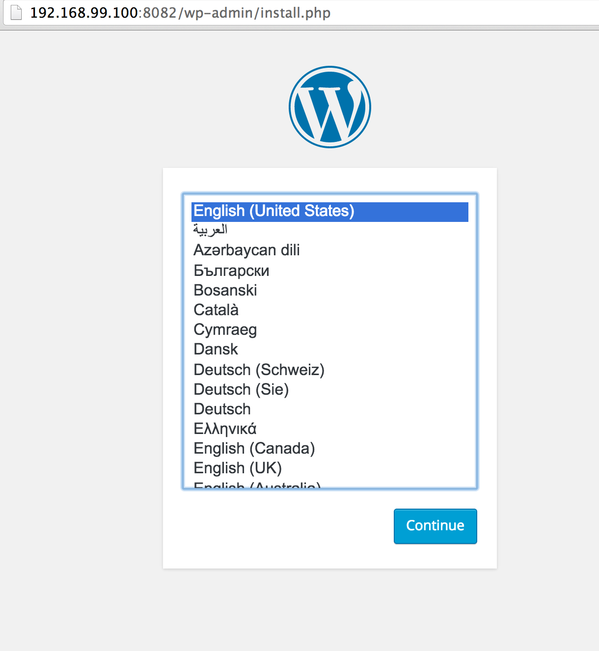
The public project files is useful – it’d be great to see more sharing of general useful docker-compose scripts and asscociated quick-start tutorials (eg WordPress Quickstart With Docker).

3. Lorry.io

lorry.io is a graphical tool for building docker compose files, but doesn’t have the drag, drop and wire together features I’d like to see.

Lorry.io is used to be published by CenturyLink, who also published panamax, (lorry.io was the newer development, I think?) But it seems to have disappeared… there’s still a code repo for it, though, and a docker container exists (but no Dockerfile?). It also looks like the UI requires an API server – again, the code repo is still there… Not sure if there’s a docker-compose script somewhere that can links these together and provide a locally running installation?

Lorry_io_-_Docker_Compose_YAML_Editor

Lorry_io_-_Docker_Compose_YAML_Editor2

Lorry.io lets you search specify your own images or build files, find images on dockerhub, and configure well-formed docker compose YAML scripts from auto-populated drop down menu selections which are sensitive to the current state of the configuration.

4. docker ui

docker.ui is a simple container app that provides an interface, via the browser, into a currently running docker VM. As such, it allows you to browse the installed images and the state of any containers.

Docker_Hub

Kitematic offers a similar sort of functionality in a slightly friendlier way. See additional screenshots here.

5a. tutum Docker Cloud

[Tutum was bought out by Docker, and rebranded as Docker Cloud.]

I’ve blogged about tutum.co a couple of times before – it was the first service that I could actually use to get containers running in the cloud: all I had to do was create a Digial Ocean account, pop some credit onto it, then I could link directly to it from tutum and launch containers on Digital Ocean directly from the tutum online UI.

New_Service_Wizard___Tutum

I’d love to see some of the cloud deployment aspects of tutum make it into Kitematic…

UPDATE: the pricing model adopted with the move to Docker Cloud is based on a fee-per-managed-node basis. The free tier offers one free managed node, but the management fee otherwise is at a similar rate to fee for actually running a small node on one of the managed services (Digital Ocean, AWS etc). So using Docker Cloud to manage your nodes could get expensive.

See also things like clusteriup.io

5b. Rancher

Rancher is an open source container management service that provides an alternative to Docker Cloud.

I haven’t evaluated this application yet.

To bootstrap, I guess you could launch a free managed node using Docker Cloud and use it to set up a Rancher running in a container on a Docker Cloud managed node. Then the cost of the management is the cost of running the server containing the Rancher container?

6. docker Compose UI

The docker compose UI looks as if it provides a browser based interface to manage deployed container compositions, akin to some of the dashboards provided by online hosts.

francescou_docker-compose-ui

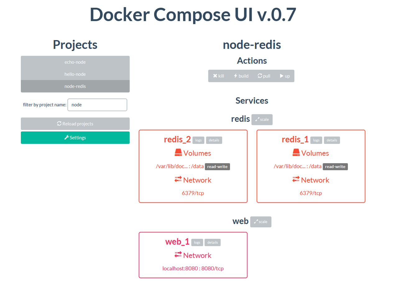
If you have a directory containing subdirectories each containing a docker-compose file, it’ll let you select and launch those compositions. Handy. And as of June 2017, still being maintained…

7. ImageLayers

Okay – I said I was going to avoid devops tools, but this is another example of a sort of thing that may be handy when trying to put a composition of several containers together because it might help identify layers that can be shared across different images.

imagelayers.io looks like it pokes through the Dockerfile of one or more containers and shows you the layers that get built.

ImageLayers___A_Docker_Image_Visualizer

I’m not sure if you can point it at a docker-compose file and let it automatically pull out the layers from identified sources (images, or build sources)?

PS here are the bonus apps since this post was first written:

  • docker image graph: display a graphical tree view of the layers in your current current images; a graphical browser based view lets you select and delete unwanted layers/images.
  • Wercker Container Workflows: manage what happens to a container after it gets built; free plan available.

Running a Shell Script Once Only in vagrant

Via somewhere (I’ve lost track of the link), here’s a handy recipe for running a shell script once and once only from Vagrantfile.

In the shell script (runonce.sh):

#!/bin/bash

if [ ! -f ~/runonce ]
then

  #ONCE RUN CODE HERE

  touch ~/runonce
fi

In the Vagrantfile:

  config.vm.provision :shell, :inline => <<-SH
    chmod ugo+x /vagrant/runonce.sh
    /vagrant/runonce.sh
  SH

Robot Journalism in Germany

By chance, I came across a short post by uber-ddj developer Lorenz Matzat (@lorz) on robot journalism over the weekend: Robot journalism: Revving the writing engines. Along with a mention of Narrative Science, it namechecked another company that was new to me: [b]ased in Berlin, Retresco offers a “text engine” that is now used by the German football portal “FussiFreunde”.

A quick scout around brought up this Retresco post on Publishing Automation: An opportunity for profitable online journalism [translated] and their robot journalism pitch, which includes “weekly automatic Game Previews to all amateur and professional football leagues and with the start of the new season for every Game and detailed follow-up reports with analyses and evaluations” [translated], as well as finance and weather reporting.

I asked Lorenz if he was dabbling with such things and he pointed me to AX Semantics (an Aexea GmbH project). It seems their robot football reporting product has been around for getting on for a year (Robot Journalism: Application areas and potential[translated]) or so, which makes me wonder how siloed my reading has been in this area.

Anyway, it seems as if AX Semantics have big dreams. Like heralding Media 4.0: The Future of News Produced by Man and Machine:

The starting point for Media 4.0 is a whole host of data sources. They share structured information such as weather data, sports results, stock prices and trading figures. AX Semantics then sorts this data and filters it. The automated systems inside the software then spot patterns in the information using detection techniques that revolve around rule-based semantic conclusion. By pooling pertinent information, the system automatically pulls together an article. Editors tell the system which layout and text design to use so that the length and structure of the final output matches the required media format – with the right headers, subheaders, the right number and length of paragraphs, etc. Re-enter homo sapiens: journalists carefully craft the information into linguistically appropriate wording and liven things up with their own sugar and spice. Using these methods, the AX Semantics system is currently able to produce texts in 11 languages. The finishing touches are added by the final editor, if necessary livening up the text with extra content, images and diagrams. Finally, the text is proofread and prepared for publication.

A key technology bit is the analysis part: “the software then spot patterns in the information using detection techniques that revolve around rule-based semantic conclusion”. Spotting patterns and events in datasets is an area where automated journalism can help navigate the data beat and highlight things of interest to the journalist (see for example Notes on Robot Churnalism, Part I – Robot Writers for other takes on the robot journalism process). If notable features take the form of possible story points, narrative content can then be generated from them.

To support the process, it seems as if AX Semantics have been working on a markup language: ATML3 (I’m not sure what it stands for? I’d hazard a guess at something like “Automated Text ML” but could be very wrong…) A private beta seems to be in operation around it, but some hints at tooling are starting to appear in the form of ATML3 plugins for the Atom editor.

One to watch, I think…

Exporting and Distributing Docker Images and Data Container Contents

Although it was a beautiful day today, and I should really have spent it in the garden, or tinkering with F1 data, I lost the day to the screen and keyboard pondering various ways in which we might be able to use Kitematic to support course activities.

One thing I’ve had on pause for some time is the possibility of distributing docker images to students via a USB stick, and then loading them into Kitematic. To do this we need to get tarballs of the appropriate images so we could then distribute them.

docker save psychemedia/openrefine_ou:tm351d2test | gzip -c > test_openrefine_ou.tgz
docker save psychemedia/tm351_scipystacknserver:tm351d3test | gzip -c > test_ipynb.tgz
docker save psychemedia/dockerui_patch:tm351d2test | gzip -c > test_dockerui.tgz
docker save busybox:latest | gzip -c > test_busybox.tgz
docker save mongo:latest | gzip -c > test_mongo.tgz
docker save postgres:latest | gzip -c > test_postgres.tgz

On the to do list is getting to these to with the portable Kitematic branch (I’m not sure if that branch will continue, or whether the interest is too niche?!), but in the meantime, I could load it into the Kitematic VM from the Kitematice CLI using:

docker load < test_mongo.tgz

assuming the test_mongo.tgz file is in the current working directory.

Another I need to explore is how to get the set up the data volume containers on the students’ machine.

The current virtual machine build scripts aim to seed the databases from raw data, but to set up the student machines it would seem more sensible to either rebuild a database from a backup, or just load in a copy of the seeded data volume container. (All the while we have to be mindful of providing a route for the students to recreate the original, as distributed, setup, just in case things go wrong. At the same time, we also need to start thing about backup strategies for the students so they can checkpoint their own work…)

The traditional backup and restore route for PostgreSQL seems to be something like the following:

#Use docker exec to run a postgres export
docker exec -t vagrant_devpostgres_1 pg_dumpall -Upostgres -c &gt; dump_`date +%d-%m-%Y"_"%H_%M_%S`.sql
#If it's a large file, maybe worth zipping: pg_dump dbname | gzip > filename.gz

#The restore route would presumably be something like:
cat postgres_dump.sql | docker exec -i vagrant_devpostgres_1 psql -Upostgres
#For the compressed backup: cat postgres_dump.gz | gunzip | psql -Upostgres

For mongo, things seem to be a little bit more complicated. Something like:

docker exec -t vagrant_mongo_1 mongodump

#Complementary restore command is: mongorestore

would generate a dump in the container, but then we’d have to tar it and get it out? Something like these mongodump containers may be easier? (mongo seems to have issues with mounting data containers on host, on a Mac at least?

By the by, if you need to get into a container within a Vagrant launched VM (I use vagrant with vagrant-docker-compose), the following shows how:

#If you need to get into a container:
vagrant ssh
#Then in the VM:
  docker exec -it CONTAINERNAME bash

Another way of getting to the data is to export the contents of the seeded data volume containers from the build machine. For example:

#  Export data from a data volume container that is linked to a database server

#postgres
docker run --volumes-from vagrant_devpostgres_1 -v $(pwd):/backup busybox tar cvf /backup/postgresbackup.tar /var/lib/postgresql/data 

#I wonder if these should be run with --rm to dispose of the temporary container once run?

#mongo - BUT SEE CAVEAT BELOW
docker run --volumes-from vagrant_mongo_1 -v $(pwd):/backup busybox tar cvf /backup/mongobackup.tar /data/db

We can then take the tar file, distribute it to students, and use it to seed a data volume container.

Again, from the Kitematic command line, I can run something like the following to create a couple of data volume containers:

#Create a data volume container
docker create -v /var/lib/postgresql/data --name devpostgresdata busybox true
#Restore the contents
docker run --volumes-from devpostgresdata -v $(pwd):/backup ubuntu sh -c "tar xvf /backup/postgresbackup.tar"
#Note - the docker helpfiles don't show how to use sh -c - which appears to be required...
#Again, I wonder whether this should be run with --rm somewhere to minimise clutter?

Unfortunately, things don’t seem to run so smoothly with mongo?

#Unfortunately, when trying to run a mongo server against a data volume container
#the presence of a mongod.lock seems to break things
#We probably shouldn't do this, but if the database has settled down and completed
#  all its writes, it should be okay?!
docker run --volumes-from vagrant_mongo_1 -v $(pwd):/backup busybox tar cvf /backup/mongobackup.tar /data/db --exclude=*mongod.lock
#This generates a copy of the distributable file without the lock...

#Here's an example of the reconstitution from the distributable file for mongo
docker create -v /data/db --name devmongodata busybox true
docker run --volumes-from devmongodata -v $(pwd):/backup ubuntu sh -c "tar xvf /backup/mongobackup.tar"

(If I’m doing something wrong wrt the getting the mongo data out of the container, please let me know… I wonder as well with the cavalier way I treat the lock file whether the mongo container should be started up in repair mode?!)

If have a docker-compose.yml file in the working directory like the following:

mongo:
  image: mongo
  ports:
    - "27017:27017"
  volumes_from:
    - devmongodata

##We DO NOT need to declare the data volume here
#We have already created it
#Also, if we leave it in, a "docker-compose rm" command
#will destroy the data volume container...
#...which means we wouldn't persist the data in it
#devmongodata:
#    command: echo created
#    image: busybox
#    volumes: 
#        - /data/db

We can the run docker-compose up and it should fire up a mongo container and link it to the seeded data volume container, making the data contains in that data volume container available to us.

I’ve popped some test files here. Download and unzip, from the Kitematic CLI cd into the unzipped dir, create and populate the data containers as above, then run: docker-compose up

You should be presented with some application containers including OpenRefine and an OU customised IPython notebook server. You’ll need to mount the IPython notebooks folder onto the unzipped folder. The example notebook (if everything works!) should show demonstrate calls to prepopulated mongo and postgres databases.

Hopefully!

Fighting With docker – and Pondering Innovation in an Institutional Context

I spent my not-OU day today battling with trying to bundle up a dockerised VM, going round in circles trying simplify things a bit, and getting confused by docker-compose not working quite so well following an upgrade.

I think there’s still some weirdness going on (eg in docker-ui showing messed container names?) but I’m now way too confused to care or try to unpick it…

I also spent a chunk of time considering the 32 bit problem, but got nowhere with it…. Docker is predominantly a 64 bit thing, but the course has decided in it’s wisdom that we have to support 32 bit machines, which means I need to find a way of getting a 32 bit version of docker into a base box (apt-get install docker.io I think?), finding way of getting the vagrant docker provisioner to use it (would an alias help?), and checking that vagrant-docker-compose works in a 32 bit VM, then tracking down 32 docker images for PostgreSQL, MongoDB, dockerUI and OpenRefine (or finding build files for them so I can build my own 32 bit images).

We then need to be able to test the VM in a variety of regimes: 32 bit O/S on a 32 bit machine, 32 bit O/S on a 64 bit machine, 64 bit O/S on a 64 bit machine, with a variety of hardware virtualisation settings we might expect on students’ machines. I’m on a highly specced Macbook Pro, though, so my testing is skewed…

And I’m not sure I have it in me to try to put together 32 bit installs…:-( Perhaps that’s what LTS are for…?!;-)

(I keep wondering if we could get access to stats about the sorts of machines students are using to log in to the OU VLE from the user-agent strings of their browsers that can be captured in webstats? And take that two ways: 1) look to see how it’s evolving over time; 2) look to see what the profile of machines is for students in computing programmes, particular those coming up to level 3 option study? That’s the sort of pratical, useful data that could help inform course technology choices but that doesn’t have learning analytics buzzword kudos or budget attached to it though, so I suspect it’s not often championed…)

When LTS was an educational software house, I think there was also more opportunity, support and willingness to try to explore what the technology might be able to do for us and OUr students? Despite the continual round of job ads to support corporate IT, I fear that exploring the educational uses of software has not had much developer support in recent years…

As an example of the sort of thing I think we could explore – if only we could find a forum to do so – is the following docker image that contains an OU customised IPython notebook: psychemedia/ouflpy_scipystacknserver

The context is a forthcoming FutureLearn course on introductory programming. We’re currently planning on getting students to use Anaconda to run the IPython Notebooks that provide the programming environment for the course, but I idly wondered what a Kitematic route might be like. (The image is essentially the scipystack and notebook server with a few notebook extensions and OU customisations installed.)

There are some sample (testing) notebooks here that illustrate some of the features.

Here’s the installation recipe:

– download and unzip the notebooks (double click the downloaded file) and keep a note of where you unzipped the notebook directory to.

– download and install Kitematic. Ths makes use of docker and Virtualbox – but I think it should install them both for you if you don’t already have them installed.

– start Kitematic, search for psychemedia/ouflpy_scipystacknserver and create an application container.

Kitematic_fl_1

It should download and start up automatically.

When it’s running, click on the Notebooks panel and Enable Volumes. This allows the container to see a folder on your computer (“volumes” are a bit like folders that can be aliased or mapped on to other folders across devices).

Kitematic_fl_2

Click the cog (settings) symbol in the Notebooks panel to get to the Volumes settings. Select the directory that you created when you unzipped the downloaded notebooks bundle.

Kitematic_fl_3

Click on the Ports tab. If you click on the link that’s displayed, it should open an IPython notebook server homepage in your browser.

Kitematic_fl_4

Here’s what you should see…

Kitematic_fl_5

Click on a notebook link to open the notebook.

Kitematic_fl_6

The two demo notebooks are just simple demonstrations of some custom extensions and styling features I’ve been experimenting with. You should be able to create you own notebooks, open other people’s notebooks, etc.

You can also run the container in the cloud. Tweak the following recipe to try it out on Digital Ocean: Getting Started With Personal App Containers in the Cloud or Running RStudio on Digital Ocean, AWS etc Using Tutum and Docker Containers. (That latter example you could equally well run in Kitematic – just search for and install rocker/rstudio.)

The potential of using containers still excites me, even after 6 months or so of messing around the fringes of what’s possible. In the case of writing a new level computing course with a major practical element, limiting ourselves to a 32 bit build seems a backward step to me? I fully appreciate the need to to make our courses as widely accessible as possible, and in an affordable a way as possible (ahem…) but here’s why I think supporting 32 bit machines in for a new level 3 computing course is a backward step.

In the first case, I think we’re making life harder for OUrselves. (Trying to offer backwards compatibility is prone to this.) Docker is built for 64 bit and most of the (reusable) images are 64 bit. If we had the resource to contribute to a 32 bit docker ecosystem, that might be good for making this sort of technology accessible more widely internationally, as well as domestically, but I don’t think there’s the resource to do that? Secondly, we arguably worsen the experience for students with newer, more powerful machines (though perhaps this could be seen as levelling the playing field a bit?) I always liked the idea of making use of progressive enhancement as a way of trying to offer the best possible experience using the technology they have, though we’d always have to ensure we weren’t then favouring some students over others. (That said, the OU celebrates diversity across a whole range of dimensions in every course cohort…)

Admittedly, students on a computing programme may well have bought a computer to see them through their studies – if the new course is the last one they do, that might mean the machine they bought for their degree is now 6 years old. But on the other hand, students buying a new computer recently may well have opted for an affordable netbook, or even a tablet computer, neither of which can support the installation of “traditional” software applications.

The solution I’d like to explore is a hybrid offering, where we deliver software that makes use of browser based UIs and software services that communicate using standard web protocols (http, essentially). Students who can install software on their computers can run the services locally and access them through their browser. Students who can’t install the software (because they have an older spec machine, or a newer netbook/tablet spec machine, or who do their studies on a public access machine in a library, or using an IT crippled machine in their workplace (cough, optimised desktop, cOUgh..) can access the same applications running in the cloud, or perhaps even from one or more dedicated hardware app runners (docker’s been running on a Raspberry Pi for some time I think?). Whichever you opt for, exactly the same software would be running inside the container and exposing it in the same way though a browser… (Of course, this does mean you need a network connection. But if you bought a netbook, that’s the point, isn’t it?!)

There’s a cost associated with running things in the cloud, of course – someone has to pay for the hosting, storage and bandwidth. But in a context like FutureLearn, that’s an opportunity to get folk paying and then top slice them with a (profit generating…) overhead, management or configuration fee. And in the context of the OU – didn’t we just get a shed load of capital investment cash to spend on remote experimentation labs and yet another cluster?

There are also practical consequences – running apps on you own machine makes it easier to keep copies of files locally. When running in the cloud, the files have to live somewhere (unless we start exploring fast routes to filesharing – Dropbox can be a bit slow at synching large files, I think…)

Anyway – docker… 32 bit… ffs…

If you give the container a go, please let me know how you get on… I did half imagine we might be able to try this for a FutureLearn course, though I fear the timescales are way too short in OU-land to realistically explore this possibility.

Doodling With 3d Animated Charts in R

Doodling with some Gapminder data on child mortality and GDP per capita in PPP$, I wondered whether a 3d plot of the data over the time would show different trajectories over time for different countries, perhaps showing different development pathways over time.

Here are a couple of quick sketches, generated using R (this is the first time I’ve tried to play with 3d plots…)

library(xlsx)
#data downloaded from Gapminder
#dir()
#wb=loadWorkbook("indicator gapminder gdp_per_capita_ppp.xlsx")
#names(getSheets(wb))

#Set up dataframes
gdp=read.xlsx("indicator gapminder gdp_per_capita_ppp.xlsx", sheetName = "Data")
mort=read.xlsx("indicator gapminder under5mortality.xlsx", sheetName = "Data")

#Tidy up the data a bit
library(reshape2)

gdpm=melt(gdp,id.vars = 'GDP.per.capita',variable.name='year')
gdpm$year = as.integer(gsub('X', '', gdpm$year))
gdpm=rename(gdpm, c("GDP.per.capita"="country", "value"="GDP.per.capita"))

mortm=melt(mort,id.vars = 'Under.five.mortality',variable.name='year')
mortm$year = as.integer(gsub('X', '', mortm$year))
mortm=rename(mortm, c("Under.five.mortality"="country", "value"="Under.five.mortality"))

#The following gives us a long dataset by country and year with cols for GDP and mortality
gdpmort=merge(gdpm,mortm,by=c('country','year'))

#Filter out some datasets by country
x.us=gdpmort[gdpmort['country']=='United States',]
x.bg=gdpmort[gdpmort['country']=='Bangladesh',]
x.cn=gdpmort[gdpmort['country']=='China',]

Now let’s have a go at some charts. First, let’s try a static 3d line plot using the scatterplot3d package:

library(scatterplot3d)

s3d = scatterplot3d(x.cn$year,x.cn$Under.five.mortality,x.cn$GDP.per.capita, 
                     color = "red", angle = -50, type='l', zlab = "GDP.per.capita",
                     ylab = "Under.five.mortality", xlab = "year")
s3d$points3d(x.bg$year,x.bg$Under.five.mortality, x.bg$GDP.per.capita, 
             col = "purple", type = "l")
s3d$points3d(x.us$year,x.us$Under.five.mortality, x.us$GDP.per.capita, 
             col = "blue", type = "l")

Here’s what it looks like… (it’s worth fiddling with the angle setting to get different views):

3dline

A 3d bar chart provides a slightly different view:

s3d = scatterplot3d(x.cn$year,x.cn$Under.five.mortality,x.cn$GDP.per.capita, 
                     color = "red", angle = -50, type='h', zlab = "GDP.per.capita",
                     ylab = "Under.five.mortality", xlab = "year",pch = " ")
s3d$points3d(x.bg$year,x.bg$Under.five.mortality, x.bg$GDP.per.capita, 
             col = "purple", type = "h",pch = " ")
s3d$points3d(x.us$year,x.us$Under.five.mortality, x.us$GDP.per.capita, 
             col = "blue", type = "h",pch = " ")

3dbar

As well as static 3d plots, we can generate interactive ones using the rgl library.

Here’s the code to generate an interactive 3d plot that you can twist and turn with a mouse:

#Get the data from required countries - data cols are GDP and child mortality
x.several = gdpmort[gdpmort$country %in% c('United States','China','Bangladesh'),]

library(rgl)
plot3d(x.several$year, x.several$Under.five.mortality,  log10(x.several$GDP.per.capita),
       col=as.integer(x.several$country), size=3)

We can also set the 3d chart spinning….

play3d(spin3d(axis = c(0, 0, 1)))

We can also grab frames from the spinning animation and save them as individual png files. If you have Imagemagick installed, there’s a function that will generate the image files and weave them into an animated gif automatically.

It’s easy enough to install on a Mac if you have the Homebrew package manager installed. On the command line:

brew install imagemagick

Then we can generate a movie:

movie3d(spin3d(axis = c(0, 0, 1)), duration = 10,
        dir = getwd())

Here’s what it looks like:

movie

Handy…:-)

WordPress Quickstart With Docker

I need a WordPress install to do some automated publishing tests, so had a little look around to see how easy it’d be using docker and Kitematic. Remarkably easy, it turns out, once the gotchas are sorted. So here’s the route in four steps:

1) Create a file called docker-compose.yml in a working directory of your choice, containing the following:

somemysql:
  image: mysql
  environment:
    MYSQL_ROOT_PASSWORD: example
    
somewordpress:
  image: wordpress
  links:
    - somemysql:mysql
  ports:
    - 8082:80

The port mapping sets the WordPress port 80 to be visible on host at port 8082.

2) Using Kitematic, launch the Kitematic command-line interface (CLI), cd to your working directory and enter:

docker-compose up -d

(The -d flag runs the containers in detached mode – whatever that means?!;-)

3) Find the IP address that Kitematic is running the VM on – on the command line, run:

docker-machine env dev

You’ll see something like export DOCKER_HOST="tcp://192.168.99.100:2376" – the address you want is the “dotted quad” in the middle; here, it’s 192.168.99.100

4) In your browser, go to eg 192.168.99.100:8082 (or whatever values your setup us using) – you should see the WordPress setup screen:

WordPress_›_Installation

Easy:-)

Here’s another way (via this docker tutorial: wordpress):

i) On the command line, get a copy of the MySQL image:

docker pull mysql:latest

ii) Start a MySQL container running:

docker run --name some-mysql -e MYSQL_ROOT_PASSWORD=example -d mysql

iii) Get a WordPress image:

docker pull wordpress:latest

iv) And then get a WordPress container running, linked to the database container:

docker run --name wordpress-instance --link some-mysql:mysql -p 8083:80 -d wordpress

v) As before, lookup the IP address of the docker VM, and then go to port 8083 on that address.

FOI and Communications Data

Last week, the UK Gov announced an Independent Commission on Freedom of Information (written statement) to consider:

  • whether there is an appropriate public interest balance between transparency, accountability and the need for sensitive information to have robust protection
  • whether the operation of the Act adequately recognises the need for a ‘safe space’ for policy development and implementation and frank advice
  • the balance between the need to maintain public access to information, the burden of the Act on public authorities and whether change is needed to moderate that while maintaining public access to information

To the, erm, cynical amongst us, this could be interpreted as the first step of a government trying to make it harder access public information about decision making processes (that is, a step to reduce transparency), though it would be interesting if the commission reported that making more information available proactively available as published public documents, open data and so was an effective route to reducing the burden of FOIA on local authorities.

One thing I’ve been meaning to do for a long time is have a proper look at WhatDoTheyKnow, the MySociety site that mediates FOI requests in a public forum, as well as published FOI disclosure logs, to see what the most popular requests are by sector to see whether FOI requests can be used to identify datasets and other sources of information that are commonly requested and, by extension, should perhaps be made available proactively (for early fumblings, see FOI Signals on Useful Open Data? or The FOI Route to Real (Fake) Open Data via WhatDoTheyKnow, for example).

(Related, I spotted this the other day on the Sunlight Foundation blog: Pilot program will publicize all FOIA responses at select federal agencies: Currently, federal agencies are only required to publicly share released records that are requested three or more times. The new policy, known as “release to one, release to all,” removes this threshold for some agencies and instead requires that any records released to even one requester also be posted publicly online. I’d go further – if the same requests are made repeatedly (eg information about business rates seems to be one such example) the information should be published proactively.)

In a commentary on the FOI Commission, David Higgerson writes (Freedom of Information Faces Its Biggest THreat Yet – Here’s Why):

The government argues it wants to be the most transparent in the world. Noble aim, but the commission proves it’s probably just words. If it really wished to be the most transparent in the world, it would tell civil servants and politicians that their advice, memos, reports, minutes or whatever will most likely be published if someone asks for them – but that names and any references to who they are will be redacted. Then the public could see what those working within Government were thinking, and how decisions were made.

That is, the content should be made available, but the metadata should be redacted. This immediately put me in mind of the Communications Data Bill, which is perhaps likely to resurface anytime soon, that wants to collect communications metadata (who spoke to whom) but doesn’t directly let folk get to peak at the content. (See also: From Communications Data to #midata – with a Mobile Phone Data Example. In passing, I also note that the cavalier attitude of previous governments to passing hasty, ill-thought out legislation in the communications data area at least is hitting home. It seems that the Data Retention and Investigatory Powers Act (DRIPA) 2014 is “inconsistent with European Union law”. Oops…)

Higgerson also writes:

Politicians aren’t stupid. Neither are civil servants. They do, however, often tend to be out of touch. The argument that ‘open data’ makes a government transparent is utter bobbins. Open data helps people to see the data being used to inform decisions, and see the impact of previous decisions. It does not give context, reasons or motives. Open data, in this context, is being used as a way of watering down the public’s right to know.

+1 on that… Transparency comes more from the ability to keep tabs on the decision making process, not just the data. (Some related discussion on that point here: A Quick Look Around the Open Data Landscape.)

Detecting Undercuts in F1 Races Using R

One of the things that’s been on my to do list for some time has been the identification of tactical or strategic events within a race that might be detected automatically. One such event is an undercut described by F1 journalist James Allen in the following terms (The secret of undercut and offset):

An undercut is where Driver A leads Driver B, but Driver B turns into the pits before Driver A and changes to new tyres. As Driver A is ahead, he’s unaware that this move is coming until it’s too late to react and he has passed the pit lane entry.
On fresh tyres, Driver B then drives a very fast “Out” lap from the pits. Driver A will react to the stop and pit on the next lap, but his “In” lap time will have been set on old tyres, so will be slower. As he emerges from the pit lane after his stop, Driver B is often narrowly ahead of him into the first corner.

In logical terms, we might characterise this as follows:

    • two drivers, d1 and d2: d1 !=d2;
    • d1 pits on lap X, and drives an outlap on lap X+1;
    • d1’s position on their pitlap (lap X) is greater than d2’s position on the same lap X;
    • d2 pits on lap X+1, with an outlap on lap X+2;
    • d2’s position on their outlap (lap X+2) is greater than d1’s position on the same lap X+2.

We can generalise this formulation, and try to make it more robust, by comparing positions on the lap prior to d1’s stop (lap A) with the positions on d2’s outlap (lap B):

        • two drivers, d1 and d2: d1 !=d2;
        • d1 pits on lap A+1;
        • d1’s position on their “prelap” (lap A), the lap prior to their pitlap (lap A+1), is greater than d2’s position on lap A; this condition tries to ensure that d1 is behind d2 as they enter the pit stop phase but it misses the effect on any first lap stops (unless we add a lap 0 containing the grid positions);
        • d1’s outlap is on lap A+2;
        • d2 pits on lap B-1 within the inclusive range [lap A+2, lap A+1+N]: N>=1, (that is, within N laps of D1’s stop) with an outlap on lap B; the parameter, N, allows us to test for changes of position within a pit stop window, rather than requiring that d2 pits on the lap immediately following d1’s stop;
        • d2’s position on their outlap (lap B, in the inclusive range [lap A+3, lap A+2+N]) is greater than d1’s position on the same lap B.

One way of implementing these constraints is to write a declarative style query that specifies the conditions we want the solution to meet, rather than writing a procedural programme to find such an answer. Using the sqldf package, we can use a SQL query to achieve just this result.

One way of writing the query is to create two situations, a and b, where situation a corresponds to a lap on which d1 stops, and situation b corresponds to the driver d2’s stop. We then capture the data for each driver in each situation, to give four data states: d1a, d1b, d2a, d2b. These states are then subjected to the conditions specified above (using N=5).

#First get laptime data from the ergast API
lapTimes=lapsData.df(2015,9)

#Now find pit times
p=pitsData.df(2015,9)

#merge pitdata with lapsdata
lapTimesp=merge(lapTimes, p, by = c('lap','driverId'), all.x=T)

#flag pit laps
lapTimesp$ps = ifelse(is.na(lapTimesp$milliseconds), F, T)

#Ensure laps for each driver are sorted
library(plyr)
lapTimesp=arrange(lapTimesp, driverId, lap)

#do an offset on the laps that are pitstops for each driver
#to set outlap flags for each driver
lapTimesp=ddply(lapTimesp, .(driverId), transform, outlap=c(FALSE, head(ps,-1)))

#identify lap before pit lap by reverse sorting
lapTimesp=arrange(lapTimesp, driverId, -lap)
#So we can do an offset going the other way
lapTimesp=ddply(lapTimesp, .(driverId), transform, prelap=c(FALSE, head(ps,-1)))

#tidy up
lapTimesp=arrange(lapTimesp,acctime)

#Now we can run the SQL query
library(sqldf)
ss=sqldf('SELECT d1a.driverId AS d1, d2a.driverId AS d2, \
            d1a.lap AS A, d1a.position AS d1posA, d1b.position AS d1posB, \
            d2b.lap AS B, d2a.position AS d2posA, d2b.position AS d2posB \
          FROM lapTimesp d1a, lapTimesp d1b, lapTimesp d2a, lapTimesp d2b \
          WHERE d1a.driverId=d1b.driverId AND d2a.driverId=d2b.driverId \
            AND d1a.driverId!=d2a.driverId \
            AND d1a.prelap AND d1a.lap=d2a.lap AND d2b.outlap AND d2b.lap=d1b.lap \
            AND (d1a.lap+3<=d1b.lap AND d1b.lap<=d1a.lap+2+5) \
            AND d1a.position>d2a.position AND d1b.position < d2b.position')

For the 2015 British Grand Prix, here’s what we get:

          d1         d2  A d1posA d2posA  B d1posB d2posB
1  ricciardo      sainz 10     11     10 13     12     13
2     vettel      kvyat 13      8      7 19      8     10
3     vettel hulkenberg 13      8      6 20      7     10
4      kvyat hulkenberg 17      6      5 20      9     10
5   hamilton      massa 18      3      1 21      2      3
6   hamilton     bottas 18      3      2 22      1      3
7     alonso   ericsson 36     11     10 42     10     11
8     alonso   ericsson 36     11     10 43     10     11
9     vettel     bottas 42      5      4 45      3      5
10    vettel      massa 42      5      3 45      3      4
11     merhi    stevens 43     13     12 46     12     13

With a five lap window we have evidence that supports successful undercuts in several cases, including VET taking KVY and HUL with his early stop at lap 13+1 (KVY pitting on lap 19-1 and HUL on lap 20-1), and MAS and BOT both being taken first by HAM’s stop at lap 18+1 and then by VET’s stop at lap 42+1.

To make things easier to read, we may instead define d1a.lap+1 AS d1Pitlap and d2b.lap-1 AS d2Pitlap.

The query doesn’t guarantee that the pit stop was responsible for change in order, but it does at least gives us some prompts as to where we might look.

Tata F1 Connectivity Innovation Prize, 2015 – Mood Board Notes

It’s probably the wrong way round to do this – I’ve already done an original quick sketch, after all – but I thought I’d put together a mood board collection of images and design ideas relating to the 2015 Tata F1 Connectivity Innovation Prize to see what else is current in the world of motorsport telemetry display design just in case I do get round to entering the competition and need to bulk up the entry a bit with additional qualification…

First up, some imagery from last year’s challenge brief – and F1 timing screen; note the black background the use of a particular colour palette:

In the following images, click through on the image to see the original link.

How about some context – what sort of setting might the displays be used in?

20140320-img1rsr_HotSpot full

Aston-Martin-Racing-Bahrain-25-580x435image1.img.640.medium

From flatvision case study of the Lotus F1 pit wall basic requirements include:

  • sunlight readable displays to be integrated within a mobile pit wall;
  • a display bright enough to be viewed in all light conditions.

The solution included ‘9 x 24” Transflective sunlight readable monitors, featuring a 1920×1200 resolution’. SO that fives some idea of real estate available per screen.

So how about some example displays…

The following seems to come from a telemetry dash product:

telemetry_main_screen

There’s a lot of text on that display, and what also looks like timing screen info about other cars. The rev counter uses bar segments that increase in size (something I’ve seen on a lot of other car dashboards). The numerbs are big and bold, with units identifying what the value relates to.

The following chart (the engineer’s view from something called The Pitwall Project) provides an indication of tyre status in the left hand column, with steering and pedal indicators (i.e. driver actions) in the right hand column.

engineerinaction

Here’s a view (from an unknown source) that also displays separate tyre data:

index


Another take on displaying the wheel layout and a partial gauge view in the right hand column:

GAUGE track

Or how about relating tyre indicator values even more closely to the host vehicle?

file-1544-005609

This Race Technology Monitor screen uses a segmented bar for the majority of numerical displays. These display types give a quantised display, compared to the continuously varying numerical indicator. The display also shows historical traces, presumably of the corresponding quantity?

telem1

The following dashes show a dial rich view compared to a more numerical display:

download (1) download

The following sample dash seems to be a recreation for a simulation game? Note the spectrum coloured bar that has a full range outline, and the use of colour in the block colour background indicators. Note also the combined bar and label views (the label in the mid-point of the bar – which means is may have to straddle two differently coloured backgrounds.

RealTimeTelemetry2.3maxresdefault


The following Sim Racing Data Analysis display uses markers on the bars to identify notable values – max and min, perhaps? Or max and optimal?

data-analysis


It also seems like there are a few mobile apps out there doing dashboard style displays – this one looks quite clean to me and demonstrates a range of colour and border styles:

unnamed unnamed (2)screen480x480  unnamed (1)


Here’s another app – and a dial heavy display style:

unnamed (3)

Finally, some views on how to capture the history of the time series. The first one is health monitoring data – as you;d expect from health-monitoring related displays, it’s really clean looking:

FIA-seeking-real-time-human-telemetry-for-F1


I’m guessing the time-based trace goes left to right, but for our purposes, streaming the history from right to left, with the numerical indicator essentially bleeding into the line chart display, could work?

This view shows a crude way of putting several scales onto one line chart area:

telemetory


This curiosity is from one of my earlier experiments – “driver DNA”. For each of the four bands, lap count is on the vertical axis, distance round lap on the horizontal axis. The colour is the indicator value. The advantage of this is that you see patterns lap on lap, but the resolution of the most current value in a realtime trace might be hard to see?

china_race_data_gears


Some time ago, The Still design agency posted a concept pitwall for McLaren Mercedes. The images are still lurking in the Google Image search cache, and include example widgets:

widgets

and an example tyre health monitor display:

tyre-health

To my eye, those numbers are too far apart (the display is too wide and likely occluded by the animated line charts), and the semantics of the streaming are unclear (if the stream flows from the number, new numbers will come in at the left for the left hand tyres and from the right for the right hand ones?

And finally, an example of a typical post hoc race data capture analysis display/replay.

maxresdefault (1)Where do you start to look?!

PS in terms of implementation, a widget display seems sensible. Something like freeboard looks like it could provide a handy prototyping tool, or something like the RShiny dashboard backed up by JSON streaming support from jsonlite and HTML widgets wrapped by htmlwidgets.