Trying to find useful things to do with emerging technologies in open education and data journalism. Snarky and sweary to anyone who emails to offer me content for the site.
To tie in with the UN’s Sustainable Development Goals summit later this week, the OU teamed up with production company Wingspan Productions and data raconteur Professor Hans Rosling to produce a second “Don’t Panic” lecture performance that airs on BBC2 at 8pm tonight: Don’t Panic – How to End Poverty in 15 Years.
(I did try to suggest that a spinning 3d chart could be quite compelling up on the big screen to illustrate different country trajectories over time, but was told it’d probably be too complicated graphic for the audience to understand!;-)
Off the back of the previous co-production, the OU commissioned a series of video shorts featuring Hans Rosling that review several ways in which we can make sense of global development using data, and statistics:
One idea for making use of these videos was to incorporate them into a full open course on FutureLearn, but for a variety of (internal?) reasons, that idea was canned. However, some of the material I’d started sketching for that possibility have finally made the light of day. They appear as a series of OpenLearn lessons relating to the first three short films listed above, with the videos cut into bite size fragments and interspersed throughout a narrative text and embedded interactive data charts:
You might also pick up on some of the activity possibilities that are included too…
Note that those lessons are not quite presented as originally handed over… I was half hoping OpenLearn might have a go at displaying them as “scrollytelling” immersive stories as something of experiment, but that appears not to be the case (maybe I should have actually published the stories first?! Hmmm…!). Anyway, here’s what I original drafted, using Storybuilder:
If you have any comments on the charts, or feedback on the immersive story presentation (did it work for you, or did you find it irritating?), please let me know via the comments below.
PS if you are interested in doing a FutureLearn course with an development data feel, at least in part, check out OUr forthcoming FutureLearn MOOC, Learn to Code for Data Analysis. Using interactive IPython notebooks, you’ll learn how to start wrangling and visualising open datasets (including weather data, World Bank indicators data, and UN Comtrade import and export data) using the Python programming language and the pandas data wrangling python package.
The history of the Luddites fascinates me and it’s something I hope to properly immerse myself in one day…
The story is something I keep meaning to pitch as an OU/BBC co-pro, though there are already other BBC Radio 4 vehicles that would make a good home for the story:
In Our Time comes to mind in the first instance, and would provide an opportunity to review the overtones of revolution and the clampdown on secret societies that were prevalent at the time and which presumably coloured the state response that turned Huddersfield into a garrison town.
The Long View might take another tack, providing a look at the nature of innovation and the human response to it in a time of price hikes: economic factors had a role to play in fomenting civil unrest, as a hike in wheat prices made the daily bread unaffordable, particularly for those skilled workers whose trade was being replaced by mechanisation.
A recent BBC documentary featuring Huddersfield’s Simon Armitage* on The Pendle Witch Child used animation to nice effect as a way of dramatising that story from just over the border, and could perhaps also work as a way of retelling particular elements of the Luddite tale on television. Armitage’s probation officer background that perhaps stood him in good stead for appreciating the social context of the Pendle witch trials, and this could again be brought to bear when considering the 1812 rebellion: the York trials that resulted saw 17 men being hanged.
* who was born in Marsden. Perfick. It couldn’t be much more of a local story to him!
In the meantine, here’s a round-up stub for BBC content on the topic of the Luddites… Please let me know of anything I’m missing…
Remember Gapminder, the animated motion chart popularised by Hans Rosling in his TED Talks and Joy of Stats TV programme? Well it’s back on TV this week in Don’t Panic – The Truth About Population, a compelling piece of OU/BBC co-produced stats theatre featuring Hans Rosling, and a Pepper’s Ghost illusion brought into the digital age courtesy of the Musion projection system:
Whilst considering what materials we could use to support the programme, we started looking for ways to make use of the Gapminder visualisation tool that makes several appearances in the show. Unfortunately, neither Gapminder (requires Java?), nor the Google motion chart equivalent of it (requires Flash?), appear to work with a certain popular brand of tablet that is widely used as a second screen device…
Looking around the web, I noticed that that Mike Bostock had produced a version of the motion chart using d3.js: The Wealth & Health of Nations. Hmmm…
Playing with that rendering on a tablet, I had a few problems when trying to highlight individual countries – the interaction interfered with an invisible date slider control – but a quick shout out to my OU colleague Pete Mitton resulted in a tweaked version of the UI with the date control moved to the side. I also added a tweak to allow specified countries to be highlighted. You can find an example here (source).
Looking at how the data was pulled into the chart, it seems to be quite a convoluted form of JSON. After banging my head against a wall for a bit, a question on Stack Overflow about how to wrangle the data from something that looked like this:
Country Region  Year    V1  V2
AAAA    XXXX    2001    12  13
BBBB    YYYY    2001    14  15
AAAA    XXXX    2002    36  56
AAAA    XXXX    1999    45  67
One of the reasons that I wanted to use R for the data transformation step, rather than something like Python, was that I was keen to try to get a version of the motion charts working with the rCharts library. Such is the way of the world, Ramnath is the maintainer of rCharts, and with his encouragement I had a go at getting the motion chart to work with that library, heavily cribbing from @timelyportfolio’s rCharts Extra – d3 Horizon Conversion tutorial on getting things to work with rCharts along the way.
For what it’s worth, my version of the code is posted here: rCharts_motionchart.
I put together a couple of demo’s that seem to work, including the one shown below that pulls data from the World Bank indicators API and then chucks it onto a motion chart…
UPDATE: I’ve made things a bit easier compared to the original recipe included in this post… we can now generate fertility/GDP/population motion chart for a range of specified countries using data pulled directly from the World Bank development indicators API with just the following two lines of R code:
To start with, here are a couple of helper functions:
require('WDI')

#A handy helper function for getting country data - this doesn't appear in the WDI package?
#---- https://code.google.com/p/google-motion-charts-with-r/source/browse/trunk/demo/WorldBank.R?r=286
getWorldBankCountries <- function(){
  require(RJSONIO)
  wbCountries <- fromJSON("http://api.worldbank.org/country?per_page=300&format=json")
  wbCountries <- data.frame(t(sapply(wbCountries[[2]], unlist)))
  wbCountries$longitude <- as.numeric(wbCountries$longitude)
  wbCountries$latitude <- as.numeric(wbCountries$latitude)
  levels(wbCountries$region.value) <- gsub("\\(all income levels\\)", "", levels(wbCountries$region.value))
  return(wbCountries)
}


#----http://stackoverflow.com/a/19729235/454773
pluck_ = function (element){
  function(x) x[[element]]
}

#' Zip two vectors
zip_ <- function(..., names = F){
  x = list(...)
  y = lapply(seq_along(x[[1]]), function(i) lapply(x, pluck_(i)))
  if (names) names(y) = seq_along(y)
  return(y)
}

#' Sort a vector based on elements at a given position
sort_ <- function(v, i = 1){
  v[sort(sapply(v, '[[', i), index.return = T)$ix]
}

library(plyr)
This next bit still needs some refactoring, and a bit of work to get it into a general form:
#I chose to have a go at putting all the motion chart parameters into a list

params=list(
  start=1950,
  end=2010,
  x='Fertility',
  y='GDP',
  radius='Population',
  color='Region',
  key='Country',
  yscale='log',
  xscale='linear',
  rmin=0,
  xmin=0

  )

##This bit needs refactoring - grab some data; the year range is pulled from the motion chart config;
##It would probably make sense to pull countries and indicators etc into the params list too?
##That way, we can start to make this block a more general function?

tmp=getWorldBankCountries()[,c('iso2Code','region.value')]
names(tmp)=c('iso2Code','Region')

data <- WDI(indicator=c('SP.DYN.TFRT.IN','SP.POP.TOTL','NY.GDP.PCAP.CD'),start = params$start, end = params$end,country=c("BD",'GB'))
names(data)=c('iso2Code','Country','Year','Fertility','Population','GDP')

data=merge(data,tmp,by='iso2Code')

#Another bit of Ramnath's magic - http://stackoverflow.com/a/19729235/454773
dat2 <- dlply(data, .(Country, Region), function(d){
  list(
    Country = d$Country[1],
    Region = d$Region[1],
    Fertility = sort_(zip_(d$Year, d$Fertility)),
    GDP = sort_(zip_(d$Year, d$GDP)),
    Population=sort_(zip_(d$Year, d$Population))
  )
})

#cat(rjson::toJSON(setNames(dat2, NULL)))
To minimise the amount of motion chart configuration, can we start to set limits based on the data values?
#This really needs refactoring/simplifying/tidying/generalising
#I'm not sure how good the range finding heuristics I'm using are, either?!
paramsTidy=function(params){
  if (!('ymin' %in% names(params))) params$ymin= signif(min(0.9*data[[params$y]]),3)
  if (!('ymax' %in% names(params))) params$ymax= signif(max(1.1*data[[params$y]]),3)
  if (!('xmin' %in% names(params))) params$xmin= signif(min(0.9*data[[params$x]]),3)
  if (!('xmax' %in% names(params))) params$xmax= signif(max(1.1*data[[params$x]]),3)
  if (!('rmin' %in% names(params))) params$rmin= signif(min(0.9*data[[params$radius]]),3)
  if (!('rmax' %in% names(params))) params$rmax= signif(max(1.1*data[[params$radius]]),3)
  params
}

params=paramsTidy(params)
This is the function that generates the rChart:
require(rCharts)

#We can probably tidy the way that the parameters are mapped...
#I wasn't sure whether to try to maintain the separation between params and rChart$params?
rChart.generator=function(params, h=400,w=800){
  rChart <- rCharts$new()
  rChart$setLib('../motionchart')
  rChart$setTemplate(script = "../motionchart/layouts/motionchart_Demo.html")

  rChart$set(

   countryHighlights='',
   yearMin= params$start,
   yearMax=params$end,

   x=params$x,
   y=params$y,
   radius=params$radius,
   color=params$color,
   key=params$key,

   ymin=params$ymin,
   ymax=params$ymax,
   xmin=params$xmin,
   xmax=params$xmax,
   rmin=params$rmin,
   rmax=params$rmax,

   xlabel=params$x,
   ylabel=params$y,

   yscale=params$yscale,
   xscale=params$xscale,

   width=w,
   height=h
 )

 rChart$set( data= rjson::toJSON(setNames(dat2, NULL)) )

 rChart
}

rChart.generator(params,w=1000,h=600)
Aside from tidying – and documenting/commenting – the code, the next thing on my to do list is to see whether I can bundle this up in a Shiny app. I made a start sketching a possible UI, but I’ve run out of time to do much more for a day or two… (I was also thinking of country checkboxes for either pulling in just that country data, or highlighting those countries.)
items=c("Fertility","GDP","Population")
names(items)=items

shinyUI(pageWithSidebar(
  headerPanel("Motion Chart demo"),

  sidebarPanel(
    selectInput(inputId = 'x',
                label = "X",
                choices = items,
                selected = 'Fertility'),
    selectInput(inputId = 'y',
                label = "Y",
                choices = items,
                selected = 'GDP'),
    selectInput(inputId = 'r',
                label = "Radius",
                choices = items,
                selected = 'Population')
  ),
  mainPanel(
    #The next line throws an error (a library is expected? But I don't want to use one?)
    showOutput("motionChart",'')
  )
))
As ever, we’ve quite possibly run out of time on getting much up on the OpenLearn website by Thursday to support the programme as it airs, which is partly why I’m putting this code out now… If you manage to do anything with it that would allow folk to dynamically explore a range of development indicators over the next day or two (especially GDP, fertility, mortality, average income, income distributions (this would require different visualisations?)), we may be able to give it a plug from OpenLearn, and maybe via any tweetalong campaign that’s running as the programme airs…
If you do come up with anything, please let me know via the comments, or twitter (@psychemedia)…
In what is being claimed as the biggest ever experiment in “edutainment”, a US television company is forming a partnership with a top-ranking Californian university to produce online courses linked to a hit TV show.
This blurring of the digital boundaries between academic study and the entertainment industry will see a course being launched next month based on the post-apocalypse drama series the Walking Dead.
Television shows might have spin-off video games or merchandising, but this drama about surviving disaster and social collapse is now going to have its own university course.
The OU has supplemented courses with material from TV broadcasts for several decades, and has also wrapped factual programming with OU courses. We’ve even commissioned drama pieces that have been woven into OU courses. But something about wrapping Hollywood hype also seemed familiar… and then I remembered Hollywood Science. But it’s not available on iPlayer, unfortunately, and I don’t think it went to DVD either…which makes this all something of a non-post!
A few years ago I worked on an OU robotics course ambitiously titled “Robotics and the Meaning of Life” (the working title had been “Joy, Fun, Robotics”), elements of which have been woven into a new OU course Technologies in practice (hmm, thinks – would folk be interested in a course on data in practice?)
As well as providing a general introduction to robotics technology, the course reviewed a range of social, political and ethical issues that might impact on a society in which mobile, intelligent, autonomous machines were part of our everyday experience. As part of our current co-pro series of the BBC World Service Click radio programme, we’ve been exploring some of the issues associated with recent developments in robotic vehicles. This has also provided an opportunity for me to start scouting around some of the emerging laws that are being considered with a view to regulating the operation -and behaviour – of autonomous intelligent robots. So here’s a quick round up of some of the related articles that I’ve recently posted to OpenLearn…
A dark future for warehousing? – robots are playing an increasingly important role in the logistics industry, with robot workers increasingly finding a role in warehouses. This post reviews several different ways in which robots can work with – and instead of – human workers in today’s modern warehouses.
Robot cars, part 1: Parking the future for now – the DARPA robot vehicle challenges demonstrated how autonomous robot vehicles could cope with off-road and urban driving conditions, leading in part to the development of things like the Google autonomous car that is currently being tested on public roads in several US states. Whilst the mass availability of such vehicles is still only a remote possibility for a variety of reasons (from cost and safety issues, to legal and ethical considerations), autonomous driving in certain limited situations is now possible.In this post, we look at one such situation, disliked by many a driver – parking – and see how our cars may soon be managing that aspect of driving on our behalf in the near future.
Robot cars, part 2: Convoys of the near future – along with the fiddliness of parking, the monotony of stop-start traffic jams and convoy style motorway driving provide another environment in which autopilot systems may be able to improve not only the driving experience, but also road safety. In this post, I review some recent demonstrations in autonomous driver support systems suited to these particular road conditions.
Naughty robot: Where’s your human operator? – a wealth of regulations at international, national and even regional (state) level cover the operation of our public highways and public airspace. But when the robots start taking control of their own actions and decision-making in these spaces, do we need further regulation to limit the behaviour of robots as distinct from humans? And when it comes to allowing autonomous robots to bear arms, is that a situation we are comfortable with? In this post, I review some of the emerging laws that are developing around not only the testing and use of autonomous robot cars on our public highways, but also in consideration of autonomous flying vehicles – drones – in both domestic and military settings. in part, this sets up the question – will there be one law for humans and other for robots?
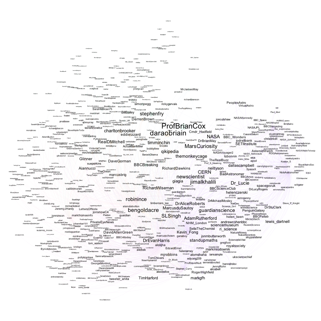
Another strong piece of TV commissioning via the Open University Open Media Unit (OMU) aired this week in the guide of The Challenger, a drama documentary telling the tale of Richard Feynman’s role in the accident enquiry around the space shuttle Challenger disaster. (OMU also produced an ethical game if you want to try you own hand out at leading an ethics investigation.)
Running a quick search for tweets containing the terms feynman challenger to generate a list of names of Twitter users commenting around the programme, I grabbed a sample of their friends (max 197 per person) and then plotted the commonly followed accounts within that sample.
If you treat this image as a map, you can see regions where the accounts are (broadly) related by topic or interest category. What regions can you see?! (For more on this technique, see Communities and Connections: Social Interest Mapping.)
I also ran a search for tweets containing bbc2 challenger:
Let’s peek in to some of the regions…”Space” related twitter accounts for example:
Or news media:
(from which we might conclude that the audience was also a Radio 4 audience?!;-)
How about a search on bbc2 feynman?
Again, we see distinct regions. As with the other maps, the programme audience also seems to have an interest in following popular science writers:
Interesting? Possibly – the maps provide a quick profile of the audience, and maybe confirm its the sort of audience we might have expected. Notable perhaps are the prominence of Brian Cox and Dara O’Briain, who’ve also featured heavily in BBC science programming. Around the edges, we also see what sorts of comedy or entertainment talent appear to the audience – no surprises to see David Mitchell, Charlton Brooker and Aianucci in there, though I wouldn’t necessarily have factored in Eddie Izzard (though we’d need to look at “proper” baseline interest levels of general audiences to see whether any of these comedians are over-represented in these samples compared to commonly followed folk in a “random” sample of UK TV watchers on Twitter. The patterns of following may be “generally true” rather than highlighting folk atypically followed by this audience.)
Useful? Who knows…?!
(I have PDF versions of the full plots if anyone wants copies…)
It seems that “key” to the Trinity Mirror initiative is the creation of a new “Shared Content Unit” based in Liverpool that will provide features content to Trinity’s papers across the UK [which] will produce material across the regional portfolio in print and online including travel, fashion, food, films, books and “other content areas that do not require a wholly local flavour”.
In my local rag last week, (the Isle of Wight County Press), a front page story on the Island’s gambling habit localised a national report by the Campaign for Fairer Gambling on Fixed Odds Betting Terminals. The report included a dataset (“To find the stats for your area download the spreadsheet here and click on the arrow in column E to search for your MP”) that I’m guessing (I haven’t checked…) provided some of the numerical facts in the story. (The Guardian Datastore also republished the data (£5bn gambled on Britain’s poorest high streets: see the data) with an additional column relating to “claimant count”, presumably the number of unemployment benefit claimants in each area (again, I haven’t checked…)) Localisation appeared in several senses:
So for example, the number of local betting shops and Fixed Odds betting terminals was identified, the mooted spend across those and the spend per head of population. Sensemaking of the figures was also applied by relating the spend to an equivalent number of NHS procedures or police jobs. (Things like the BBC Dimensions How Big Really provide one way of coming up with equivalent or corresponding quantities, at least in geographical area terms. (There is also a “How Many Really” visualisation for comparing populations.) Any other services out there like this? Maybe it’s possible to craft Wolfram Alpha queries to do this?)
Something else I spotted, via RBloggers, a post by Alex Singleton of the University of Liverpool: an Open Atlas around the 2011 Census for England and Wales, who has “been busy writing (and then running – around 4 days!) a set of R code that would map every Key Statistics variable for all local authority districts”. The result is a set of PDF docs for each Local Authority district mapping out each indicator. As well as publishing the separate PDFs, Alex has made the code available.
So what’s confluential about those?
The IWCP article localises the Fairer Gambling data in several ways:
– the extent of the “problem” in the local area, in terms of numbers of betting shops and terminals;
– a consideration of what the spend equates to on a per capita basis (the report might also have used a population of over 18s to work out the average “per adult islander”); note that there are also at least a couple of significant problems with calculating per capita averages in this example: first, the Island is a holiday destination, and the population swings over the summer months; secondly, do holidaymakers spend differently to residents on this machines?
– a corresponding quantity explanation that recasts the numbers into an equivalent spend on matters with relevant local interest.
The Census Atlas takes one recipe and uses it to create localised reports for each LA district. (I’m guessing with a quick tweak,separate reports could be generated for the different areas within a single Local Authority).
Trinity Mirror’s “Shared Content Unit” will produce content “that do[es] not require a wholly local flavour”, presumably syndicating it to its relevant outlets. But it’s not hard to also imagine a “Localisable Content” unit that develops applications that can help produced localised variants of “templated” stories produced centrally. This needn’t be quite as automated as the line taken by computational story generation outfits such as Narrative Science (for example, Can the Computers at Narrative Science Replace Paid Writers? or Can an Algorithm Write a Better News Story Than a Human Reporter?) but instead could produce a story outline or shell that can be localised.
A shorter term approach might be to centrally produce data driven applications that can be used to generate charts, for example, relevant to a locale in an appropriate style. So for example, using my current tool of choice for generating charts, R, we could generate something and then allow local press to grab data relevant to them and generate a chart in an appropriate style (for example, Style your R charts like the Economist, Tableau … or XKCD). This approach saves duplication of effort in getting the data, cleaning it, building basic analysis and chart tools around it, and so on, whilst allowing for local customisation in the data views presented. With the increasing number of workflows available around R, (for example, RPubs, knitr, github, and a new phase for the lab notebook, Create elegant, interactive presentations from R with Slidify, [Wordpress] Bloggin’ from R).
Using R frameworks such as Shiny, we can quickly build applications such as my example NHS Winter Sitrep data viewer (about) that explores how users may be able to generate chart reports at Trust or Strategic Health Authority level, and (if required) download data sets related to those areas alone for further analysis. The data is scraped and cleaned once, “centrally”, and common analyses and charts coded once, “centrally”, and can then be used to generate items at a local level.
The next step would be to create scripted story templates that allow journalists to pull in charts and data as required, and then add local colour – quotes from local representatives, corresponding quantities that are somehow meaningful. (I should try to build an example app from the Fairer Gaming data, maybe, and pick up on the Guardian idea of also adding in additional columns…again, something where the work can be done centrally, looking for meaningful datasets and combining it with the original data set.)
Business opportunities also arise outside media groups. For example, a similar service idea could be used to provide story templates – and pull-down local data – to hyperlocal blogs. Or a ‘data journalism wire service’ could develop applications either to aid in the creation of data supported stories on a particular topic. PR companies could do a similar thing (for example, appifying the Fairer Gambling data as I “appified” the NHS Winter sitrep data, maybe adding in data such as the actual location of fixed odds betting terminals. (On my to do list is packaging up the recently announced UCAS 2013 entries data.)).
The insight here is not to produce interactive data apps (aka “news applications”) for “readers” who have no idea how to use them or what read from them whatever stories they might tell; rather, the production of interactive applications for generating charts and data views that can be used by a “data” journalist. Rather than having a local journalist working with a local team of developers and designers to get a data flavoured story out, a central team produces a single application that local journalists can use to create a localised version of a particular story that has local meaning but at national scale.
Note that by concentrating specialisms in a central team, there may also be the opportunity to then start exploring the algorithmic annotation of local data records. It is worth noting that Narrative Science are already engaged in this sort activity too, as for example described in this ProPublica article on How To Edit 52,000 Stories at Once, a news application that includes “short narrative descriptions of almost all of the more than 52,000 schools in our database, generated algorithmically by Narrative Science”.
I don’t quite remember how I came across this now, but it seems the OU has an appstore, of a sort – appstore.open.ac.uk – that provides a one stop place on the web for downloading a range of OU produced iOS and Android apps:
These range from the sorts of app you might expect – the StudyAtOU app, for example, which gives a rather more browser-centric way of browsing the OU’s course offerings compared to the PDF re-presenting OU Prospectus app, or the OU News app – as well as a range of “feature” apps: PhotoFit Me, a photofit testing game, or Devolve Me, another photo based app that takes you back through your evolutionary history. In a family learning context, the Our Story app “enables young children to take part in fun games which can help develop interests and skills that will be relevant to them when they start to read” (or so the blurb says…), and the Chinese Characters First Steps app draws on the OU’s Beginner’s Chinese module to provide a simple trainer around common Chinese characters.
I haven’t tried looking at that URL on a mobile device (Android or iOS), so I’m not sure how responsive the design might be…? (I’d guess there isn’t a tablet look’n’feel design that is passed through…?)
Out of interest – do any other UK HEIs host their own “appstore”? (Links in the comments please…:-)
In other news, the OU has finally publicly launched the “collaborative online learning space” that is SocialLearn. You can try it out here… SocialLearn
Also last week, an Open University press release announced “Another innovation milestone: The Open University launches iBooks textbooks for iPad”. I thought this had happened some time ago, with the Moon Rocks iBook (First Open University iBook now in Store, 27th March 2012), but I guess this relates the first offering of a new collection?!
(Ooh.. that’s interesting: there’s a £4.99 price tag on those iBooks (I wonder if OU staff get a discount? Or whether there are discount codes available that can be used for promotional purposes?))
The titles so far appear to concentrate on science topics. The OU has a long history in producing high quality interactives/educational software (and what used to be called “computer based learning” applications) across a wide range of subject areas using licensed, as well as in-house created, content, so it’ll be interesting to see if any iBooks appear in the art history or classics area, for example.
(By the by, interactive textbooks/new pedagogy for e-books was one of the things highlighted in the Innovating Pedagogy report, although not in the context of the OU as a “commercial” educational publisher.)
In much the same way that BBC commercialised many of its offerings through BBC Worldwide, the OU also has a commercial arm – Open University Worldwide, a site that looks as if it is now hosted as an Amazon webstore:
This sells OU/BBC co-pro DVDs (at a higher price than on the main Amazon website, I notice?) as well as a range of other products, including software, print materials/study guides and home experiment kits (including the Arduino like Senseboard, due out early next year). I’m not sure if the way Apple locks down iContent means that the iBooks won’t be available on the Amazon powered OUW webstore?
The store seems to be missing a couple of tricks on the OU marketing front, though, such as areas featuring books by OU academics and books by OU alumni which I think the OU’s “physical” library folk track (i.e I think there are shelves for books by OU academics and OU students/alumni), even if they don’t post related lists of titles online anywhere? (I’m guessing the affiliate fees from any sales would be negligible…the point more is one of showcasing the range of OU family commercial cultural/content outputs.)
I suspect that the sale of books required for OU courses is not an option (because of other bookseller agreements, it wasn’t when I asked years ago when I was tinkering with the now completely broken course booksearch (the backend server has been taken down)…which in passing reminds me of what I think was the only entry to the JISC MOSAIC competition that didn’t receive a prize/honourable mention: books around courses.) As far as second-hand books go, there’s always the “unofficial” OU second-hand bookstore University Book Search.
Again, are there any other UK HEIs running Amazon webstores? I see from the Amazon “seller showcase” that the Ashmolean shop is at least one?
The mainstay of OUW operations is (I think) licensing of OU warez, course materials and courses to local partners. A recent job ad for a Business Development Manager (International Education Agents) suggests that there may be an international push coming on this front?
Open University Worldwide Ltd, which is part of the OU’s Business Development Unit, is looking to recruit a Business Development Manager (International Educational Agents). This post will be involved in supporting the OU to expand its international business through relationships with local agents or partners delivering OU qualifications to individual students and corporates in strategic markets.
You will develop and implement The Open University’s new business development strategy for global partnerships, specifically focussing on the recruitment, management and growth of a network of agents to take OU products and services to B2C and B2B markets internationally.
You will be required to grow and maintain sustainable business relationships with key decision makers in potential agent/partner organisations in selected markets, in order to market the OU offer and secure business opportunities
You will also work with external stakeholders in key international markets to secure relevant, accurate and timely market information. To identify, develop and close business opportunities to meet agreed financial targets.
PS Just as an aside, I wish the template for the OU appstore made use of name anchors so that I could link directly to the appropriate section within the page – something like appstore.open.ac.uk/#studyatou, for example; here’s what the item template currently looks like:
Chatting with KMi’s Mathieu d’Aquin a few days ago, he mentioned KMi were looking at ways of automating the creation of relevant semantic linkage that could be used to provide linkage between BBC programmes and OU content and maybe feed into the the BBC’s dynamic semantic publishing workflow.
In the context of OU and BBC programmes, one high level hook is the course code. Although I don’t think these feeds are widely promoted as a live service yet, I did see a preview(?) of an OU/BBC co-pro series feed that includes linkage options such as related course code (one only? Or does the schema allow for more than one linked course?) and OU nominated academic (one only? Or does the schema allow for more than one linked academic?More than one), as well as some subject terms and the sponsoring Faculty:
  <item>
    <title><![CDATA[OU on the BBC: Symphony]]></title>
    <link>http://www.open.edu/openlearn/whats-on/ou-on-the-bbc-history-the-symphony</link>
    <description><![CDATA[Explore the secrets of the symphony, the highest form of expression of Western classical music]]></description>
    <image title="The Berrill Building">http://www.open.edu/openlearn/files/ole/ole_images/general_images/ou_ats.jpg</image>
    <bbc_programme_page_code>b016vgw7</bbc_programme_page_code>
    <ou_faculty_reference>Music Department</ou_faculty_reference>
    <ou_course_code>A179</ou_course_code>
    <nominated_academic_oucu></nominated_academic_oucu>
    <transmissions>
        <transmission>
            <showdate>21:00:00 24/11/2011</showdate>
            <location><![CDATA[BBC Four]]></location>
            <weblink></weblink>
        </transmission>
        <transmission>
            <showdate>19:30:00 16/03/2012</showdate>
            <location><![CDATA[BBC Four]]></location>
            <weblink></weblink>
        </transmission>
        <transmission>
            <showdate>03:00:00 17/03/2012</showdate>
            <location><![CDATA[BBC Four]]></location>
            <weblink></weblink>
        </transmission>
        <transmission>
            <showdate>19:30:00 23/03/2012</showdate>
            <location><![CDATA[BBC Four]]></location>
            <weblink></weblink>
        </transmission>
        <transmission>
            <showdate>03:00:00 24/03/2012</showdate>
            <location><![CDATA[BBC Four]]></location>
            <weblink></weblink>
        </transmission>
    </transmissions>
     <comments>http://www.open.edu/openlearn/whats-on/ou-on-the-bbc-history-the-symphony#comments</comments>
 <category domain="http://www.open.edu/openlearn/whats-on">What's On</category>
 <category domain="http://www.open.edu/openlearn/tags/bbc-four">BBC Four</category>
 <category domain="http://www.open.edu/openlearn/tags/music">music</category>
 <category domain="http://www.open.edu/openlearn/tags/symphony">symphony</category>
 <pubDate>Tue, 18 Oct 2011 10:38:03 +0000</pubDate>
 <dc:creator>mc23488</dc:creator>
 <guid isPermaLink="false">147728 at http://www.open.edu/openlearn</guid>
  </item>
I’m not sure what the guid is? Nor do there seem to be slots for links to related OpenLearn resources other than the top link element? However, the course code does provide a way into course related educational resources via data.open.ac.uk, the nominated academic link may provide a route to associated research interests (for example, via ORO, the OU open research repository), the BBC programme code provides a route in to the BBC programme metadata, and the category tags may provide other linkage somewhere depending on what vocabulary gets used for specifying categories!
I guess I need to build myself a little demo to se what we can do with a fed of this sort..?!;-)
I’m not sure if plans are similarly afoot to publish BBC programme metadata actual the actual programme instance (“episode”) level? It’s good to see that the OpenLearn What’s On feed has been tidied up little to include title elements, although it’s still tricky to work out what the feed is actually of?
For example, here’s the feed I saw a few days ago:
<item>
<title><![CDATA[OU on the BBC: Divine Women - 9:00pm 25/04/2012 - BBC Two and BBC HD]]></title>
<link>http://www.open.edu/openlearn/whats-on/ou-on-the-bbc-divine-women</link>
<description><![CDATA[Historian Bettany Hughes reveals the hidden history of women in religion, from dominatrix goddesses to feisty political operators and warrior empresses ]]></description>
<location><![CDATA[BBC Two and BBC HD]]></location>
<image title="The Berrill Building">http://www.open.edu/openlearn/files/ole/ole_images/general_images/ou_ats.jpg</image>
<showdate>21:00:00 25/04/2012</showdate>
<pubDate>Tue, 24 Apr 2012 11:19:10 +0000</pubDate>
<dc:creator>sb26296</dc:creator>
<guid isPermaLink="false">151446 at http://www.open.edu/openlearn</guid>
</item>
It contains an upcoming show date for programmes that will be broadcast over the next week or so, and a link to a related page on OpenLearn for the episode, although no direct information about the BBC programme code for each item to be broadcast.
Mulling over the OU’s OULearn pages on Youtube a week or two ago, colleague Bernie Clark pointed out to me how the links from the OU clip descriptions could be rather hit or miss:
Via @lauradee, I see that the OU has a new offering on YouTube.com/edu is far more supportive of links to related content, links that can represent the start of a learning journey through OU educational – and commentary – content on the OU website.
Here’s a way in to the first bit of OU content that seems to have appeared:
This links through to a playlist page with a couple of different sorts of opportunity for linking to resources collated at the “Course materials” or “Lecture materials” level:
(The language gives something away, I think, about the expectation of what sort of content is likely to be uploaded here…)
So here, for example, are links at the level of the course/playlist:
And here are links associated with each lecture, erm, clip:
In this first example, several types of content are being linked to, although from the link itself it’s not immediately obvious what sort of resource a link points to? For example, some of the links lead through to course units on OpenLearn/Learning Zone:
Others link through to “articles” posted on the OpenLearn “news” site (I’m not ever really sure how to refer to that site, or the content posts that appear on it?)
The placing of content links into the Assignments and Others tabs always seems a little arbitrary to me from this single example, but I suspect that when a few more lists have been posted some sort of feeling about what sorts of resources should go where (i.e. what folk might expect by “Assignment” or “Other” resource links). If there’s enough traffic generated through these links, a bit of A/B testing might even be in order relating to the positioning of links within tabs and the behaviour of students once they click through (assuming you can track which link they clicked through, of course…)?
The transcript link is unambiguous though! And, in this case at least), resolves to a PDF hosted somewhere on the OU podcasts/media filestore:
(I’m not sure if caption files are also available?)
Anyway – it’ll be interesting to hear back about whether this enriched linking experience drives more traffic to the OpenLearn resources, as well as whether the positioning of links in the different tab areas has any effect on engagement with materials following a click…
And as far as the linkage itself goes, I’m wondering: how are the links to OpenLearn course units and articles generated/identified, and are those links captured in one of the data.open.ac.uk stores? Or is the process that manages what resource links get associated with lists and list items on Youtube/edu one that doesn’t leave (or readily support the automated creation of) public data traces?
PS How much (if any( of the linked resource goodness is grabbable via the Youtube API, I wonder? If anyone finds out before me, please post details in the comments below:-)