Google Translate Equilibrium Finder and Google Books Ngrams

A few days ago, in the post Translate to Google Statistical (“Google Standard”?!) English?, Iwondered whether there were any apps that looked for convergence of phrases going from one language, to another, and back again until a limit was reached. A comment from Erik at digitalmethods.net posted a link to Translation Party, a single web page app that looks for limit cycles between English and Japanese (as a default).

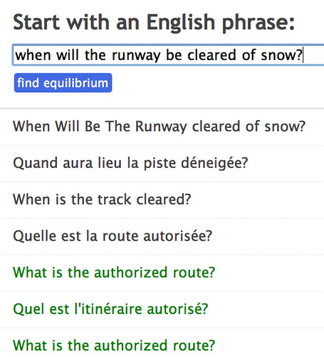
Having a look at the source, it seems there’s a switch to let you search for limits between English and other languages too, as the following screenshot shows:

Translation Party - Google trasnlation limit finder http://www.translationparty.com/?lang=fr

(Though I have to admit I don’t fully understand why the phrase in the above example appears to map to two different French translations?!)

Here’s another – timely – example, showing the dangers of this iterative approach to translation…

Translationparty.com

The switch is the URL argument lang=LANGUAGE_CODE, so for example, the French translation can be cued using http://www.translationparty.com/?lang=fr.

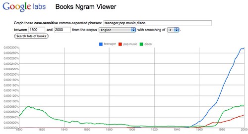
Another fun toy for the holiday break is the Google Books Ngrams trends viewer, that plots the occurrence of searched for phrases across a sample of books scanned as part of the Google Books project.

http://ngrams.googlelabs.com/graph?content=philosophy,religion,science&year_start=1800&year_end=2000&corpus=0&smoothing=3

Here’s another one:

http://ngrams.googlelabs.com/graph?content=teenager,pop+music,disco&year_start=1800&year_end=2000&corpus=0&smoothing=3

This is reminiscent of other trendspotting tools such as Google Trends (time series trends in Google search), or Trendistic ((time series trends in Twitter), which long-time readers may recall I’ve posted about before. (See also: Trendspotting, the webrhythms hashtag archive.)

My Understanding of SPARQL, the First Attempt…

(This one’s for Mike…) [Disclaimer: some or all of this post may be wrong…;-)]

So (and that was for Niall)… so: here’s what I think I know about SPARQL; or at least, here’s what I think I know about SPARQL and what I think is all you need to know to get started with SPARQL

SPARQL is a query language that can interrogate an RDF triple store.

An RDF triple store contains facts as 3 parts of a whole:

<knownThing1> <hasKnownAttribute> <knownThing2>
<knownThing1> <hasKnownRelationshipWith> <knownThing3>

That’s it, part one…

Let’s imagine a very small triple store that contains the following facts:

<Socrates> <existsAs> <aMan>
<Plato> <existsAs> <aMan>
<Zeus> <existsAs> <aGod>
<aGod> <hasLife> <Immortal>
<aMan> <hasLife> <Mortal>
<Socrates> <isTeacherOf> <Plato>

We can ask the following sorts of questions of this database, using the SPARQL query language (or should that be: using the SPAR Query Language?!)

Who is <aGod>?
select ?who where {
?who <existsAs> <aGod>
}

This should return: <Zeus>

Who is <aMan>?
select ?who where {
?who <existsAs> <aMan>
}

This should return: <Socrates>, <Plato>.

What sort of existence does <Zeus> have?
select ?existence where {
<Zeus> <existsAs> ?existence.
}

This should return: <aGod>.

What sort of life does <aMan> have?
select ?life where {
<aMan> <hasLife> ?life.
}

This should return: <Mortal>.

We only know that <Zeus> exists, but what sort of life does he have?
select ?life where {
<Zeus> <existsAs> ?dummyVar.
?dummyVar <hasLife> ?life.
}

This should return: <Immortal>.

Note that the full stop in the query is important. It means “AND”. [UPDATE: LD folk have taken issue with me saying the dot represents AND. See comment below for my take on this…]

We don’t know much, other than things exist and they have some sort of life: but who has what sort of life?
select ?who ?life where {
?who <existsAs> ?dummyVar.
?dummyVar <hasLife> ?life.
}

This should return: (<Socrates> <Mortal>),(<Plato> <Mortal>),(<Zeus> <Immortal>).

We know <Socrates>, but little more: what is there to know about him?
select ?does ?what where {
<Socrates> ?does ?what.
}

This should return: (<existsAs> <aMan>),(<isTeacherOf> <Plato>).

I think… If someone wants to set up a small triple store to try this out on, that would be handy…

If I’ve gone wrong somewhere, please let me know… (I’m writing this because I canlt sleep!)

If I haven’t gone wrong – that’s a relief… and furthermore: that is all I think you need to know to get started… (Just bear in mind that in real triple stores and queries, the syntactic clutter is a nightmare and is there solely to confuse you and scare you away…;-)

PS @cgutteridge’s Searching a SPARQL Endpoint demonstrates a useful ‘get you started’ query for exploring a real datastore (look for something by name, his example being a search over the Ordnance Survey triple store for things relating to ‘Ventnor’).

It’s All About Flow…

One of the compelling features of Yahoo Pipes for me is the way the the user interface encourages you think of programming in terms of pipelines and feeds, in which a bundle of stuff (RSS feed, CSV data, or whatever) is processed in a sequence of steps (the pipeline), with each step being applied to each item in the feed.

A few days ago I blogged about pipe2py, a toolkit from Greg Gaughan that lets you “compile” a simple Yahoo pipe into a Python code equivalent programme (Yahoo Pipes Code Generator (Python)). Given that, in general, I don’t believe the “build it and they will come” mantra, I spent half an hour or so this morning looking round the web for people who had posted queries about how to generate code equivalents of Yahoo Pipes, so that I could point them to pipe2py.

In doing so, I came across a couple of other visual pipeline environments that are maybe worth looking at in a little more detail.

PyF is a “[flow based] open source Python programming framework and platform dedicated to large data processing, mining, transforming, reporting and more.”

PyF - flow based pythin programming

On the other hand, Orange claims to offer “[o]pen source data visualization and analysis for novice and experts. Data mining through visual programming or Python scripting. Components for machine learning. Extensions for bioinformatics and text mining. Packed with features for data analytics.”

Here’s one of their promo shots:

Orange - piped visual data analysis

I haven’t had a chance to play with either of these environments – and probably won’t for a little time yet – so whilst I feel like I’m cheating by posting about them in such a cursory way without having even a simple demo to show, they’re maybe of interest to anyone who stumbles across this blog by way of pipe2py… [Update: my Orange Visualisation tool review).]

PS as well as PyF, see also: Pypes [via @dartdog]

Crowd Sourcing a Promotion Case…

So racked with embarrassment at doing this (’tis what happens when you don’t publish formally, don’t get academic citations in the literature, and don’t have a “proper” academic impact factor;-) I’m going to take the next 10 days off in a place with no internet connection…. but anyway, here goes: an attempt at crowd-sourcing parts of my promotion case….

Fragments – Open Access Journal Data

Some time ago, I put together a recipe for watching over recent contents lists from a set of journals listed in a reading list (Mashlib Pipes Tutorial: Reading List Inspired Journal Watchlists). But what if we wanted to maintain a watchlist over content that is published in just open access journals?

Unfortunately, it seems that TicTocs (and the API version (I think), JournalTOCs, don’t include metadata that identifies whether or not a journal is open access. A quick scout around, as well as a request to the twitter lazyweb, turned up a few resources that might contribute to a service that, if nothing else, returns a simplistic “yes/no” response to the query “is the journal with this ISSN an open access journal?”

– a list of journals in TicTocs (CSV);
– a list of open access journals listed in DOAJ (csv);
SHERPA/RoMEO API (look up open access related metadata for journals?)

So – as a placeholder for myself: think about some sort of hack to annotate and filter TicTocs/JournalTOCs results based on open access licensing conditions

Following a quick bounce around of ideas with @kavubob on Twitter, what else might this be used for? Ranking journals based on extent to which articles cite articles from open access journals, or ones that support some sort of open access publication?

Also – is it easy enough to find citation data at gross level – eg number of citations from one journal to other journals over a period of time? Colour nodes by whether they are OA or note, size/weight of edges between journal nodes to show number of references from one journal to another? Maybe normalise edge weight as percentage of citations from one journal to another and size nodes by number of references/citations?

Quick Viz – Australian Grand Prix

I seem to have no free time to do anything this week, or next, or the week after, so this is just a another placeholder – a couple of quick views over some of Hamilton’s telemetry from the Australian Grand Prix.

First, a quick Google Earth to check the geodata looks okay – the number labels on the pins show the gear the car is in:

Next, a quick look over the telemetry video (hopefully I’ll have managed to animate this properly for the next race…)

And finally, a Google map shows the locations where the pBrakeF (brake pedal force?) is greater than 10 %.

Oh to have some time to play with this more fully…;-)

PS for alternative views over the data, check out my other F1 telemetry data visualisations.

Mulling Over What to Do Next on the F1 Race Day Strategist

It’s F1 race weekend again, so I’m back pondering what to do next on my F1 Race Day Strategist spreadsheets. Coming across an article on (BBC F1’s fuel-adjusted Monaco GP grid), I guess one thing I could do is look to try and model the fuel adjusted grid for each race. That post also identifies the speed penalty per kg (“each kilo of fuel slows it down by about 0.025 seconds”) so I need to factor that in too, somehow, into a laptime predictor spreadsheet, maybe?

Note that I didn’t really see many patterns in lap time changes when I tried to plot them previously (A Few More Tweaks to the Pit Stop Strategist Spreadsheet) so maybe the time gained by losing weight is offset by decreasing tyre performance?

One thing the spreadsheet has (badly) assumed to data was a fuel density of 1 kg/l. Checking the F1 2009 technical specification, the actual density can range between 0.72 and 0.775 kg/l (regulation 19.3), so relating fuel timings (l/s), lap distances/fuel efficiencies (km/l), and car starting weight (kg) means that the density measures need taking into account.

Unfortunately, I factored density into some of the formulae but not others, so the spreadsheets could take some picking apart trying to take density into account to keep the different calculations consistent. Hmm, maybe I should start a new spreadsheet from scratch to work out fuel adjusted grid positions, and then use the basic elements from that spreadsheet as the base elements for the other spreadsheets?

Something else that I need to start considering, particularly given that there won’t be any race day refuelling next year, is tyre performance (note to self: track temperature is important here). A quick scout around didn’t turn up any useful charts (I was using words like “model”, “tyre”, “performance”, “timing” and “envelope”) but what I think I want is a simple, first approximation model of tyres that models time “penalties” and “bonuses” about an arbitrary point, over number of laps, and as a function of track temperature.

For the spreadsheet, I’m thinking something like an “attack decay” or attack-decay-sustain-release (ADSR) envelope (something I came across originally in the context of sound synthesis many years ago…)

On the x-axis, I’m guessing I want laps, on the y-axis, a modifier to lap time (in seconds) relative to some nominal ideal lap time. The model should describe the number of laps it takes for the tyres to come on (a decreasing modifier to the point at which the tyres are working optimally), followed by an increasing penalty modifier as they go off.

Ho hum, quali over, so I’ve run out of time to actually do anything about any of this now… maybe tomorrow…?

Subscriptions Not Courses? Idling Around Lifelong Learning

As yet more tales of woe appear around failing business models (it’s not just the newspapers that are struggling: it appears Youtube is onto a loser too…), I thought I’d take a coffee break out of course writing to jot down a cynical thought or two about lifelong learning

…because along with the widening participation agenda and blah, blah, blah, blah, lifelong learning is one of those things that we hear about every so often as being key to something or other.

Now I’d probably consider myself to be a lifelong learner: it’s been a good few years since I took a formal course, and yet every day I try to learn how to do something I didn’t know how to do when I got up that morning; and I try to be open to new academic ideas too (sometimes…;-)

But who, I wonder, is supposed to be delivering this lifelong learning stuff, whatever it is? Because there’s money to be made, surely? If lifelong learning is something that people are going to buy into, then who owns, or is trying to grab that business? Just imagine it: having acquired a punter, you may have them for thirty, forty, fifty years?

I guess class of major providers are the professional institutions? You give them an annual fee, and by osmosis you keep your credentials current (you can trust me, I’m a chartered widget fixer, etc.).

So here’s my plan: offering students an undergrad first degree is the loss leader. Just like the banks (used to?) give away loads of freebies to students in freshers week, knowing that if they took out an account they’d both run up a short term profitable debt, and then start to bring in a decent salary (allegedly), in all likelihood staying with the same bank for a lifetime, so too could the universities see 3 years of undergrad degree as the recruitment period for a beautiful lifetime relationship.

Because alumni aren’t just a source of funds once a year and when the bequest is due…

Instead, imagine this: when you start your degree, you sign up to the 100 quid a year subscription plan (maybe with subscription waiver while you’re still an undergrad). When you leave, you get a monthly degree top-up. Nothing too onerous, just a current awareness news bundle made up from content related to the undergrad courses you took. This content could be produced as a side effect of keeping currently taught courses current: as a lecturer updates their notes from one year to the next, the new slide becomes the basis for the top-up news item. Or you just tag each course, and then pass on a news story or two discovered using that tag (Martin, you wanted a use for the Guardian API?!;-)

Having the subscription in place means you get 100 quid a year per alumni, without having to do too much at all…and as I suspect we all know, and maybe most of us bear testament to, once the direct debit is in place, there can be quite a lot of inertia involved in stopping it…

But there’s more – because you also have an agreement with the alumni to send them stuff once a month (and as a result maybe keep the alumni contacts database up to date a little more reliably?). Like the top-up content that is keeping their degree current (err….? yeah, right…)…

…and adverts… adverts for proper top-up/CPD courses, maybe, that they can pay to take…

…or maybe they can get these CPD courses for “free” with the 1000 quid a year, all you can learn from, top-up your degree content plan (access to subscription content and library services extra…)

Or how about premium “perpetual degree” plans, that get you a monthly degree top-up and the right to attend one workshop a year “for free” (with extra workshops available at cost, plus overheads;-)

It never ceases to amaze me that we don’t see degrees as the start of continual process of professional education. Instead, we produce clumpy, clunky courses that are almost necessarily studied out of context (in part because they require you take out 100 hours, or 150 hours, or 300 hours) of study. Rather than give everyone drip feed CPD for an hour or two a week, or ten to twenty minutes a day, daily feed learning style, we try to flog them courses at Masters level, maybe, several years after they graduate…

In my vision of the world, we’d dump the courses, and all subscribe to an appropriate daily learning feed… ;-)

Maybe…

END: coffee break…

PS see also: New flexible degrees the key to growth in higher education:

The future higher education system will need to ensure greater diversity of methods of study, as well as of qualifications. Long-term trends suggest that part-time study will continue to rise, and it’s difficult to see how we can increase the supply of graduates as we must without an increase in part-time study.

“But we will surely need to move decisively away from the assumption that a part-time degree is a full time degree done in bits. I don’t have any doubt that the degree will remain the core outcome. But the trend to more flexible ways of learning will bring irresistible pressure for the development of credits which carry value in their own right, for the acceptance of credits by other institutions, and for the ability to complete a degree through study at more than one institution.”

… or so says John Denham…

Interactive Photos from Obama’s Inauguration

Now the dust has settled from last week’s US Presidential inauguration, I thought I’d have a look around for interactive photo exhibits that recorded the event. (I’ll maintain a list here if and when I find anything else to add.)

So here’s what I found…

Time Lapse photo (Washington Post)

Satellite Image of the National Mall (Washington Post)

A half-metre resolution satellite image over Washington taken around the time of the inauguration.

You can also see this GeoEye image in Google Earth.

Gigapixel Photo of the Inauguration (David Bergman)

Read more about how this photo was taken here: How I Made a 1,474-Megapixel Photo During President Obama’s Inaugural Address.

Interactive Panorama From the Crowds (New York Times)

PhotoSynth collage (CNN)

I suppose the next thing to consider is this: what sort of mashup is possible using these different sources?!;-)

[PS If you find any more interactive photo exhibits with a similar grandeur of scale, please add a link in a comment to this post:-)]

Speedmash and Mashalong

Last week I attended the very enjoyable Mashed Library event, which was pulled together by Owen Stephens (review here).

My own contribution was in part a follow on to the APIs session I attended at CETIS08 – a quick demo of how to use Yahoo Pipes and Google spreadsheets as rapid mashing tools. I had intended to script what I was going to do quite carefully, but an extended dinner at Sagar (which I can heartily recommend:-) put paid to that, and the “script” I did put together just got left by the wayside…

However, I’ve started thinking that a proper demo session, lasting one to two hours, with 2-4 hrs playtime to follow, might be a Good Thing to do… (The timings would make for either a half day or full day session, with breaks etc.)

So just to scribble down a few thoughts and neologisms that cropped up last week, here’s what such an event might involve, drawing on cookery programmes to help guide the format:

Owen’s observation that the flavour of the Mashed Library hackathon was heavily influenced by the “presentations” was well made; and maybe why it’s worth trying to build a programme around pushing a certain small set of tools and APIs, effectively offering “micro-training” in them to start with, and then exploring their potential use in the hands-on sessions, makes sense? It might also mean we could get the tools’n’API providers to offer a bit of sponsorship, e.g. in terms of covering the catering costs?

So, whaddya think? Worth a try in the New Year? If you think it might work, prove your commitment by coming up with a T-shirt design for the event, were it to take place ;-)

PS hmm, all these cookery references remind me of the How Do I Cook? custom search engine. Have you tried searching it yet?

PPS I guess I should also point out the JISC Developer Happiness Days event that is booked for early next year. Have you signed up yet?;-)