Getting Started With Twitter Analysis in R

Earlier today, I saw a post vis the aggregating R-Bloggers service a post on Using Text Mining to Find Out What @RDataMining Tweets are About. The post provides a walktrhough of how to grab tweets into an R session using the twitteR library, and then do some text mining on it.

I’ve been meaning to have a look at pulling Twitter bits into R for some time, so I couldn’t but have a quick play…

Starting from @RDataMiner’s lead, here’s what I did… (Notes: I use R in an R-Studio context. If you follow through the example and a library appears to be missing, from the Packages tab search for the missing library and import it, then try to reload the library in the script. The # denotes a commented out line.)

require(twitteR)
#The original example used the twitteR library to pull in a user stream
#rdmTweets <- userTimeline("psychemedia", n=100)
#Instead, I'm going to pull in a search around a hashtag.
rdmTweets <- searchTwitter('#mozfest', n=500)
# Note that the Twitter search API only goes back 1500 tweets (I think?)

#Create a dataframe based around the results
df <- do.call("rbind", lapply(rdmTweets, as.data.frame))
#Here are the columns
names(df)
#And some example content
head(df,3)

So what can we do out of the can? One thing is look to see who was tweeting most in the sample we collected:

counts=table(df$screenName)
barplot(counts)

# Let's do something hacky:
# Limit the data set to show only folk who tweeted twice or more in the sample
cc=subset(counts,counts>1)
barplot(cc,las=2,cex.names =0.3)

Now let’s have a go at parsing some tweets, pulling out the names of folk who have been retweeted or who have had a tweet sent to them:

#Whilst tinkering, I came across some errors that seemed
# to be caused by unusual character sets
#Here's a hacky defence that seemed to work...
df$text=sapply(df$text,function(row) iconv(row,to='UTF-8'))

#A helper function to remove @ symbols from user names...
trim <- function (x) sub('@','',x)

#A couple of tweet parsing functions that add columns to the dataframe
#We'll be needing this, I think?
library(stringr)
#Pull out who a message is to
df$to=sapply(df$text,function(tweet) str_extract(tweet,"^(@[[:alnum:]_]*)"))
df$to=sapply(df$to,function(name) trim(name))

#And here's a way of grabbing who's been RT'd
df$rt=sapply(df$text,function(tweet) trim(str_match(tweet,"^RT (@[[:alnum:]_]*)")[2]))

So for example, now we can plot a chart showing how often a particular person was RT’d in our sample. Let’s use ggplot2 this time…

require(ggplot2)
ggplot()+geom_bar(aes(x=na.omit(df$rt)))+opts(axis.text.x=theme_text(angle=-90,size=6))+xlab(NULL)

Okay – enough for now… if you’re tempted to have a play yourself, please post any other avenues you explored with in a comment, or in your own post with a link in my comments;-)

Accessing and Visualising Sentencing Data for Local Courts

A recent provisional data release from the Ministry of Justice contains sentencing data from English(?) courts, at the offence level, for the period July 2010-June 2011: “Published for the first time every sentence handed down at each court in the country between July 2010 and June 2011, along with the age and ethnicity of each offender.” Criminal Justice Statistics in England and Wales [data]

In this post, I’ll describe a couple of ways of working with the data to produce some simple graphical summaries of the data using Google Fusion Tables and R…

…but first, a couple of observations:

– the web page subheading is “Quarterly update of statistics on criminal offences dealt with by the criminal justice system in England and Wales.”, but the sidebar includes the link to the 12 month set of sentencing data;
– the URL of the sentencing data is http://www.justice.gov.uk/downloads/publications/statistics-and-data/criminal-justice-stats/recordlevel.zip, which does not contain a time reference, although the data is time bound. What URL will be used if data for the period 7/11-6/12 is released in the same way next year?

The data is presented as a zipped CSV file, 5.4MB in the zipped form, and 134.1MB in the unzipped form.

The unzipped CSV file is too large to upload to a Google Spreadsheet or a Google Fusion Table, which are two of the tools I use for treating large CSV files as a database, so here are a couple of ways of getting in to the data using tools I have to hand…

Unix Command Line Tools

I’m on a Mac, so like Linux users I have ready access to a Console and several common unix commandline tools that are ideally suited to wrangling text files (on Windows, I suspect you need to install something like Cygwin; a search for windows unix utilities should turn up other alternatives too).

In Playing With Large (ish) CSV Files, and Using Them as a Database from the Command Line: EDINA OpenURL Logs and Postcards from a Text Processing Excursion I give a couple of examples of how to get started with some of the Unix utilities, which we can crib from in this case. So for example, after unzipping the recordlevel.csv document I can look at the first 10 rows by opening a console window, changing directory to the directory the file is in, and running the following command:

head recordlevel.csv

Or I can pull out rows that contain a reference to the Isle of Wight using something like this command:

grep -i wight recordlevel.csv > recordsContainingWight.csv

(The -i reads: “ignoring case”; grep is a command that identifies rows contain the search term (wight in this case). The > recordsContainingWight.csv says “send the result to the file recordsContainingWight.csv” )

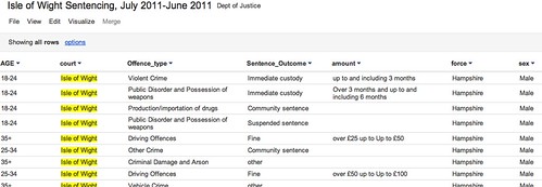
Having extracted rows that contain a reference to the Isle of Wight into a new file, I can upload this smaller file to a Google Spreadsheet, or as Google Fusion Table such as this one: Isle of Wight Sentencing Fusion table.

Isle fo wight sentencing data

Once in the fusion table, we can start to explore the data. So for example, we can aggregate the data around different values in a given column and then visualise the result (aggregate and filter options are available from the View menu; visualisation types are available from the Visualize menu):

Visualising data in google fusion tables

We can also introduce filters to allow use to explore subsets of the data. For example, here are the offences committed by females aged 35+:

Data exploration in Google FUsion tables

Looking at data from a single court may be of passing local interest, but the real data journalism is more likely to be focussed around finding mismatches between sentencing behaviour across different courts. (Hmm, unless we can get data on who passed sentences at a local level, and look to see if there are differences there?) That said, at a local level we could try to look for outliers maybe? As far as making comparisons go, we do have Court and Force columns, so it would be possible to compare Force against force and within a Force area, Court with Court?

R/RStudio

If you really want to start working the data, then R may be the way to go… I use RStudio to work with R, so it’s a simple matter to just import the whole of the reportlevel.csv dataset.

Once the data is loaded in, I can use a regular expression to pull out the subset of the data corresponding once again to sentencing on the Isle of Wight (i apply the regular expression to the contents of the court column:

recordlevel <- read.csv("~/data/recordlevel.csv")
iw=subset(recordlevel,grepl("wight",court,ignore.case=TRUE))

We can then start to produce simple statistical charts based on the data. For example, a bar plot of the sentencing numbers by age group:

age=table(iw$AGE)
barplot(age, main="IW: Sentencing by Age", xlab="Age Range")

R - bar plot

We can also start to look at combinations of factors. For example, how do offence types vary with age?

ageOffence=table(iw$AGE, iw$Offence_type)
barplot(ageOffence,beside=T,las=3,cex.names=0.5,main="Isle of Wight Sentences", xlab=NULL, legend = rownames(ageOffence))

R barplot - offences on IW

If we remove the beside=T argument, we can produce a stacked bar chart:

barplot(ageOffence,las=3,cex.names=0.5,main="Isle of Wight Sentences", xlab=NULL, legend = rownames(ageOffence))

R - stacked bar chart

If we import the ggplot2 library, we have even more flexibility over the presentation of the graph, as well as what we can do with this sort of chart type. So for example, here’s a simple plot of the number of offences per offence type:

require(ggplot2)
#You may need to install ggplot2 as a library if it isn't already installed
ggplot(iw, aes(factor(Offence_type)))+ geom_bar() + opts(axis.text.x=theme_text(angle=-90))+xlab('Offence Type')

GGPlot2 in R

Alternatively, we can break down offence types by age:

ggplot(iw, aes(AGE))+ geom_bar() +facet_wrap(~Offence_type)

ggplot facet barplot

We can bring a bit of colour into a stacked plot that also displays the gender split on each offence:

ggplot(iw, aes(AGE,fill=sex))+geom_bar() +facet_wrap(~Offence_type)

ggplot with stacked factor

One thing I’m not sure how to do is rip the data apart in a ggplot context so that we can display percentage breakdowns, so we could compare the percentage breakdown by offence type on sentences awarded to males vs. females, for example? If you do know how to do that, please post a comment below ;-)

PS HEre’s an easy way of getting started with ggplot… use the online hosted version at http://www.yeroon.net/ggplot2/ using this data set: wightCrimRecords.csv; download the file to your computer then upload it as shown below:

yeroon.net/ggplot2

PPS I got a little way towards identifying percentage breakdowns using a crib from here. The following command:
iwp=tapply(iw$Offence_type,iw$sex,function(x){prop.table(table(x))})
generates a (multidimensional) array for the responseVar (Offence) about the groupVar (sex). I don’t know how to generate a single data frame from this, but we can create separate ones for each sex as follows:
iwpMale=data.frame(iwp['Male'])
iwpFemale=data.frame(iwp['Female'])

We can then plot these percentages using constructions of the form:
ggplot(iwp2)+geom_bar(aes(x=Male.x,y=Male.Freq))
What I haven’t worked out how to do is elegantly map from the multidimensional array to a single data.frame? If you know how, please add a comment below…(I also posted a question on Cross Validated, the stats bit of Stack Exchange…)

More Dabblings With Local Sentencing Data

In Accessing and Visualising Sentencing Data for Local Courts I posted a couple of quick ways in to playing with Ministry of Justice sentencing data for the period July 2010-June 2011 at the local court level. At the end of the post, I wondered about how to wrangle the data in R so that I could look at percentage-wise comparisons between different factors (Age, gender) and offence type and mentioned that I’d posted a related question to to the Cross Validated/Stats Exchange site (Casting multidimensional data in R into a data frame).

Courtesy of Chase, I have an answer:-) So let’s see how it plays out…

To start, let’s just load the Isle of Wight court sentencing data into RStudio:

require(ggplot2)
require(reshape2)
iw = read.csv("http://dl.dropbox.com/u/1156404/wightCrimRecords.csv")

Now we’re going to shape the data so that we can plot the percentage of each offence type by gender (limited to Male and Female options):

iw.m = melt(iw, id.vars = "sex", measure.vars = "Offence_type")
iw.sex = ddply(iw.m, "sex", function(x) as.data.frame(prop.table(table(x$value))))
ggplot(subset(iw.sex,sex=='Female'|sex=='Male')) + geom_bar(aes(x=Var1,y=Freq)) + facet_wrap(~sex)+ opts(axis.text.x=theme_text(angle=-90)) + xlab('Offence Type')

Here’s the result:

Splitting down offences by percentage and gender

We can also process the data over a couple of variables. So for example, we can look to see how female recorded sentences break down by offence type and age range, displaying the results as a percentage of how often each offence type on its own was recorded by age:

iw.m2 = melt(iw, id.vars = c("sex","Offence_type" ), measure.vars = "AGE")
iw.off=ddply(iw.m2, c("sex","Offence_type"), function(x) as.data.frame(prop.table(table(x$value))))

ggplot(subset(iw.off,sex=='Female')) + geom_bar(aes(x=Var1,y=Freq)) + facet_wrap(~Offence_type) + opts(axis.text.x=theme_text(angle=-90)) + xlab('Age Range (Female)')

Offence type broken down by age and gender

Note that this graphic may actually be a little misleading because percentage based reports donlt play well with small numbers…: whilst there are multiple Driving Offences recorded, there are only two Burglaries, so the statistical distribution of convicted female burglars is based over a population of size two… A count would be a better way of showing this

PS I was hoping to be able to just transmute the variables and generate a raft of other charts, but I seem to be getting an error, maybe because some rows are missing? So: anyone know where I’m supposed to post R library bug reports?

Rescuing Twapperkeeper Archives Before They Vanish

A couple of years or so ago, various JISC folk picked up on the idea that there might be value in them thar tweets and started encouraging the use of Twapperkeeper for archiving hashtagged tweets around events, supporting the development of that service in exchange for an open source version of the code. Since then, Twapperkeeper has been sold on, with news out this week that the current Twapperkeeper archives will be deleted early in the New Year.

Over on the MASHE blog (one of the few blogs in my feeds that just keeps on delivering…), Martin Hawksey has popped up a Twapperkeeper archive importer for Google Spreadsheets that will grab up to 15,000 tweets from a Twapperkeeper archive and store them in a Google Spreadsheet (from where I’m sure you’ll be able to tap in to some of Martin’s extraordinary Twitter analysis and visualisation tools, as well as exporting Tweets to NodeXL (I think?!)).

The great thing about Martin’s “Twapperkeeper Rescue Tool” (?!;-) is that archived Tweets are hosted online, which makes them accessible for web based hacks if you have the Spreadsheet key. But which archives need rescuing? One approach might be to look to see what archives have been viewed using @andypowe11’s Summarizr? I don’t know if Andy has kept logs of which tag archives folk have analysed using Summarizr, but these may be worth grabbing? I don’t know if JISC has a list of hashtags from events they want to continue to archive? (Presumably a @briankelly risk assessment goes into this somewhere? By the by, I wonder in light of the Twapperkeeper timeline whether Brian would now feel the need to change any risk analysis he might have posted previously advocating the use of a service like Twapperkeeper?)

A more selfish approach might be to grab one or more Twapperkeeper archives onto your own computer. Grab your TwapperKeeper Archive before Shutdown! describes how to use R to do this, and is claimed to work for rescues of up to 50,000 tweets from any one archive.

Building on the R code from that example, along with a couple of routines from my own previous R’n’Twitter experiments (Getting Started With Twitter Analysis in R), here’s some R code that will grab items from a Twapperkeeper archive and parse them into a dataframe that also includes Twitter IDs, sender, to and RT information:

**NOTE – IN TESTING, THIS CODE HAS CHOKED FOR MORE ON CERTIN ARCHIVES (CHARACTER ENCODINGS IN SOME ARCHIVES BREAKING THINGS ON IMPORT) – FOR UPDATED CODE, SEE THE REDUX POST

require(XML)
require(stringr)

#A helper function to remove @ symbols from user names...
trim <- function (x) sub('@','',x)

twapperkeeperRescue=function(hashtag){
    #startCrib: http://libreas.wordpress.com/2011/12/09/twapperkeeper/
    url <- paste("http://twapperkeeper.com/rss.php?type=hashtag&name=",hashtag,"&l=50000", sep="")
    doc <- xmlTreeParse(url,useInternal=T)
    tweet <- xpathSApply(doc, "//item//title", xmlValue)  
    pubDate <- xpathSApply(doc, "//item//pubDate", xmlValue)
    #endCrib
    df=data.frame(cbind(tweet,pubDate))
    df$from=sapply(df$tweet,function(tweet) str_extract(tweet,"^([[:alnum:]_]*)"))
    df$id=sapply(df$tweet,function(tweet) str_extract(tweet,"[[:digit:]/s]*$"))
    df$txt=sapply(df$tweet,function(tweet) str_trim(str_replace(str_sub(str_replace(tweet,'- tweet id [[:digit:]/s]*$',''),end=-35),"^([[:alnum:]_]*:)",'')))
    df$to=sapply(df$txt,function(tweet) trim(str_extract(tweet,"^(@[[:alnum:]_]*)")))
    df$rt=sapply(df$txt,function(tweet) trim(str_match(tweet,"^RT (@[[:alnum:]_]*)")[2]))
    return(df)
}
#usage: 
#tag='ukdiscovery'
#twarchive.df=twapperkeeperRescue(tag)

#if you want to save the parsed archive:
twapperkeeperSave=function(hashtag,path='./'){
    tweet.df=twapperkeeperRescue(hashtag)
    fn <- paste(path,"twArchive_",hashtag,".csv")
    write.csv(tweet.df,fn)
}
#usage:
#twapperkeeperSave(tag)

If I get a chance, I’ll try to post some visualisation/analysis functions too…

PS I also doodled a Python script to download (even large) Twapperkeeper archives, by user

Rescuing Twapperkeeper Archives Before They Vanish, Redux

In Rescuing Twapperkeeper Archives Before They Vanish, I described a routine for grabbing Twapperkeeper archives, parsing them, and saving them to a local desktop file using the R programming language (downloading RStudio is the easiest way I know of getting R…).

Following a post fron @briankelly (Responding to the Forthcoming Demise of TwapperKeeper), where Brian described how to lookup all the archives saved by a person on Twapperkeeper and using that as a basis for an archive rescue strategy, I thought I’d tweak my code to grab all the hashtag archives for a particular user (other archives are also available, search as search term archives; I don’t grab the list of these… IF you fancy generalising the code, please post a link to it in the comments;-)

What should have been a trivial task didn’t work, of course: the R XML parser seemed to choke on some of the archive files claiming they weren’t the claimed UTF-8 encoding. Character encodings are still something that I don’t understand at all (and more than a few times have caused me to give up on a hack), but on the offchance, I tried using a more resilient file loader (curl, if that means anything to you…;-) rather than the XML package loader, and it seems to do the trick (warnings are still raised, but that’s an improvement on errors, that tend cause everything to stop).

Anyway, here’s the revised code, along with an additional routine for grabbing all the hashtag archives saved on Twapperkeeper by a named individual. If I get a chance (i.e. when I learn how to do it!), I’ll add in a line to two that will grab all the archives from a list of named individuals…

require(XML)
require(stringr)
require(RCurl)

#A helper function to remove @ symbols from user names...
trim <- function (x) sub('@','',x)
tagtrim <- function (x) sub('#','',x)

twapperkeeperRescue=function(hashtag,num=10000){
    #startCrib: http://libreas.wordpress.com/2011/12/09/twapperkeeper/
    #tweak - reduce to a grab of 10000 archived tweets
    url <- paste("http://twapperkeeper.com/rss.php?type=hashtag&name=",hashtag,"&l=",num, sep="")
    print(url)
    #This is a hackfix I tried on spec - use the RCurl library to load in the file...
    lurl=getURL(url)
    #...then parse it, rather than loading it in directly using the XML parser...
    doc <- xmlTreeParse(lurl,useInternal=T,encoding = "UTF-8")
    tweet <- xpathSApply(doc, "//item//title", xmlValue)  
    pubDate <- xpathSApply(doc, "//item//pubDate", xmlValue)
    #endCrib
    df=data.frame(cbind(tweet,pubDate))
    print('...extracting from...')
    df$from=sapply(df$tweet,function(tweet) str_extract(tweet,"^([[:alnum:]_]*)"))
    print('...extracting id...')
    df$id=sapply(df$tweet,function(tweet) str_extract(tweet,"[[:digit:]/s]*$"))
    print('...extracting txt...')
    df$txt=sapply(df$tweet,function(tweet) str_trim(str_replace(str_sub(str_replace(tweet,'- tweet id [[:digit:]/s]*$',''),end=-35),"^([[:alnum:]_]*:)",'')))
    print('...extracting to...')
    df$to=sapply(df$txt,function(tweet) trim(str_extract(tweet,"^(@[[:alnum:]_]*)")))
    print('...extracting rt...')
    df$rt=sapply(df$txt,function(tweet) trim(str_match(tweet,"^RT (@[[:alnum:]_]*)")[2]))
    return(df)
}

#usage: 
#tag='ukdiscovery'
#twarchive.df=twapperkeeperRescue(tag)

#if you want to save the parsed archive:
twapperkeeperSave=function(hashtag,num=10000,path='./'){
    tweet.df=twapperkeeperRescue(hashtag,num)
    fn <- paste(path,"twArchive_",hashtag,".csv")
    write.csv(tweet.df,fn)
}
#usage:
#twapperkeeperSave(tag)


#The following function grabs a list of hashtag archives saved by a given user
# and then rescues each archive in turn...
twapperkeeperUserRescue=function(uname='psychemedia',num=10000){
	#This routine only grabs hashtag archives;
	#Search archives and other archives can also be identified an downloaded if you feel like generalising this bit of code...;-)
	url=paste('http://twapperkeeper.com/allnotebooks.php?type=hashtag&name=&description=&tag=&created_by=',uname,sep='')
	archives=readHTMLTable(url,which=2,header=T)
	archives$Name=sapply(archives$Name,function(tag) tagtrim(tag))
	mapply(twapperkeeperSave,archives$Name,num)
}
#usage:
#user='psychemedia'
#twapperkeeperUserRescue(user)
#twapperkeeperUserRescue(user,1000)
#The numerical argument is the number of archived tweets you want to save (max 50000)
#Note to self: need to trap this maxval...

Now… do I build some archive analytics and visualisation on top of this, or do I have a play with building an archive rescuer in Scraperwiki?!

PS I also doodled a Python script to download (even large) Twapperkeeper archives, by user

A Tool Chain for Plotting Twitter Archive Retweet Graphs – Py, R, Gephi

Another set of stepping stones that provide a clunky route to a solution that @mhawksey has been working on a far more elegant expression of (eg Free the tweets! Export TwapperKeeper archives using Google Spreadsheet and Twitter: How to archive event hashtags and create an interactive visualization of the conversation)…

The recipe is as follows:

– download a Twapperkeeper archive to a CSV file using a Python script as described in Python Script for Exporting (Large) Twapperkeeper Archives By User; the CSV file should contain a single column with one row per archive entry; each row includes the sender, the tweet, the tweet ID and a timestamp; **REMEMBER – TWAPPERKEEPER ARCHIVES WILL BE DISABLED ON JAN 6TH, 2012**

– in an R environment (I use RStudio), reuse code from Rescuing Twapperkeeper Archives Before They Vanish and Cornelius Puschmann’s post Generating graphs of retweets and @-messages on Twitter using R and Gephi:

require(stringr)

#A helper function to remove @ symbols from user names...
trim <- function (x) sub('@','',x)

twapperkeeperCSVParse=function(fp){
    df = read.csv(fp, header=F)
    df$from=sapply(df$V1,function(tweet) str_extract(tweet,"^([[:alnum:]_]*)"))
    df$id=sapply(df$V1,function(tweet) str_extract(tweet,"[[:digit:]/s]*$"))
    df$txt=sapply(df$V1,function(tweet) str_trim(str_replace(str_sub(str_replace(tweet,'- tweet id [[:digit:]/s]*$',''),end=-35),"^([[:alnum:]_]*:)",'')))
    df$to=sapply(df$txt,function(tweet) trim(str_extract(tweet,"^(@[[:alnum:]_]*)")))
    df$rt=sapply(df$txt,function(tweet) trim(str_match(tweet,"^RT (@[[:alnum:]_]*)")[2]))
    return(df)
}
#usage: 
#twarchive.df=twapperkeeperCSVParse("PATH_TO_YOUR_FILE")
#For example:
df=twapperkeeperCSVParse("~/code/twapps/reports/twArchive_online11.txt")

ats.df <- data.frame(df$from,df$to)
rts.df <- data.frame(df$from,df$rt)

#Cribbing http://blog.ynada.com/339
require(igraph)
ats.g <- graph.data.frame(ats.df, directed=T)
rts.g <- graph.data.frame(rts.df, directed=T)

write.graph(ats.g, file="ats.graphml", format="graphml")
write.graph(rts.g, file="rts.graphml", format="graphml")

– Cornelius’ code uses the igraph library to construct a graph and export graphml files that describe graphs of at behaviour (tweets in the archive sent from one user to another) and RT behaviour (tweets from one person retweeting another using the RT @name convention).

– visualise the graphml files in Gephi. Note a couple of things – empty nodes aren’t handled properly in my version of the code, so the graph includes a dummy node that all non-at or non-RT row tweet senders point to; when you visualise the graph, this node will be obvious, so just delete it ;-)

– the Gephi visualisation by default uses the Label attribute for labeling nodes – we need to change this:

Gephi - setting node label choice

You should now be able to view graphs that illustrate RT or @ behaviour as captured in a Twapperkeeper archive in Gephi.

ILI2011 RT behaviour

Just by the by, we can also generate stats’n graphs of the contents of the archive. For example, via Getting Started With Twitter Analysis in R, we can generate a bar plot to show who was retweeted most:

require(ggplot2)

ggplot()+geom_bar(aes(x=na.omit(df$rt)))+opts(axis.text.x=theme_text(angle=-90,size=6))+xlab(NULL)

We can also do some counting to find out who was RT’d the most, for example:

#count the occurrences of each name in the rt column
rt.count=data.frame(table(df$rt))
#sort the results in descending order and display the top 5 results
head(rt.count[order(-rt.count$Freq),],5)
#There are probably better ways of doing that! If so, let me know via comments

Next on the to do list is:
– automate the production of archive reports
– work in the time component so we can view behaviour over time in Gephi… (here’s a starting point maybe, again from Cornelius Puschmann’s blog: Dynamic Twitter graphs with R and Gephi (clip and code))

As things stand though, I may not be able to get round to either of those for a while…

A Quick View Over a MASHe Google Spreadsheet Twitter Archive of UKGC12 Tweets

Following on from A Tool Chain for Plotting Twitter Archive Retweet Graphs – Py, R, Gephi, here’s a quick view summary view over #UKGC12 tweets saved in Google Spreadsheet archive as developed by Martin Hawksey, generated from an R script (R code available here; #ukgc12 tweet archive here)…

(I did mean to tidy these up, add in titles etc etc but it’s late and I’m realllly tiered:-(

So for example, an ordered bar chart showing who was @’d most by hashtagged tweets:

Tweets to an individual

And a scatterplot showing the number of tagged tweets to and from particular individuals, sized by how many times RT’s of a person’s tweets there were:

ukgc2012 tweeps

(Hmmm..strikes me I could use a fourth dimension (colour) to capture the number of RTs issued by each person too…? I wonder if I can also tie the angle of each label to a parameter value?!)

I also had a quick peek at looking at folk who were using the tag and/or were heavily followed by tag users (nodes sized according to betweenness centrality):

Connections between recent users of the #ukgc12 hashtag and the folk they tend to follow (node size: betweenness centrality)

You can view a dynamic version of the conversation graph around the tag using Martin’s TAGSExplorer (about).

PS See the first comment below from Ben Marwick for a link to a text analysis script in R that can be easily tweaked to use archived tweets. When I get a chance, I’ll try to wrap this into a Sweave script (cf. How Might Data Journalists Show Their Working? Sweave for the automated generation of PDF and HTML reports.).

Over on F1DataJunkie, 2011 Season Review Doodles…

Things have been a little quiet, post wise here, of late, in part because of the holiday season… but I have been posting notes on a couple of charts in progress over on the F1DataJunkie blog. Here are links to the posts in chronological order – they capture the evolution of the chart design(s) to date:

You can find a copy of the data I used to create the charts here: F1 2011 Year in Review spreadsheet.

I used R to generate the charts (scripts are provided and/or linked to from the posts, or included in the comments – I’ll tidy them and pop them into a proper Github repository if/when I get a chance), loading the data in to RStudio using this sort of call:

require(RCurl)

gsqAPI = function(key,query,gid=0){ return( read.csv( paste( sep="",'http://spreadsheets.google.com/tq?', 'tqx=out:csv','&tq=', curlEscape(query), '&key=', key, '&gid=', curlEscape(gid) ), na.strings = "null" ) ) }

key='0AmbQbL4Lrd61dEd0S1FqN2tDbTlnX0o4STFkNkc0NGc'
sheet=4

qualiResults2011=gsqAPI(key,'select *',sheet)

If any other folk out there are interested in using R to wrangle with F1 data, either from 2011 or looking forward to 2012, let me know and maybe we could get a script collection going on Github:-)

Amateur Mapmaking: Getting Started With Shapefiles

One of the great things about (software) code is that people build on it and out from it… Which means that as well as producing ever more complex bits of software, tools also get produced over time that make it easier to do things that were once hard to do, or required expensive commercial software tools.

Producing maps is a fine example of this. Not so very long ago, producing your own annotated maps was a hard thing to do. Then in June, 2005, or so, the Google Maps API came along and suddenly you could create your own maps (or at least, put markers on to a map if you had latitude and longitude co-ordinates available). Since then, things have just got easier. If you want to put markers on a map just given their addresses, it’s easy (see for example Mapping the New Year Honours List – Where Did the Honours Go?). You can make use of Ordnance Survey maps if you want to, or recolour and style maps so they look just the way you want.

Sometimes, though, when using maps to visualise numerical data sets, just putting markers onto a map, even when they are symbols sized proportionally in accordance with your data, doesn’t quite achieve the effect you want. Sometimes you just have to have a thematic, choropleth map:

OS thematic map example

The example above is taken from an Ordnance Survey OpenSpace tutorial, which walks you through the creation of thematic maps using the OS API.

But what do you do if the boundaries/shapes you want to plot aren’t supported by the OS API?

One of the common ways of publishing boundary data is in the form of shapefiles (suffix .shp, though they are often combined with several other files in a .zip package). So here’s a quick first attempt at plotting shapefiles and colouring them according to an appropriately defined data set.

The example is based on a couple of data sets – shapefiles of the English Government Office Regions (GORs), and a dataset from the Ministry of Justice relating to insolvencies that, amongst other things, describes numbers of insolvencies per time period by GOR.

The language I’m using is R, within the RStudio environment. Here’s the code:

#Download English Government Office Network Regions (GOR) from:
#http://www.sharegeo.ac.uk/handle/10672/50
##tmpdir/share geo loader courtesy of http://stackoverflow.com/users/1033808/paul-hiemstra
tmp_dir = tempdir()
url_data = "http://www.sharegeo.ac.uk/download/10672/50/English%20Government%20Office%20Network%20Regions%20(GOR).zip"
zip_file = sprintf("%s/shpfile.zip", tmp_dir)
download.file(url_data, zip_file)
unzip(zip_file, exdir = tmp_dir)

library(maptools)

#Load in the data file (could this be done from the downloaded zip file directly?
gor=readShapeSpatial(sprintf('%s/Regions.shp', tmp_dir))

#I can plot the shapefile okay...
plot(gor)

Here’s what it looks like:

Thematic maps for UK Government Office Regions in R

#I can use these commands to get a feel for the data contained in the shapefile...
summary(gor)
attributes(gor@data)
gor@data$NAME
#[1] North East               North West              
#[3] Greater London Authority West Midlands           
#[5] Yorkshire and The Humber South West              
#[7] East Midlands            South East              
#[9] East of England         
#9 Levels: East Midlands East of England ... Yorkshire and The Humber

#download data from http://www.justice.gov.uk/downloads/publications/statistics-and-data/courts-and-sentencing/csq-q3-2011-insolvency-tables.csv
insolvency<- read.csv("http://www.justice.gov.uk/downloads/publications/statistics-and-data/courts-and-sentencing/csq-q3-2011-insolvency-tables.csv")
#Grab a subset of the data, specifically to Q3 2011 and numbers that are aggregated by GOR
insolvencygor.2011Q3=subset(insolvency,Time.Period=='2011 Q3' & Geography.Type=='Government office region')

#tidy the data - you may need to download and install the gdata package first
#The subsetting step doesn't remove extraneous original factor levels, so I will.
require(gdata)
insolvencygor.2011Q3=drop.levels(insolvencygor.2011Q3)

names(insolvencygor.2011Q3)
#[1] "Time.Period"                 "Geography"                  
#[3] "Geography.Type"              "Company.Winding.up.Petition"
#[5] "Creditors.Petition"          "Debtors.Petition"  

levels(insolvencygor.2011Q3$Geography)
#[1] "East"                     "East Midlands"           
#[3] "London"                   "North East"              
#[5] "North West"               "South East"              
#[7] "South West"               "Wales"                   
#[9] "West Midlands"            "Yorkshire and the Humber"
#Note that these names for the GORs don't quite match the ones used in the shapefile, though how they relate one to another is obvious to us...

#So what next? [That was the original question...!]

#Here's the answer I came up with...
#Convert factors to numeric [ http://stackoverflow.com/questions/4798343/convert-factor-to-integer ]
#There's probably a much better formulaic way of doing this/automating this?
insolvencygor.2011Q3$Creditors.Petition=as.numeric(levels(insolvencygor.2011Q3$Creditors.Petition))[insolvencygor.2011Q3$Creditors.Petition]
insolvencygor.2011Q3$Company.Winding.up.Petition=as.numeric(levels(insolvencygor.2011Q3$Company.Winding.up.Petition))[insolvencygor.2011Q3$Company.Winding.up.Petition]
insolvencygor.2011Q3$Debtors.Petition=as.numeric(levels(insolvencygor.2011Q3$Debtors.Petition))[insolvencygor.2011Q3$Debtors.Petition]

#Tweak the levels so they match exactly (really should do this via a lookup table of some sort?)
i2=insolvencygor.2011Q3
i2c=c('East of England','East Midlands','Greater London Authority','North East','North West','South East','South West','Wales','West Midlands','Yorkshire and The Humber')
i2$Geography=factor(i2$Geography,labels=i2c)

#Merge the data with the shapefile
gor@data=merge(gor@data,i2,by.x='NAME',by.y='Geography')

#Plot the data using a greyscale
plot(gor,col=gray(gor@data$Creditors.Petition/max(gor@data$Creditors.Petition)))

And here’s the result:

Thematic map via augmented shapefile in R

Okay – so it’s maybe not the most informative of maps, it needs a scale, the London data is skewed, etc etc… But it shows that the recipe seems to work..

(Here’s a glimpse of how I worked my way to this example using a question to Stack Overflow: Plotting Thematic Maps in R Using Shapefiles and Data Files from DIfferent Sources (note: better solutions may have since been posted to that question, and which may improve on the recipe provided in this post…)

PS If the R thing is just too scary, here’s a recipe for plotting data using shapefiles in Google Fusion Tables [PDF] (alternative example) that makes use of the ShpEscape service for importing shapefiles into Fusion Tables (note that shpescape can be a bit slow converting an uploaded file and may appear to be doing nothing much at all for 10-20 minutes…). See also: Quantum GIS

Social Media Interest Maps of Newsnight and BBCQT Twitterers

I grabbed independent samples of 1500 recent users of the #newsnight and #bbcqt hashtags within a minute or two of each other about half an hour ago. Here’s who’s followed by 25 or more of the recent hashtaggers in each case. Can you distinguish the programmes each audience interest projection map relates to?

Here’s the first one – are these folk followed by 25 or more of the folk who recently used the #bbcqt or the #newsnight hashtag?

#bbcqt 1500 forward friends 25 25

Here’s the second one – are these folk followed by 25 or more of the folk who recently used the #bbcqt or the #newsnight hashtag?

#newsnight 1500   forward friends  projection 25 25

The answer is a only a click away…

PS I’ve got a couple of scripts in the pipeline that should be able to generate data that I can use to generate this sort of differencing word cloud, the idea being I should be able to identify at a glance accounts that different hashtag communities both follow, and accounts that they differently follow…

UPDATE: so here’s a quick first pass at comparing the audiences. I’m not sure how reliable the method is, but it’s as follows:

– for each hashtag, grab 1500 recent tweets. Grab the list of folk the hashtagging users follow and retain a list (the ‘interest list’) of folk followed by at least 25 of the hashtaggers. Filter the hashtagger list so that it only contains hashtaggers who follow at least 25 people (this cuts out brand new users and newly created spam accounts). Count the number of filtered hashtaggers that follow each person in the interest list, and normalise by dividing through by the total number of filtered hashtaggers. To recap, for each tag, we now have a list of folk who were popularly followed by users of that tag, along with a number for each one between 0 and 1 describing proportionally how much of the hashtagging sample follow them.

(Note that there may be all sorts of sampling errors… I guess I need to qualify reports with the number of unique folk tweeting in the twitter sample captured. I maybe also need to improve sampling so rather than searching for 1500 tweets, I generate a sample of 1000 unique users of the tag?)

I then load these files into R and run through the following process:

#Multiply this nromalised follower proportion by 1000 and round down to get an integer between 0 and 1000 representing a score relative to the proportion of filtered hashtagger who follow each person in the interest list.
counts_newsnight$normIn=as.integer(counts_newsnight$inNorm*1000)
counts_bbcqt$normIn=as.integer(counts_bbcqt$inNorm*1000)

#ANother filtering step: we're going to plot similarities and differences between folk followed by at least 25% of the corresponding filtered hashtaggers
newsnight=subset(counts_newsnight,select=c(username,normIn),subset=(inNorm>=0.25))
bbcqt=subset(counts_bbcqt,select=c(username,normIn),subset=(inNorm>=0.25))

#Now generate a dataframe
qtvnn=merge(bbcqt,newsnight,by="username",all=T)
colnames(qtvnn)=c('username','bbcqt','newsnight')

#replace the NA cell values (where for example someone in the bbcqt list is not in the newsnight list
qtvnn[is.na(qtvnn)] <- 0

That generates a dataframe that looks something like this:

      username bbcqt newsnight
1    Aiannucci   414       408
2  BBCBreaking   455       464
3 BBCNewsnight   317       509
4  BBCPolitics     0       256
5   BBCr4today     0       356
6  BarackObama   296       334

Thanks to Josh O’Brien on Stack Overflow, I can recast this data frame into a term.matrix that plays nicely with the latest version of the R wordcloud package.

mat <- as.matrix(qtvnn[-1])
dimnames(mat)[1] <- qtvnn[1]
comparison.cloud(term.matrix = mat)
commonality.cloud(term.matrix = mat)

Here’s the result – commonly followed folk:

And differentially followed folk (at above the 25% level, remember…)

So from this what can we say? Both audiences have a general news interest, into pop politics and perhaps satirical comedy, maybe leaning to the left? The Question Time audience is a more casual audience, more minded to following celebrities, whereas the Newsnight audience is a bit more into following notable media folk (journalists, editors) and also political news. (I’d be keen to hear any other readings of these maps – please feel free to leave a comment containing your interpretations/observations/reading:-)

UPDATE2: to try to get a handle on what the word clouds might be telling us from an alternative visual perspective on the data, rather than inspecting the actual code for example, here’s a scatterplot showing how the follower proportions compare directly:

COmparison of who #newsnight and #bbcqt hashtaggers follow

ggplot(na.omit(subset(qtvnn,bbcqt>0 & newsnight>0))) + geom_text(aes(x=bbcqt,y=newsnight,label=username,angl=45),size=4) + xlim(200,600) + ylim(200,600) + geom_abline(intercept=0, slope=1,colour='grey')

Here’s another view – this time plotting followed folk for each tag who are not followed by the friends of the other tag [at at least the 25% level]:

hashtag comparison - folk not follwed by other tag

I couldn’t remember/didn’t have Google to hand to find the best way of reshaping the data for this, so I ended up with a horrible horrible hack…

nn=data.frame(typ='newsnight',subset(qtvnn,select=c(username,newsnight),subset=(newsnight>0 & bbcqt==0)))
qt=data.frame(typ='bbcqt',subset(qtvnn,select=c(username,bbcqt),subset=(newsnight==0 & bbcqt>0)))
colnames(nn)=c('typ','name',val'')
colnames(qt)=c('typ','name',val'')
qtnn=rbind(nn,qt)
ggplot()+geom_text(data=qtnn,aes(x=typ,y=val,label=name),size=3)

I think this is all starting to get to the point where I need to team up with a proper developer and get *all* the code properly written and documented before any errors that are currently there get baked in too deeply…