Wondering About the Food Supply Chain…and Animal Fat Powered Biodiesel…

With yet more scandal about horsemeat in the UK foodchain, (going against the “English taboo” for eating horsemeat, as French reports describe it), I thought I’d do a couple of quick sketches around companies mentioned in the scandal (I used this How the horsemeat scandal unfolded timeline to get a lead on the names of some of the companies involved).

Using the scraper I described in Corporate Sprawl Sketch Trawls Using OpenCorporates, I popped in a few different seed companies and pulled back lists of companies that shared two or more co-directors with the seed company (call these the “direct set” companies) as well as companies that shared two or more directors with directors of the direct set companies. We can look at the graph structure of these companies and their directors to get a feel for the directorial organisation of these companies, or we can just look at the list of companies for an insight into the companies that directors related to companies related to directors of the seed company that are engaged in. (It gets a bit fiddly trying to describe it in words – you have to get a feel for the graph;-)

Anyway, via OpenCorporates and ScraperWiki, here’s a list of:

(Note that these lists are not necessarily complete…)

(Hmm.. thinks.. maybe I should run the companies through my trademark gallery generator to see what well known food brand logos turn up?!)

Looking through the ABP Foods related companies list, I noticed a lot of companies associated to oil. A bit of casual searching turned up Agri, a subsidiary of ABP Food Group that among other things produces biodiesel from waste cooking oil. Good stuff… I know various folk try out converting their cars to run on oil that’s fallen out the back of a chip shop, so it’s encouraging, I guess, that waste oil is being used at more industrial scale to produce biodiesel, rather than growing crops specifically for that purpose.

As you do, I had a bit more of a search around around biodiesel, and came across this PDF from Biofuel Production From Animal Fats. Among other things, I learn that “Almost 90% of 2008 Canadian biodiesel was produced from animal fats and greases”. Blimey…

There was also this slide that gives a broad bit of context:

animalFats

A bit more digging, and I came across some Environment Agency guidelines on waste and biodiesel, which summarise the “inputs” as follows:

2.3 Input materials

2.3.1 Known and defined input materials must be used. These are waste cooking oil, rendered animal fat (tallow) and chemical catalysts (typically sodium hydroxide or potassium hydroxide).

2.3.2 Wastes that are suitable for biodiesel production are classified under the following European Waste Catalogue (EWC) codes. Please note that not all wastes classified under these codes may be suitable for processing:
– 20.01.25: waste cooking oil originating in restaurants, catering facilities and kitchens (municipal wastes (household waste and similar commercial, industrial and institutional wastes) including separately collected fractions: edible oil and fat); and
– 02.02.99: rendered animal fat and waste cooking oil (wastes from the preparation and processing of animal carcasses, meat, fish and other foods of animal and vegetable origin other than from the sources listed at 20.01.25: wastes not otherwise specified).

2.3.3 The input wastes in 2.3.2 are classified as animal by-products under the EU Animal By-Products Regulations (ABPR) and the UK legislation making provision for the administration and enforcement of the Regulation. However, the process of turning waste classified under EWC code 20.01.25 into quality biodiesel is not controlled under ABPR

2.3.4 The process of turning waste classified under EWC code 02.02.99 into quality biodiesel (with the exception of waste of vegetable origin where it can be demonstrated that such waste has been kept separate from waste of animal origin) is controlled under ABPR and as such must take place at premises subject to approval under Article 13 ABPR Processing must be in accordance with the requirements of Annex V Chapter III ABPR and Annex IV Regulation (EC) No 92/2005.

2.3.5 In certain instances quality biodiesel may be blended with other biodiesel made from virgin oil at the site of manufacture. Provided that the biodiesel meets the specifications defined in BS EN 14214 in the case of biodiesel intended for use as an automotive fuel, or BS EN 14213 in the case of biodiesel intended for use as a heating fuel, this is acceptable.

2.3.6 To ensure that only appropriate input materials are used in the manufacture of quality biodiesel, the producer must have and maintain procedures in the form of acceptance criteria.

2.3.7 The acceptance criteria must specify:
– the types of waste cooking oils and rendered animal fats that are accepted;
– the quantity and method of acceptance; and
– the date of delivery and source of the waste cooking oil and rendered animal fats.

2.3.8 Input materials must be stored at the site of quality biodiesel production in accordance with all relevant regulatory controls, which include the Control of Pollution (Oil Storage) (England) Regulations 2001.

So I may be naive, but that was news to me…

Press Releases and Convenient Report Publication Formats for Data Journalists

One of the things that I’ve been pondering lately is how I increasingly read the news in a “View Source”* frame of mind, wanting to look behind news stories as reported to read the actual survey report, press release, or Hansard report they take their lead from (more from this in a future post…) – see for example Two can play at that game: When polls collide for a peek behind the polls that drove a couple of conflicting recent news stories. Once you start reading news stories in the context of the press releases that drove them, you can often start to see how little journalistic value add there is to a large proportions of particular sorts of news stories. When FutureLearn was announced, most of the early stories were just a restatement of the press release, for example.

[*View Source refers to the ability, in most desktop based web browsers, to view the HTML source code that is used to generate a rendered HTML web page. That is, you can look to see how a particular visual or design effect in web page was achieved by looking at the code that describes how it was done.]

I’m still a little hazy about what the distinguishing features of “data journalism” actually are (for example, Sketched Thoughts On Data Journalism Technologies and Practice), but for the sake of this post let’s just assume that doing something with an actual data file is necessary part of the process when producing a data driven journalistic story. Note that this might just be limited to re-presenting a supplied data set in a graphical form, or it might involve a rather more detailed analysis that requires, in part, the combination of several different original data sets.

So what might make for a useful “press release” or report publication as far as a data journalist goes? One example might be raw data drops published as part of a predefined public data publication scheme by a public body. But again, for the purposes of this post, I’m more interested in examples of data that is released in a form that is packaged in a that reduces the work the data journalist needs to do and yet still allows them to argue that what they’re doing is data journalism, as defined above (i.e. it involves doing something with a dataset…).

Here are three examples that I’ve seen “in the wild” lately, without doing any real sort of analysis or categorisation of the sorts of thing they contain, the way in which they publish the data, or the sorts of commentary they provide around it. That can come later, if anyone thinks there is mileage in trying to look at data releases in this way…

The press release for the UCAS End of Cycle report 2012 includes headline statistical figures, a link to a PDF report, a link to PNG files of the figures used in the report (so that they can be embedded in articles about the report, presumably) and a link to the datasets used to create the figures used in the report.

ucasEndCycleReportPR

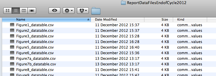
Each figure has it’s own datafile in CSV format:

ucasCycleReportData

Each datafile also contains editorial metadata, such as chart title and figure number:

ucasendcyclereportdatafig

The released data thus allows the data journalist (or the art department of a large news organisation…) to publish their own stylised view of the charts (or embed their own biases in the way they display the data…) and do a very limited amount of analysis on that data. The approach is still slightly short of true reproducibility, or replicability, though – it might take a little bit of effort for us to replicate the figure as depicted from the raw dataset, for example in the setting of range limits for numerical axes. (For an old example of what a replicable report might look like, see How Might Data Journalists Show Their Working?. Note that tools and workflows have moved on since that post was written – I really need to do an update. If you’re interested in examples of what’s currently possible, search for knitr…)

In this sort of release, where data is available separately for each published figure, it may be possible for the data journalist to combine data from different chart-related datasets (if they are compatible) into a new dataset. For example, if two separate charts displayed the performance of the same organisations on two different measures, we might be able to generate a single dataset that lets us plot a “dodged” bar chart showing the performance of each of those organisations against the two measures on the same chart; where two charts compare the behaviour of the same organisations at two different times, we may be able to combine the data to produce a slopegraph. And so on…

The ONS – the Office of National Statistics – had a hard time in December 2012 from the House of Commons Public Administration Committee over its website as part of an inquiry on Communicating and publishing statistics (see also the session the day before). I know I struggle with the ONS website from time to time, but it’s maybe worth considering as a minimum viable product, and to start iterating…?

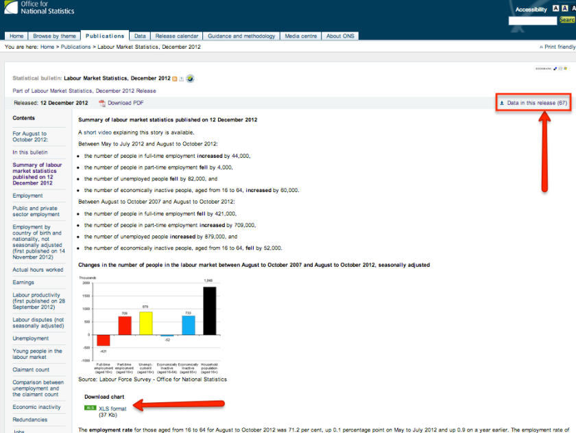
So for example, the ONS publishes lots of statistical bulletins using what appears to be a templated format. For example, if we look at the Labour Market Statistics, December 2012, we see a human readable summary of the headline items in the release along with links to specific data files containing the data associated with each chart and a download area for data associated with the release:

ONSstatisitcalbulletin

If we look at the Excel data file associated with a “difference over time” chart, we notice the the data used to derive the difference is also included:

onsexcel

In this case, we could generate a slope graph directly from the datafile associated with the chart, even though not all that information was displayed in the original chart.

(This might then be a good rule of thumb for testing the quality of “change” data supplied as part of a data containing press release – are the original figures that are differenced to create the difference values also released?)

If we follow the data in this release link, we find a set of links to a whole range of downloadable statistical data tables, as well as “Datasets associated with this release

onsDatawiththisrelease

It can all start getting a bit rathole, rabbit warren from here on in… For example, here are the datasets related with the statistical bulletin:

onsDatasets withRelease

Here’s a page for the Labour Market statistics dataset, and so on…

onsDataset

That said, the original statistical bulletin does provide specific data downloads that are closely tied to each chart contained within the bulletin.

The third example is the Chief Medical Officer’s 2012 annual report, a graphically rich report published in November 2012. (It’s really worth a look…) The announcement page mentions that “All of the underlying data used to create the images in this report will be made available at data.gov.uk.” (The link points to the top level of the data.gov.uk site). A second link invites you to Read the CMO’s report, leading to a page that breaks out the report in the form of links to chapter level PDFs. However, that page also describes how “When planning this report, the Chief Medical Officer decided to make available all of the data used to create images in the report, which in turn leads to a page that contains links to a set of Dropbox pages that allow you to download data on a chapter by chapter basis from the first volume of the report in an Excel format.

Whilst the filenames are cryptic, and the figures in the report not well identified, the data is available, which is a Good Thing. (The page also notes: “The files produced this year cannot be made available in csv format. This option will become available once the Chief Medical Officer’s report is refreshed.” I’m not sure if that means CSV versions of the data will be produced for this report, or will be produced for future versions of the report, in the sense of the CMO’s Annual Report for 2013, etc?)

Once again, though, there may still be work to be done recreating a particular chart from a particular dataset (not least because some of the charts are really quite beautiful!;-) Whilst it may seem a little churlish to complain about a lack of detail about how to generate a particular chart from a particular dataset, I would just mention that one reason the web developed its graphical richness so quickly was that by “Viewing Source” developers could pinch the good design ideas they saw on other websites and implement (and further develop) them simply by cutting and pasting code from one page into another.

What each of the three examples described shows is an opening up of the data immediately behind a chart (and in at least one example from the ONS, making available the data from which the data displayed in a difference chart was calculated), and good examples of a basic form of data transparency? The reader does not have to take a ruler to a chart to work out what value a particular point is (which can be particularly hard on log-log or log-lin scale charts!), they can look it up in the original data table used to generate the chart. Taking them as examples of support for a “View Source” style of behaviour, what other forms of “View Source” supporting behaviour should we be trying to encourage?

PS If we now assume that the PR world is well versed with the idea that there are data journalists (or chart producing graphics editors) out there and that they do produce data bearing press releases for them. How might the PR folk try to influence the stories the data journalists tell by virtue of the data they release to them, and the way in which they release it?

PPS by the by, I noticed today that there is a British Standard Guide to presentation of tables and graphs [ BS 7581:1992 ] (as well as several other documents providing guidance on different forms of “statistical interpretation”). But being a British Standard, you have to pay to see it… unless you have a subscription, of course; which is one of the perks you get as a member of an academic library with just such a subscription. H/T to “Invisible librarian” (in sense of Joining the Flow – Invisible Library Tech Support) Richard Nurse (@richardn2009) for prefetching me a link to the OU’s subscription on British Standards Online in rsponse to a tweet I made about it:-)

#online12 Reflections – Can Open Public Data Be Disruptive to Information Vendors?

Whilst preparing for my typically overloaded #online12 presentation, I thought I should make at least a passing attempt at contextualising it for the corporate attendees. The framing idea I opted for, but all too briefly reviewed, was whether open public data might be disruptive to the information industry, particularly purveyors of information services in vertical markets.

If you’ve ever read Clayton Christensen’s The Innovator’s Dilemma, you’ll be familiar with the idea behind disruptive innovations: incumbents allow start-ups with cheaper ways of tackling the less profitable, low-quality end of the market to take that part of the market; the start-ups improve their offerings, take market share, and the incumbent withdraws to the more profitable top-end. Learn more about this on OpenLearn: Sustaining and disruptive innovation or listen again to the BBC In Business episode on The Innovator’s Dilemma, from which the following clip is taken.

In the information industry, the following question then arises: will the availability of free, open public data be adopted at the low, or non-consuming end of the market, for example by micro- and small companies who haven’t necessarily be able to buy in to expensive information or data services, either on financial grounds or through lack of perceived benefits? Will the appearance of new aggregation services, often built around screenscrapers and/or public open data sources start to provide useful and useable alternatives at the low end of the market, in part because of their (current) lack of comprehensiveness or quality? And if such services are used, will they then start to improve in quality, comprehensiveness and service offerings, and in so doing start a ratcheting climb to quality that will threaten the incumbents?

Here are a couple of quick examples, based around some doodles I tried out today using data from OpenCorporates and OpenlyLocal. The original sketch (demo1() in the code here) was a simple scraper on Scraperwiki that accepted a person’s name, looked them up via a director search using the new 0.2 version of the OpenCorporates API, pulled back the companies they were associated with, and then looked up the other directors associated with those companies. For example, searching around Nigel Richard Shadbolt, we get this:

One of the problems with the data I got back is that there are duplicate entries for company officers; as Chris Taggart explained, “[data for] UK officers [comes] from two Companies House sources — data dump and API”. Another problem is that officers’ records don’t necessarily have start/end dates associated with them, so it may be the case that directors’ terms of office don’t actually overlap within a particular company. In my own scraper, I don’t check to see whether an officer is marked as “director”, “secretary”, etc, nor do I check to see whether the company is still a going concern or whether it has been dissolved. Some of these issues could be addressed right now, some may need working on. But in general, the data quality – and the way I work with it – should only improve from this quick’n’dirty minimum viable hack. As it is, I now have a tool that at a push will give me a quick snapshot of some of the possible director relationships surrounding a named individual.

The second sketch (demo2() in the code here) grabbed a list of elected council members for the Isle of Wight Council from another of Chris’ properties, OpenlyLocal, extracted the councillors names, and then looked up directorships held by people with exactly the same name using a two stage exact string match search. Here’s the result:

As with many data results, this is probably most meaningful to people who know the councillors – and companies – involved. The results may also surprise people who know the parties involved if they start to look-up the companies that aren’t immediately recognisable: surely X isn’t a director of Y? Here we have another problem – one of identity. The director look-up I use is based on an exact string match: the query to OpenCorporates returns directors with similar names, which I then filter to leave only directors with exactly the same name (I turn the strings to lower case so that case errors don’t cause a string mismatch). (I also filter companies returned to be solely ones with a gb jurisdiction.) In doing the lookup, we therefore have the possibility of false positive matches (X is returned as a director, but it’s not the X we mean, even though they have exactly the same name); and false negative lookups (eg where we look up a made up director John Alex Smith who is actually recorded in one or more filings as (the again made-up) John Alexander Smith.

That said, we do have a minimum viable research tool here that gives us a starting point for doing a very quick (though admittedly heavily caveated) search around companies that a councillor may be (or may have been – I’m not checking dates, remember) associated with.

We also have a tool around which we can start to develop a germ of an idea around conflict of interest detection.

The Isle of Wight Armchair Auditor, maintained by hyperlocal blog @onthewight (and based on an original idea by @adrianshort) hosts local spending information relating to payments made by the Isle of Wight Council. If we look at the payments made to a company, we see the spending is associated with a particular service area.

If you’re a graph thinker, as I am;-), the following might then suggest itself to you:

  1. From OpenlyLocal, we can get a list of councillors and the committees they are on;
  2. from OnTheWight’s Armchair Auditor, we can get a list of companies the council has spent money with;
  3. from OpenCorporates, we can get a list of the companies that councillors may be directors of;
  4. from OpenCorporates, we should be able to get identifiers for at least some of the companies that the council has spent money with;
  5. putting those together, we should be able to see whether or not a councillor may be a director of a company that the council is spending with and how much is being spent with them in which spending areas;
  6. we can possibly go further, if we can associate council committees with spending areas – are there councillors who are members of a committee that is responsible for a particular spending area who are also directors of companies that the council has spent money with in those spending areas? Now there’s nothing wrong with people who have expertise in a particular area sitting on a related committee (it’s probably a Good Thing). And it may be that they got their experience by working as a director for a company in that area. Which again, could be a Good Thing. But it begs a transparency question that a journalist might well be interested in asking. And in this case, with open data to hand, might technology be able to help out? For example, could we automatically generate a watch list to check whether or not councillors who are directors of companies that have received monies in particular spending areas (or more generally) have declared an interest, as would be appropriate? I think so…(caveated of course by the fact that there may be false positives and false negatives in the report…; but it would be a low effort starting point).

Once you get into this graph based thinking, you can take it mich further of course, for example looking to see whether councillors in one council are directors of companies that deal heavily with neighbouring councils… and so on.. (Paranoid? Me? Nah… Just trying to show how graphs work and how easy it can be to start joining dots once you start to get hold of the data…;-)

Anyway – this is all getting off the point and too conspiracy based…! So back to the point, which was along the lines of this: here we have the fumblings of a tool for mixing and matching data from two aggregators of public information, OpenlyLocal and OpenCorporates that might allow us to start running crude conflict of interest checks. (It’s easy enough to see how we can run the same idea using lists of MP names from the TheyWorkForYou API; or looking up directorships previously held by Ministers and the names of companies of lobbiests they meet (does WhosLobbying have an API of such things?). And so on…

Now I imagine there are commercial services around that do this sort of thing properly and comprehensively, and for a fee. But it only took me a couple of hours, for free, to get started, and having started, the paths to improvement become self-evident… and some of them can be achieved quite quickly (it just takes a little (?!) but of time…) So I wonder – could the information industry be at risk of disruption from open public data?

PS if you’re into conspiracies, Cambridge’s Centre for Research in the Arts, Social Sciences and Humanities (CRASSH) has a post-doc positions open with Professior John Naughton on The impact of global networking on the nature, dissemination and impact of conspiracy theories. The position is complemented by several parallel fellowships, including ones on Rational Choice and Democratic Conspiracies and Ideals of Transparency and Suspicion of Democracy.

Using Google Fusion Tables for a Quick Look at GCSE/A’Level Certificate Awards Market Share by Examination Board

On my to do list for some time has been a quick peek at market share in the school exams market – does any one awarding body dominate at a particular level, for example, or within a particular subject area? Or how about dominating a particular subject at a particular level? (If you thing this might have anything to do with my idle thought around plurality, you wouldn’t be far wrong…;-) For additional context, see eg House of Commons Education Committee – The administration of examinations for 15–19 year olds in England.)

And so, a couple of months ago, I posted an FOI request to OfQual asking for a copy of relevant data. The request was politely declined at the time on the grounds that the data would seen be available in public anyway. The following question did come to mind though: if the data is public but in PDF (rather than machine readable dataset) form, and I specifically requested machine readable form, presumably an “It’s already publicly available” response wouldn’t wash, given the Protection of Freedoms amendment to FOI that enshrines the right to data in data form? The FOI response also gave a link to the Joint Council for Qualifications (JCQ), although the URL provided doesn’t seem to work now/any more – I’m guessing this: http://www.jcq.org.uk/examination-results/a-levels is the sort of thing they were trying to refer me to? Which is PDF doc with a load of data tables… Hmm… Looking through that data, I started to wonder about the existence of a more refined dataset, specific one that for each qualification body shows the number of people who took a particular qualification at a particular level and the break down of grades awards. In this way, we could look to see whether one board appeared to be “easier” than another in terms of the distribution of grades awarded within a particular qualification by a particular board.

Anyway… it now being after October 19th, the date by which the data was due to be released, I went to the OfQual site to find the data. The site appears to have had a redesign and I couldn’t find the data anywhere… Using the URL I’d discovered on the old site and included in my FOI request – http://www.ofqual.gov.uk/standards/statistics/general-data/ – I found the following “no but, yes but”, blink and you’ll take it for a 404, page, which has the page title (that appears in a browser tab) of Page not found - OfQual:

If you click through and visit the page on the “old” site – http://www2.ofqual.gov.uk/standards/statistics/general-data/ – you can get to a copy of the data… I also popped a copy onto Google Fusion Tables.

(If you can work out where on the new site this data is, along with a protocol/strategy for finding it from: 1) the OfQual homepage, and 2) Google, I’d appreciate it if you’d post a hint or too in the comments;-)

Using the “new look” interface to Google Fusion Tables, here are a few examples of different views we might generate over the data to get a feel for relative market shares.

To start with, the data looks something like this:

The first thing I did was to duplicate the data, and then collapse the results columns relating to years other than 2012 (for now, I’m just interested in 2012 numbers to get a feel for current market shares):

Here’s the result:

We’re not really interested in rows where no certificates were awarded in 2012, so we can filter those rows out:

This is just like selecting a numeric facet for a column in OpenRefine. The Fusion Tables panel that pops up, though, is perhaps not quite as, erm “refined” as the panel in OpenRefine (which shows a range slider). Instead, in Fusion Tables, we are presented with two limit boxes – the one on the left sets an inclusive lower boundary on the value displayed (a “greater than or equal to” limit) and the one on the right an inclusive upper bound (a “less than or equal to” limit). To view rows where the certs2012 value is greater than 0, we put a 1 in the lower bound box and leave the upper bound empty (which is to say, we filter to allow through values >=1).

So where are we at? We now have a set of data that describes for 2012 how many awards were made by each board for each GCE/GCSE certificate they offer. So what? What I was interested in was the market share for each board. The Summary view provides us with a straightforward way of doing this:

What we want to do is sum up the certificates awarded by each board:

This gives a report of the form:

So for example, we can see from the summary table that is generated that AQA awarded (?) almost three and a half million certificates, and OCR just over 1.5 million.

Knowing the total number of certificates awarded by each board is one thing, but the resolution isn’t great because it mixes levels – if one board dominated A’levels and another GCSEs, the order(s) of magnitude more people taking GCSEs would mask the dominant share at A’level, where far fewer certificates are awarded.

To summarise the certificates awarded by each board at each qualification level, we can refine the Summary view:

Here’s what this particular summary view looks like – note that we can sort the rows according to the values in a particular column:

If you are more interested in looking at market share across a particular subject area, we can use a Filter to limit the search results:

The filter panel contains the different factor levels (R), or text facets (OpenRefine) of the elements contained within the selected column.

As well as filtering by a particular facet value, we can also filter results based on a full text string match (I don’t thing Boolean search is possible – just a literal string match on whatever appears in the search box):

To look at data for a particular qualification, we can bring in another filter from the Filter menu, or we can “find” particular values:

This is very much like the text facet view in Google Refine – here’s what the filtered, summarised and found view looks like:

As far as working out dominant market share, we haven’t really got very far – the above data conversation suggests that there is a whole load of context we need to be clear about when we count up the number of certificates awarded by each body and then compare them (are we making subject based comparisons, level based comparisons, subject and level based comparisons, etc.) What we do have, though, is a conversational strategy for starting to ask particular questions of the data. For example, how do the boards compare in the award of Math (string fragment that should match both Maths and Mathematics in a certificate title) across the levels:

And at A’level?

This is fine insofar as it goes, but it would be a bit laborious trying to get a macroscopic view for market shares over all subject areas and levels separately… To do that, I’d probably opt for another tool with powerful support for grouping and visualisation. R maybe…?;-) But that’ll have to wait for another post…

PS You’ll notice that I haven’t actually made any comments about which boards have what market share…And that’s part of the point of OUseful.info as a “howto” resource – it’s a place for coming up with questions and strategies for starting to answer them, as well as sharing process ideas rather than any particular outcomes from applying those processes…

Finding (Nearly) Duplicate Items in a Data Column

[WARNING – THIS IS A *BAD ADVICE* POST – it describes a trick that sort of works, but the example is contrived and has a better solution – text facet and then cluster on facet (h/t to @mhawksey’s Mining and OpenRefine(ing) JISCMail: A look at OER-DISCUSS [Listserv] for making me squirm so much through that oversight I felt the need to post this warning…]

Suppose you have a dataset containing a list of Twitter updates, and you are looking for tweets that are retweets or modified retweets of the same original tweet. The OpenRefine Duplicate custom facet will identify different row items in that column that are exact duplicates of each other, but what about when they just don’t quite match: for example, an original tweet and it’s appearance in an RT (where the retweet string contains RT and the name of the original sender), or an MT, where the tweet may have been shortened, or an RT of an RT, or an RT with an additional hashtag. Here’s one strategy for finding similar-ish tweets, such as popular retweets, in the data set using custom text facets in OpenRefine.

The Ngram GREL function generates a list of word ngrams of a specified length from a string. If you imagine a sliding window N words long, the first ngram will be the first N words in the string, the second ngram the second word to the second+N’th word, and so on:

If we can reasonably expect word sequences of length N to appear in out “duplicate-ish” strings, we can generate a facet on ngrams of that length.

It may also be worth experimenting with combining the ngram function with the fingerprint GREL function. The fingerprint function identifies unique words in a string, reduces them to lower case, and then sorts them in alphabetical order:

If we generate the fingerprint of a string, and then run the ngram function, we generate ngrams around the alphabetically ordered fingerprint terms:

For a sizeable dataset, and/or long strings, it’s likely that we’ll get a lot of ngram facet terms:

We could list them all by setting an appropriate choice count limit, or we can limit the facet items to be displayed by displaying the choice counts, setting the range slider to show those facet values that appear in a large number of columns for example, and then ordering the facet items by count:

Even if tweets aren’t identical, if they contain common ngrams we can pull them out.

Note that we might then order the tweets as displayed in the table using time/date order (a note on string to time format conversions can be found in this postFacets in OpenRefine):

Or alternatively, we might choose to view them using a time facet:

Note that when you set a range in the time facet, you can then click on it and slide it as a range, essentially providing a sliding time window control for viewing records that appear over a given time range/duration.

Sketched Thoughts On Data Journalism Technologies and Practice

Over the last year or two, I’ve given a handful of talks to postgrad and undergrad students broadly on the topic of “technology for data driven journalism”. The presentations are typically uncompromising, which is to say I assume a lot. There are many risks in taking such an approach, of course, as waves of confusion spread out across the room… But it is, in part, a deliberate strategy intended to shock people into an awareness of some of the things that are possible with tools that are freely available for use in the desktop and browser based sheds of today’s digital tinkerers… Having delivered one such presentation yesterday, at UCA, Farnham, here are some reflections on the whole topic of “#ddj”. Needless to say, they do not necessarily reflect even my opinions, let alone those of anybody else;-)

The data-driven journalism thing is being made up as we go along. There is a fine tradition of computer assisted journalism, database journalism, and so on, but the notion of “data driven journalism” appears to have rather more popular appeal. Before attempting a definition, what are some of the things we associate with ddj that might explain the recent upsurge of interest around it?

  • access to data: this must surely be a part of it. In one version we might tell of the story, the arrival of Google Maps and the reverse engineering of an API to it by Paul Rademacher for his April 2005 “Housing Maps mashup”, opened up people’s eyes to the possibility of map-based mashups; a short while later, in May 2005, Adrian Holovaty’s Chicago Crime Map showed how the same mashup idea could be used as an example of “live”, automated and geographically contextualised reporting of crime data. Mashups were all about appropriating web technologies and web content, building new “stuff” from pre-existing “stuff” that was already out there. And as an idea, mashups became all the rage way back then, offering as they did the potential for appropriating, combining and re-presenting elements of different web applications and publications without the need for (further) programming.
    In March 2006, a year or so after the first demonstration of the Housing Maps mashup, and in part as a response to the difficulty in getting hold of latitude and longitude data for UK based locations that was required to build Google maps mashups around British locations, the Guardian Technology supplement (remember that? It had Kakoru puzzles and everything?!;-) launched the “Free Our Data” campaign (history). This campaign called for the free release of data collected at public expense, such as the data that gave the latitude and longitude for UK postcodes.
    The early promise of, and popular interest in “mashups” waxed, and then waned; but there was a new tide rising in the information system that is the web: access to data. The mashups had shown the way forward in terms of some of the things you could do if you could wire different applications together, but despite the promise of no programming it was still too techie, too geeky, too damned hard and fiddly for most people; and despite what the geeks said, it was still programming, and there often still was coding involved. So the focus changed. Awareness grew about the sorts of “mashup” were possible, so now you could ask a developer to build you “something like that”, as you pointed to an appropriate example. The stumbling block now was access to the data to power an app that looked like that, but did the same thing for this.
    For some reason, the notion of “open” public data hit a policy nerve, and in the UK, as elsewhere, started to receive cross-party support. (A brief history of open public data in a UK context is illustrated in the first part of Open Standards and Open Data.) The data started to flow, or at least, started to become both published (through mandated transparency initiatives, such as the release of public accounting data) and requestable (for example, via an extension to FOI by the Protection of Freedoms Act 2012).
    We’ve now got access in principle and in practice to increasing amounts of data, we’ve seen some of the ways in which it can be displayed and, to a certain extent, started to explore some of the ways in which we can use it as a source for news stories. So the time is right in data terms for data driven journalism, right?
  • access to visualisation technologies: it wasn’t very long ago when it was still really hard to display data on screen using anything other than canned chart types – pie charts, line charts, bar charts (that is, the charts you were introduced to in primary school. How many chart types have you learned to read, or create, since then?). Spreadsheets offer a range of grab-and-display chart generating wizards, of course, but they’re not ideal when working with large datasets, and they’re typically geared for generating charts for reports, rather than being used analytically. The visual analysis mantra – Overview first, zoom and filter, then details-on-demand – (coined in Ben Schneiderman’s 1997 article A Grander Goal: A Thousand-Fold Increase in Human Capabilities, I think?) arguably requires fast computers and big screens to achieve the levels of responsiveness that is required for interactive usage, and we have those now…

There are, however, still some considerable barriers to access:

  • access to clean data: you might think I’m repeating myself here, but access to data and access to clean data are two separate considerations. A lot of the data that’s out there and published is still not directly usable (you can’t just load it into a spreadsheet and work on it directly); things that are supposed to match often don’t (we might know that Open Uni, OU and Open University refer to the same thing, but why should a spreadsheet?); number columns often contain things that aren’t numbers (such as commas or other punctuation); dates are provided in a wide variety of formats that we can recognise as such, but a computer can’t – at least, not unless we give it a bit of help; data gets misplaced across columns; character encodings used by different applications and operating systems don’t play nicely; typos proliferate; and so on. So whose job is it to clean the data before it can be inspected or analysed?
  • access to skills and workflows: engineering practice tends to have a separation between the notion of “engineer” and “technician”. Over-generalising and trivialising matters somewhat, engineers have academic training, and typically come at problems from a theory dominated direction; technicians (or technical engineers) have the practical skills that can be used to enact the solutions produced by the engineers. (Of course, technicians can often suggest additional, or alternative, solutions, in part reflecting a better, or more immediate, knowledge about the practical considerations involved in taking one course of action compared to another.) At the moment, the demarcation of roles (and skills required at each step of the way) in a workflow based around data discovery, preparation, analysis and reporting is still confused.
  • What questions should ask? If you think of data as a source, with a story to tell: how do you set about finding that source? Why do you even think you want to talk to that source? What sorts of questions should you ask that source, and what sorts of answer might you reasonably expect it to provide you with? How can you tell if that source is misleading you, lying to you, hiding something from you, or is just plain wrong? To what extent do you or should you trust a data source? Remember, ever cell in a spreadsheet is a fact. If you have a spreadsheet containing a million data cells, that’s a lot of fact checking to do…
  • low or misplaced expectations: we don’t necessarily expect Journalism students to know how to drive to a spreadsheet let alone run or apply complex statistics, or even have a great grasp on “the application of number”; but should they? I’m not totally convinced we need to get them up to speed with yesterday’s tools and techniques… As a tool builder/tool user, I keep looking for tools and ways of using tools that may be thought of as emerging “professional” tools for people who work with data on a day-to-day basis, but wouldn’t class themselves as data scientists, or data researchers; tools for technicians, maybe. When presenting tools to students, I try showing the tools that are likely to be found on a technician’s workbench. As such, they may look a little bit more technical than tools developed for home use (compare a socket set from a trade supplier with a £3.50 tool-roll bargain offer from your local garage), but that’s because they’re quality tools that are fit for purpose. And as such, it may take a bit of care, training and effort to learn how to use them. But I thought the point was to expose students to “industry-strength” ideas and applications? And in an area where tools are developing quite quickly, students are exactly the sort of people we need to start engaging with them: 1) at the level of raising awareness about what these tools can do; 2) as a vector for knowledge and technology transfer, getting these tools (or at least, ideas about what they can do) out into industry; 3) for students so inclined, recruiting those students for the further development of the tools, recruiting power users to help drive requirements for future iterations of the tools, and so on. If the journalism students are going to be the “engineers” to the data wrangler technicians, it’ll be good for them to know the sorts of things they can reasonably ask their technicians to help them to do…Which is to say, the journalists need exposing to the data wrangling factory floor.

Although a lot of the #ddj posts on this OUseful.info blog relate to tools, the subtext is all about recognising data as a medium, the form particular datasets take, and the way in which different tools can be used to work with these forms. In part this leads to a consideration of the process questions that can be asked of a data source based on identifying natural representations that may be contained within it (albeit in hidden form). For example, a list of MPs hints at a list of constituencies, which have locations, and therefore may benefit from representation in a geographical, map based form; a collection of emails might hint at a timeline based reconstruction, or network analysis showing who corresponded with whom (and in what order), maybe?

And finally, something that I think is still lacking in the formulation of data journalism as a practice is an articulation of the process of discovering the stories from data: I like the notion of “conversations with data” and this is something I’ll try to develop over forthcoming blog posts.

PS see also @dkernohan’s The campaigning academic?. At the risk of spoiling the punchline (you should nevertheless go and read the whole thing), David writes: “There is a space – in the gap between academia and journalism, somewhere in the vicinity of the digital humanities movement – for what I would call the “campaigning academic”, someone who is supported (in a similar way to traditional research funding) to investigate issues of interest and to report back in a variety of accessible media. Maybe this “reporting back” could build up into equivalence to an academic reward, maybe not.

These would be cross-disciplinary scholars, not tied to a particular critical perspective or methodology. And they would likely be highly networked, linking in both to the interested and the involved in any particular area – at times becoming both. They might have a high media profile and an accessible style (Ben Goldacre comes to mind). Or they might be an anonymous but fascinating blogger (whoever it is that does the wonderful Public Policy and The Past). Or anything in between.

But they would campaign, they would investigate, they would expose and they would analyse. Bringing together academic and old-school journalistic standards of integrity and verifiability.”

Mixed up in my head – and I think in David’s – is the question of “public accounting”, as well as sensemaking around current events and trends, and the extent to which it’s the role of “the media” or “academic” to perform such a function. I think there’s much to be said for reimagining how we inform and educate in a network-centric web-based world, and it’s yet another of those things on my list of things I intend to ponder further… See also: From Academic Privilege to Consultations as Peer Review.

Chit Chat with New Datasets – Facets in OpenRefine (Was /Google Refine/)

One of the many ways of using Google OpenRefine is as a toolkit for getting a feel for the range of variation contained within a dataset using the various faceting options. In the sense of analysis being a conversation with data, this is a bit like an idle chit-chat/getting to know you phase, as a precursor to a full blown conversation.

Faceted search or faceted browsing/navigation typically provides a set of limiting search filters to a set of search results that limits or restricts the displayed results to ones that fulfil certain conditions. In a library catalogue, the facets might refer to metadata fields such as publication date, thus allowing a user to search within a given date range, or publisher:

Where the facet relates to a categorical variable – that is, where there is a set of unique values that the facet can take (such as the names of different publishers) – a view of the facet values will show the names of the different publishers extracted from the original search results. Selecting a particular publisher, for example, will then limit the displayed results to just those results associated with that publisher. For numerical facets, where the quantities associated with the facet related to a number or date (that is, a set of things that have a numerical range), the facet view will show the full range of values contained within that particular facet. The user can then select a subset of results that fall within a specified part of that range.

In the case of Open Refine, facets can be defined on a per column basis. For categorical facets, Refine will identify the set of unique values associated with a particular faceted view that are contained within a column, along with a count of how many times each facet value occurs throughout the column. The user can then choose to view only those rows with a particular (facet selected) value in the faceted column. For columns that contain numbers, Refine will generate a numerical facet that spans the range of values contained within the column, along with a histogram that provides a count of occurrences of numbers within small ranges across the full range.

So what faceting options does Google Refine provide?

Here’s how they work (data used for the examples comes from Even Wholesale Drug Dealers Can Use a Little Retargeting: Graphing, Clustering & Community Detection in Excel and Gephi and JSON import from the Twitter search API…):

– exploring the set of categories described within a column using the text facet:

Faceted views also allow you to view the facet values by occurrence count, so it’s easy to see which the most popular facet values are:

You can also get a tab separated list of facet values:

Sometimes it can be useful to view rows associated with particular facet values that occur a particular number of times, particulalry at the limits (for example, very popular facet values, or uniquely occurring facet values):

– looking at the range of numerical values contained in a column using the numeric facet:

– looking at the distribution over time of column contents using the timeline facet:

Faceting by time requires time-related strings to be parsed as such; sometimes, Refine needs a little bit of help in interpreting an imported string as a time string. So for example, given a “time” string such as Mon, 29 Oct 2012 10:56:52 +0000 from the Twitter search API, we can use the GREL function toDate(value,"EEE, dd MMM y H:m:s") to create a new column with time-cast elements.

(See GRELDateFunctions and the Java SimpleDateFormat class documentation for more details.)

– getting a feel for the correlation of values across numerical columns, and exploring those correlations further, using the scatterplot facet.

This generates a view that generates a set of scatterplots relating to pairwise combinations of all the numerical columns in the dataset:

Clicking on one of these panels allows you to filter points within a particular area of the corresponding scatter chart (click and drag a rectangular area over the points you want to view), effectively allowing you to filter the data across related ranges of two numerical columns at the same time:

A range of customisable faceting options are also provided that allow you to define your own faceting functions:

  • the Custom text… facet;
  • the Custom Numeric… facet

More conveniently, a range of predefined Customized facets are provided that provide shortcuts to “bespoke” faceting functions:

So for example:

  • the word facet splits strings contained in cells into single words, counts their occurrences throughout the column, and then lists unique words and their occurrence count in the facet panel. This faceting option thus provides a way of selecting rows where the contents of a particular column contain one or more specified words. (The user defined GREL custom text facet ngram(value,1) provides a similar (though not identical) result – duplicated words in a cell are identified as unique by the single word ngram function; see also split(value," "), which does seem to replicate the behaviour of the word facet function.)
  • the duplicates facet returns boolean values of true and false; filtering on true values returns all the rows that have duplicated values within a particular column; filtering on false displays all unique rows.
  • the text length facet produces a facet based on the character count(?) of strings in cells within the faceted column; the custom numeric facet length(value) achieves something similar; the related measure, word count, can be achieved using the custom numeric facet length(split(value," "))

Note that facet views can be combined. Selecting multiple rows within a particular facet panel provides a Boolean OR over the selected values (that is, if any of the selected values appear in the column, the corresponding rows will be displayed). To AND conditions, even within the same facet, create a separate facet panel for each ANDed condition.

PS On the OpenRefine (was Google Refine) name change, see From Freebase Gridworks to Google Refine and now OpenRefine. The code repository is now on github: OpenRefine Repository. I also notice that openrefine.org/ has been minted and is running a placeholder instance of WordPress. I wonder if it would be worth setting up an aggregator for community posts, a bit like R-Blogger (for example, I have an RStats category feed from this blog that I syndicate to the RBloggers aggregator, and have just created an OpenRefine category that could feed a OpenRefinery aggregator channel).

PPS for an example of using OpenRefine to find differences between two recordsets, see Owen Stephens’ Using Open Refine for e-journal data.

Merging Data Sets Based on Partially Matched Data Elements

A tweet from @coneee yesterday about merging two datasets using columns of data that don’t quite match got me wondering about a possible R recipe for handling partial matching. The data in question related to country names in a datafile that needed fusing with country names in a listing of ISO country codes,although the recipe I’m describing here is intended to be a general purpose partial matcher. (See the comments for alternative methods for the special case of reconciling country names with country codes.)

The original data set had the form:

RANK,ECONOMY,PERCENTAGE OF INDIVIDUALS USING THE INTERNET 2011
1,Iceland,95
2,Norway,94
3,Netherlands,92.3
4,Sweden,91
5,Luxembourg,90.9
6,Denmark,90
7,Finland,89.4
8,Qatar,86.2
9,New Zealand,86
10,Switzerland,85.2
11,Liechtenstein,85
12,S. Korea,83.8
13,Germany,83
14,Canada,83
15,United Kingdom,82
16,Antigua & Barbuda,82

I’m not sure what country code listing was being used, but it probably looked something like this list of ISO Country Codes by Country:

ANDORRA;AD
ANGOLA;AO
ANGUILLA;AI
ANTARCTICA;AQ
ANTIGUA AND BARBUDA;AG
ARGENTINA;AR
ARMENIA;AM
ARUBA;AW
AUSTRALIA;AU
AUSTRIA;AT
AZERBAIJAN;AZ
BAHAMAS;BS
BAHRAIN;BH

It’s easy enough to reduce all the country names to lowercase characters so that we can try to match them exactly without worrying about any differences in capitalisation, but how do we match country names that don’t match exactly – ANTIGUA AND BARBUDA and Antigua & Barbuda, for example, or Central African Rep. and Central African Republic?

One trick is to use one of the well known partial string matching algorithms, such as the Levenshtein Distance. Here’s a recipe I hacked together that first tries to find an exact match on country names by attempting to merge the two country lists directly, and then tries to partially match any remaining unmatched names in the original list. A signature function is constructed to help out the partial matching attempt that reduces all words in the country name to lower case, sorts them alphabetically, and then concatenates them with no adjoining spaces.

(The signature idea was cribbed from the fingerprint that is available in Google Refine and that I employed in Merging Datasets with Common Columns in Google Refine.)

[@downes commented that the code wasn’t really written with clarity in mind – so I’ve added some comments…]

#Load in the data from the URLs:
PercentageUsingTheNet=read.csv(url('http://s.telegraph.co.uk/graphics/conrad/PercentageUsingTheNet.csv, encoding='MACROMAN'))
ccode=read.csv(url('http://www.iso.org/iso/country_names_and_code_elements_txt'),sep=';')

##Here's where the algorithm starts...
##I'm going to generate a signature from country names to reduce some of the minor differences between strings
##In this case:
### convert all characters to lower case (tolower())
### split the string into a vector (unlist()) of separate words (strsplit())
### sort the words alphabetically (sort())
### and then concatenate them with no spaces (paste(y,collapse='')).
##So for example, United Kingdom would become kingdomunited
##To extend this function, we might also remove stopwords such as 'the' and 'of', for example (not shown).
signature=function(x){
  sig=paste(sort(unlist(strsplit(tolower(x)," "))),collapse='')
  return(sig)
}

#The partialMatch function takes two wordlists as vectors (x,y) and an optional distance threshold (levDist)
#The aim is to find words in the second list (y) that match or partially match words in the first (x)
partialMatch=function(x,y,levDist=0.1){
  #Create a data framecontainind the signature for each word
  xx=data.frame(sig=sapply(x, signature),row.names=NULL)
  yy=data.frame(sig=sapply(y, signature),row.names=NULL)
  #Add the original words to the data frame too...
  xx$raw=x
  yy$raw=y
  #We only want words that have a signature...
  xx=subset(xx,subset=(sig!=''))

  #The first matching pass - are there any rows in the two lists that have exactly the same signature?
  xy=merge(xx,yy,by='sig',all=T)
  matched=subset(xy,subset=(!(is.na(raw.x)) & !(is.na(raw.y))))
  #?I think matched=xy[ complete.cases(raw.x,raw.y) ] might also work here?
  #Label the items with identical signatures as being 'Duplicate' matches
  matched$pass="Duplicate"

  #Grab the rows from the first list that were unmatched - that is, no matching item from the second list appears
  todo=subset(xy,subset=(is.na(raw.y)),select=c(sig,raw.x))
  #We've grabbed the signature and original raw text from the first list that haven't been matched up yet
  #Name the columns so we know what's what
  colnames(todo)=c('sig','raw')

  #This is the partial matching magic - agrep finds items in the second list that are within a 
  ## certain Levenshtein distance of items in the first list.
  ##Note that I'm finding the distance between signatures.
  todo$partials= as.character(sapply(todo$sig, agrep, yy$sig,max.distance = levDist,value=T))

  #Bring the original text into the partial match list based on the sig key.
  todo=merge(todo,yy,by.x='partials',by.y='sig')

  #Find the items that were actually partially matched, and pull out the columns relating to signatures and raw text
  partial.matched=subset(todo,subset=(!(is.na(raw.x)) & !(is.na(raw.y))),select=c("sig","raw.x","raw.y"))
  #Label these rows as partial match items
  partial.matched$pass="Partial"
  #Add the set of partially matched items to the set of duplicate matched items
  matched=rbind(matched,partial.matched)
  
  #Find the rows that still haven't been matched
  un.matched=subset(todo,subset=(is.na(raw.x)),select=c("sig","raw.x","raw.y"))

  #If there are any unmatched rows, add them to the list of matched rows, but labelled as such
  if (nrow(un.matched)>0){
    un.matched$pass="Unmatched"
    matched=rbind(matched,un.matched)
  }

  #Grab the columns of raw text from x and y from the matched list, along with how they were matched/are unmatched
  matched=subset(matched,select=c("raw.x","raw.y","pass"))
  #Ideally, the length of this should be the same as the length of valid rows in the original first list (x)

  return(matched)
}

#A rogue character in @coneee's data file borked things for me, so I originally needed to do a character code conversion first
#PercentageUsingTheNet$ECONOMY=iconv(PercentageUsingTheNet$ECONOMY)
#Loading the CSV with the encoding attribute set (h/t Kent Johnson) seemed to work properly though...

#Call the partial match function using two vectors
#The aim is to find items in the second vector that partially match items in the first
#The function returns the first list annotated with partial match items from the second and a match type
matches=partialMatch(PercentageUsingTheNet$ECONOMY,ccode$Country.Name)

As ever, this code was arrived at by tinkering and searching on Stack Overflow (using search terms along the lines of “partial match R” and “R levenshtein”). If you can improve on it, please do so and paste a link to the improved code, or a code fragment itself, in the comments below:-)

UPDATE: via the comments, the following suggestion that I don’t have time to check right now…
#Bring the original text into the partial match list based on the sig key.
-todo=merge(todo,yy,by.x=’partials’,by.y=’sig’)
+todo=merge(todo,yy,by.x=’partials’,by.y=’sig’,all.x=T)

#Label these rows as partial match items
-partial.matched$pass=”Partial”
+if (nrow(partial.matched) > 0) partial.matched$pass=”Partial”

Thanks:-)

When we run the script and look at the contents of the matches dataframe, this is an example of what we get:

This data frame can then be merged with the originally loaded data to give us the required country code annotations:

a=PercentageUsingTheNet
b=ccode
#Merge the original data set with the ISO country code country name keys
aa=merge(a,matches,by.x='ECONOMY',by.y='raw.x',all.x=T)
#Merge in the ISO country codes
aa=merge(aa,b,by.x='raw.y',by.y='Country.Name',all.x=T)
aa=subset(aa,select=c('ECONOMY','RANK','PERCENTAGE.OF.INDIVIDUALS.USING.THE.INTERNET.2011','ISO.3166.1.alpha.2.code'))

Something like this, for example:

Unfortunately, not every country in the original data set is matched:

In particular, here are the unmatched items and what they presumably should have been matched with:

Lao P.D.R. - LAO PEOPLE'S DEMOCRATIC REPUBLIC
Syria - SYRIAN ARAB REPUBLIC
S. Korea - KOREA, REPUBLIC OF
Bolivia - BOLIVIA, PLURINATIONAL STATE OF
Russia - RUSSIAN FEDERATION
Guinea Bissau - GUINEA-BISSAU
St. Vincent & Grenadines - SAINT VINCENT AND THE GRENADINES
S. Sudan - SOUTH SUDAN
Eq. Guinea - EQUATORIAL GUINEA
Congo (Dem. Rep.) - CONGO, THE DEMOCRATIC REPUBLIC OF THE
Congo (Kinshasa) - CONGO
Slovak Republic - SLOVAKIA
Iran - IRAN, ISLAMIC REPUBLIC OF
TFYR Macedonia - MACEDONIA, THE FORMER YUGOSLAV REPUBLIC OF

We could try to increase the Levenshtein Distance within which a partial match is suggested, but then we run the risk of introducing false positives.

Removing stopwords as part of the signature function may help, for example in the case of St. Vincent & Grenadines. (Also, I’m not sure what went wrong with Guinea Bissau?) We could presumably also make something of the abbreviations (S., Dem., Rep., Eq., P. D. R.), using these as NGrams or stubs in a regular expression? So for example, convert Lao P. D. R. to a regular expression invoking searches for a three word phrase in which consecutive words start with P, D, R. (Of course, this would require matching across the full country name rather than the signature.)

The Google Refine documentation page Clustering In Depth (Methods and theory behind the clustering functionality in Google Refine) also identifies several other fuzzy/partial matching algorithms that could be tried here. In which case, I guess I need to rewrite the above function so that it can accommodate different matching algorithms? IF you manage to implement any of these other fuzzy matching approaches, please post a link in the comments.

PS If you use any other approaches for partial matching of strings, please feel free to share how you do it in the comments below…:-) For example:
theBioBucket: Merging Dataframes by Partly Matching String. This post also introduces adist(), an R function that returns the Levenshtein distance between two strings.

Local Council Announcements via Newspapers, and Maybe Hyperlocal Blogs, Too…?

In a post on local council declarations of designated public place, I remarked on the following clause in The Local Authorities (Alcohol Consumption in Designated Public Places) Regulations 2007:

“5. Before making an order, a local authority shall cause to be published in a newspaper circulating in its area a notice— (a)identifying specifically or by description the place proposed to be identified;“

and idly wondered: how is a “newspaper circulating in its area” defined?

In Statutory Instrument 2012 No. 2089, The Local Authorities (Executive Arrangements) (Meetings and Access to Information) (England) Regulations 2012, which comes into force on September 10th, 2012, there is the following note on interpretations to be used within the regulations:

“newspaper” includes—
(a) a news agency which systematically carries on the business of selling and supplying reports or information to the newspapers; and
(b) any organisation which is systematically engaged in collecting news—
(i) for sound or television broadcasts;
(ii) for inclusion in programmes to be included in any programme service within the meaning of the Broadcasting Act 1990(6) other than a sound or television broadcasting service within the meaning of Part 3 or Part 1 of that Act respectively; or
(iii) for use in electronic or any other format to provide news to the public by means of the internet; [my emphasis]

So, for the purposes of those regulations, a newspaper includes any organisation which is systematically engaged in collecting news for use in electronic or any other format to provide news to the public by means of the internet. (The 2007 regs interpretation section don’t clarify the meaning of “newspapers”.)

This presumably means, for example, that under regulation 14(2), my local hyperlocal blog, Ventnorblog, could request as a newspaper a copy of any of the documents available for public inspection following payment to the Isle of Wight Council of “postage, copying or other necessary charge for transmission”. Assuming Ventnorblog passes the test of (a) being an organisation, that (b) is systematically engaged in collecting news, and for backwards compatibility with other regulations can be show to be (c) circulating in the local council area.

If this interpretation of newspapers applies more widely, (for example, if this interpretation is now applied across outstanding Local Government regulations), it also suggests that whereas councils would traditionally have had to place an advert in their local (print) newspaper, now they can do it via a hyperlocal blog?

So this might also include announcements about Licensing of public entertainments [1(4)], or adult shops [2(2)], tattoo shops [13(6)], temporary markets [37(1)], traffic orders [17(2a)], etc etc

PS Hmm, I wonder, is there a single list somewhere detailing all the legislation that requires local councils to “publish in a newspaper circulating in the area”…?

PPS via @robandale, this Local Government Information Unit initiative on Reforming Statutory Notices. It links to a survey for local councils relating to “how many notices are produced, how much they cost, how effective you believe they are etc.” to try to get a baseline on current practice.

A quick peek at the Isle of Wight Council Armchair Auditor (as run by Ventnorblog and updated from Adrian Short’s original version) gives us an idea of how much the Isle of Wight Council spends on “Advertising and Publicity” in areas such as “Traffic Management” (so presumably statutory notices relating to roadworks, road closures etc?) with the local rag, the Isle of Wight County Press.

Presumably a search on OpenlyLocal’s council spending dashboard would turn up similar spending categories for other councils? (It could be quite interesting to try exploring that… I’m not sure if data on the OpenlyLocal spending dashboard has been updated lately, though? I think OpenSpending take their data from OpenlyLocal, so that isn’t much additional help. And the DCLG opendatacommunities.org site only has budget related finance data at the moment?)

Hmm..thinks.. you could get an idea of how much external spending burden different bits of legislation impose on councils from their spending data, couldn’t you?

Olympics Swimming Lap Charts from the New York Times

Part of the promise of sports data journalism is the ability to use data from an event to enrich the reporting of that event. One of the widely used graphical devices used in motor racing is the lap chart, which shows the relative positions of each car at the end of each lap:

Another, more complex chart, and one that can be quite hard to read when you first come across it, is the race history chart, which shows the laptime of each car relative to the average laptime (calculated over the whole of the race) of the race winner:

(Great examples of how to read a race history charts can be found on the IntelligentF1 blog. For the general case, see The IntelligentF1 model.)

Both of these charts can be used to illustrate the progression of a race, and even in some cases to identify stories that might otherwise have been missed (particularly races amongst back markers, for example). For Olympics events particularly, where reporting is often at a local level (national and local press reporting on the progression of their athletes, as well as the winning athletes), timing data may be one of the few sources available for finding out what actually happened to a particular competitor who didn’t feature in coverage that typically focusses on the head of the race.

I’ve also experimented with some other views, including a race summary chart that captures the start position, end of first lap position, final position and range of positions held at the end of each lap by each driver:

One of the ways of using this chart is as a quick summary of the race position chart, as well as a tool for highlighting possible “driver of the day” candidates.

A rich lap chart might also be used to convey information about the distance between cars as well as their relative positions. Here’s one experiment I tried (using Gephi to visualise the data) in which node size is proportional to time to car in front and colour is related to time to car behind (red is hot – car behind is close):

(You might also be able to imagine a variant of this chart where we fix the y-value so each row shows data relating to one particular driver. Looking along a row then allows us to see how exciting a race they had.)

All of these charts can be calculated from lap time data. Some of them can be calculated from data describing the position held by each competitor at the end of each lap. But whatever the case, the data is what drives the visualisation.

A little bit of me had been hoping that laptime data for Olympics track, swimming and cycling events might be available somewhere, but if it is, I haven’t found a reliable source yet. What I did find encouraging, though, was that the New York Times, (in many ways one of the organisations that is seeing the value of using visualised data-driven storytelling in its daily activities) did make some split time data available – and was putting it to work – in the swimming events:

Here, the NYT have given split data showing the times achieved in each leg by the relay team members, along with a lap chart that has a higher level of detail, showing the position of each team at the end of each 50m length (I think?!). The progression of each of the medal winners is highlighted using an appropriate colour theme.

[Here’s an insight from @kevinQ about how the New York Times dataviz team put this graphic together: Shifts in rankings. Apparently, they’d done similar views in previous years using a Flash component, but the current iteration uses d3.js]

The chart provides an illustration that can be used to help a reporter identify different stories about how the race progressed, whether or not it is included in the final piece. The graphic can also be used as a sidebar illustration of a race report.

Lap charts also lend themselves to interactive views, or highlighted customisations that can be used to illustrate competition between selected individuals – here’s another F1 example, this time from the f1fanatic blog:

(I have to admit, I prefer this sort of chart with greyed options for the unhighlighted drivers because it gives a better sense of the position churn that is happening elsewhere in the race.)

Of course, without the data, it can be difficult trying to generate these charts…

…which is to say: if you know where lap data can be found for any of the Olympics events, please post a link to the source in the comments below:-)

PS for an example of the lapcharting style used to track the hole by hole scoring across a multi-round golf tournament, see Andy Cotgreave’s Golf Analytics.