When Documents Become Databases – Tabulizer R Wrapper for Tabula PDF Table Extractor

Although not necessarily the best way of publishing data, data tables in PDF documents can often be extracted quite easily, particularly if the tables are regular and the cell contents reasonably space.

For example, official timing sheets for F1 races are published by the FIA as event and timing information in a set of PDF documents containing tabulated timing data:

R_-_Best_Sector_Times_pdf__1_page_

In the past, I’ve written a variety of hand crafted scrapers to extract data from the timing sheets, but the regular way in which the data is presented in the documents means that they are quite amenable to scraping using a PDF table extractor such as Tabula. Tabula exists as both a server application, accessed via a web browser, or as a service using the tabula extractor Java application.

I don’t recall how I came across it, but the tabulizer R package provides a wrapper for tabula extractor (bundled within the package), that lets you access the service via it’s command line calls. (One dependency you do need to take care of is to have Java installed; adding Java into an RStudio docker container would be one way of taking care of this.)

Running the default extractor command on the above PDF pulls out the data of the inner table:

extract_tables('Best Sector Times.pdf')

fia_pdf_sector_extract

Where the data is spread across multiple pages, you get a data frame per page.

R_-_Lap_Analysis_pdf__page_3_of_8_

Note that the headings for the distinct tables are omitted. Tabula’s “table guesser” identifies the body of the table, but not the spanning column headers.

The default settings are such that tabula will try to scrape data from every page in the document.

fia_pdf_scrape2

Individual pages, or sets of pages, can be selected using the pages parameter. For example:

  • extract_tables('Lap Analysis.pdf',pages=1
  • extract_tables('Lap Analysis.pdf',pages=c(2,3))

Specified areas for scraping can also be specified using the area parameter:

extract_tables('Lap Analysis.pdf', pages=8, guess=F, area=list(c(178, 10, 230, 500)))

The area parameter appears to take co-ordinates in the form: top, left, width, height is now fixed to take co-ordinates in the same form as those produced by tabula app debug: top, left, bottom, right.

You can find the necessary co-ordinates using the tabula app: if you select an area and preview the data, the selected co-ordinates are viewable in the browser developer tools console area.

Select_Tables___Tabula_concole

The tabula console output gives co-ordinates in the form: top, left, bottom, right so you need to do some sums to convert these numbers to the arguments that the tabulizer area parameter wants.

fia_pdf_head_scrape

Using a combination of “guess” to find the dominant table, and specified areas, we can extract the data we need from the PDF and combine it to provide a structured and clearly labeled dataframe.

On my to do list: add this data source recipe to the Wrangling F1 Data With R book…

First Thoughts on Automatically Generating Accessible Text Descriptions of ggplot Charts in R

In a course team accessibility briefing last week, Richard Walker briefly mentioned a tool for automatically generating text descriptions of Statistics Canada charts to support accessibility. On further probing, the tool, created by Leo Ferres, turned out to be called iGraph-Lite:

… an extensible system that generates natural language descriptions of statistical graphs, particularly those created for Statistics Canada online publication, “The Daily”. iGraph-Lite reads a graph from a set of graphing programs, builds intermediate representations of it in several formats (XML, CouchDB and OWL) and outputs a description using NLG algorithms over a “string template” mechanism.

The tool is a C# application compiled as a Windows application, with the code available (unchanged now for several years) on Github.

The iGraph-Lite testing page gives a wide range of example outputs:

iGraph_Testing_Page

Increasingly, online charts are labeled with tooltip data that allows a mouseover or tab action to pop-up or play out text or audio descriptions of particular elements of the chart. A variety of “good chart design” principles designed to support clearer, more informative graphics (for example, sorting categorical variable bars in a bar chart by value rather than using an otherwise arbitrary alphabetic ordering) not only improves the quality of the graphic, it also makes a tabbed through audio description of the chart more useful. For more tips on writing clear chart and table descriptions, see Almost Everything You Wanted to Know About Making Tables and Figures.

The descriptions are quite formulaic, and to a certain extent represent a literal reading of the chart, along with some elements of interpretation and feature detection/description.

Here are a couple of examples – first, for a line chart:

This is a line graph. The title of the chart is “New motor vehicle sales surge in January”. There are in total 36 categories in the horizontal axis. The vertical axis starts at 110.0 and ends at 160.0, with ticks every 5.0 points. There are 2 series in this graph. The vertical axis is Note: The last few points could be subject to revisions when more data are added. This is indicated by the dashed line.. The units of the horizontal axis are months by year, ranging from February, 2005 to January, 2007. The title of series 1 is “Seasonally adjusted” and it is a line series. The minimum value is 126.047 occuring in September, 2005. The maximum value is 153.231 occuring in January, 2007. The title of series 2 is “Trend” and it is a line series. The minimum value is 133.88 occuring in February, 2005. The maximum value is 146.989 occuring in January, 2007.

And then for a bar chart:

This is a vertical bar graph, so categories are on the horizontal axis and values on the vertical axis. The title of the chart is “Growth in operating revenue slowed in 2005 and 2006”. There are in total 6 categories in the horizontal axis. The vertical axis starts at 0.0 and ends at 15.0, with ticks every 5.0 points. There is only one series in this graph. The vertical axis is % annual change. The units of the horizontal axis are years, ranging from 2001 to 2006. The title of series 1 is “Wholesale” and it is a series of bars. The minimum value is 2.1 occuring in 2001. The maximum value is 9.1 occuring in 2004.

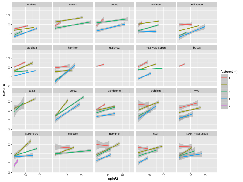
One of the things I’ve pondered before was the question of textualising charts in R using a Grammar of Graphics approach such as that implemented by ggplot2. As well as literal textualisation of grammatical components, a small amount of feature detection or analysis could also be used to pull out some meaningful points. (It also occurs to me that the same feature detection elements could also then be used to drive a graphical highlighting layer back in the visual plane.)

Prompted by my quick look at the iGraph documentation, I idly wondered how easy it would be to pick apart an R ggplot2 chart object and generate a textual description of various parts of it.

A quick search around suggested two promising sources of structured data associated with the chart objects directly: firstly, we can interrogate the object return from calling ggplot() and it’s associated functions directly; and ggplot_build(g), which allows us to interrogate a construction generated from that object.

Here’s an example from the quickest of plays around this idea:

library(ggplot2)
g=ggplot(economics_long, aes(date, value01, colour = variable))
g = g + geom_line() + ggtitle('dummy title')

#The label values may not be the actual axis limits
txt=paste('The chart titled"', g$labels$title,'";',
'with x-axis', g$labels$x,'labeled from',
ggplot_build(g)$panel$ranges[[1]]$x.labels[1], 'to',
tail(ggplot_build(g)$panel$ranges[[1]]$x.labels, n=1),
'and y-axis', g$labels$y,' labeled from',
ggplot_build(g)$panel$ranges[[1]]$y.labels[1], 'to',
tail(ggplot_build(g)$panel$ranges[[1]]$y.labels,n=1), sep=' ')
if (<span class="pl-s"><span class="pl-pds">'</span>factor<span class="pl-pds">'</span></span> <span class="pl-k">%in%</span> class(<span class="pl-smi">x</span><span class="pl-k">$</span><span class="pl-smi">data</span>[[<span class="pl-smi">x</span><span class="pl-k">$</span><span class="pl-smi">labels</span><span class="pl-k">$</span><span class="pl-smi">colour</span>]])){
txt=paste(txt, '\nColour is used to represent', g$labels$colour)

if ( class(g$data[[g$labels$colour]]) =='factor') {
txt=paste(txt,', a factor with levels: ',
paste(levels(g$data[[g$labels$colour]]), collapse=', '), '.', sep='')
}
}

txt

#The chart titled "dummy title" with x-axis date labeled from 1970 to 2010 and y-axis value01 labeled from 0.00 to 1.00
#Colour is used to represent variable, a factor with levels: pce, pop, psavert, uempmed, unemploy.&amp;amp;amp;quot;

So for a five minute hack, I’d rate that approach as plausible, perhaps?!

I guess an alternative approach might also be to add an additional textualise=True property to the ggplot() call that forces each ggplot component to return a text description of its actions, and/or features that might be visually obvious from the action of the component as well as, or instead of, the graphical elements. Hmm… maybe I should use the same syntax as ggplot2 and try to piece together something along the lines of a ggdescribe library? Rather than returning graphical bits, each function would return appropriate text elements to the final overall description?!

I’m not sure if we could call the latter approach a “transliteration” of a chart from a graphical to a textual rendering of its structure and some salient parts of a basic (summary) interpretation of it, but it feels to me that this has some merit as a strategy for thinking about data2text conversions in general. Related to this, I note that Narrative Science have teamed up with Microsoft Power BI to produce a “Narratives for Power BI” plugin. I imagine this will start trickling down to Excel at some point, though I’ve already commented on how simple text summarisers can be added into to Excel using simple hand-crafted formulas (Using Spreadsheets That Generate Textual Summaries of Data – HSCIC).

PS does anyone know if Python/matplotib chart elements also be picked apart in a similar way to ggplot objects? [Seems as if they can: example via Ben Russert.]

PPS In passing, here’s something that does look like it could be handy for simple natural language processing tasks in Python: polyglot, “a natural language pipeline that supports massive multilingual applications”; includes language detection, tokenisation, named entity extraction, part of speech tagging, transliteration, polarity (i.e. crude sentiment).

PPPS the above function is now included in Jonathan Godfrey’s BrailleR package (about).

PPPPS for examples of best practice chart description, see the UK Association for Accessible Formats (UKAAF) guidance on Accessible Images.

PPPPPS rules for converting eg MathJax and MathML to speech, braille, etc

PPPPPPS a possibly handy R package — equatiomatic — for generating a LaTeX equation that describes a fitted R model. In Python, erwanp/pytexit will “convert a Python expression to a LaTeX formula”.

Accessing a Neo4j Graph Database Server from RStudio and Jupyter R Notebooks Using Docker Containers

In Getting Started With the Neo4j Graph Database – Linking Neo4j and Jupyter SciPy Docker Containers Using Docker Compose I posted a recipe demonstrating how to link a Jupyter notebook container with a neo4j container to provide a quick way to get up an running with neo4j from a Python environment.

It struck me that it should be just as easy to launch an R environment, so here’s a docker-compose.yml file that will do just that:

neo4j:
  image: kbastani/docker-neo4j:latest
  ports:
    - "7474:7474"
    - "1337:1337"
  volumes:
    - /opt/data

rstudio:
  image: rocker/rstudio
  ports:
    - "8787:8787"
  links:
    - neo4j:neo4j
  volumes:
    - ./rstudio:/home/rstudio

jupyterIR:
  image: jupyter/r-notebook
  ports:
    - "8889:8888"
  links:
    - neo4j:neo4j
  volumes:
    - ./notebooks:/home/jovyan/work

If you’re using Kitematic (available via the Docker Toolbox), launch the docker command line interface (Docker CLI), cd into the directory containing the docker-compose.yml file, and run the docker-compose up -d command. This will download the necessary images and fire up the linked containers: one running neo4j, one running RStudio, and one running a Jupyter notebook with an R kernel.

You should then be able to find the URLs/links for RStudio and the notebooks in Kitematic:

Screenshot_12_04_2016_08_59

Once again, Nicole White has some quickstart examples for using R with neo4j, this time using the Rneo4j R package. One thing I noticed with the Jupyter R kernel was that I needed to specify the CRAN mirror when installing the package: install.packages('RNeo4j', repos="http://cran.rstudio.com/")

To connect to the neo4j database, use the domain mapping specified in the Docker Compose file: graph = startGraph("http://neo4j:7474/db/data/")

Here’s an example in RStudio running from the container:

RStudio-neo4j

And the Jupyter notebook:

neo4j_R

Notebooks and RStudio project files are shared into subdirectories of the current directory (from which the docker compose command was run) on host.

Visualising F1 Stint Strategies

With the new F1 season upon us, I’ve started tinkering with bits of code from the Wrangling F1 Data With R book and looking at the data in some new ways.

For example, I started wondering whether we might be able to learn something interesting about the race strategies by looking at laptimes on a stint by stint basis.

To begin with, we need some data – I’m going to grab it directly from the ergast API using some functions that are bundled in with the Leanpub book…

#ergast functions described in: https://leanpub.com/wranglingf1datawithr/
#Get laptime data from the ergast API
l2=lapsData.df(2016,2)
#Get pits data from the ergast API
p2=pitsData.df(2016,2)

#merge pit data into the laptime data
l3=merge(l2,p2[,c('driverId','lap','rawduration')],by=c('driverId','lap'),all=T)

#generate an inlap flag (inlap is the lap assigned the pit time)
l3['inlap']=!is.na(l3['rawduration'])

#generate an outlap flag (outlap is the first lap of the race or laps starting from the pits
l3=ddply(l3,.(driverId),transform,outlap=c(T,!is.na(head(rawduration,-1))))

#use the pitstop flag to number stints; note: a drive through penalty increments the stint count
l3=arrange(l3,driverId, -lap)
l3=ddply(l3,.(driverId),transform,stint=1+sum(inlap)-cumsum(inlap))

#number the laps in each stint
l3=arrange(l3,driverId, lap)
l3=ddply(l3,.(driverId,stint),transform,lapInStint=1:length(stint))
l3=arrange(l3,driverId, lap)

The laptimes associated with the in- and out- lap associated with a pit stop add noise to the full lap times completed within each stint, so lets flag those laps so we can then filter them out:

#Discount the inlap and outlap
l4=l3[!l3['outlap'] & !l3['inlap'],]

We can now look at the data… I’m going to facet by driver, and also group the laptimes associated with each stint. Then we can plot just the raw laptimes, and also a simple linear model based on the full lap times within each stint:

#Generate a base plot
g=ggplot(l4,aes(x=lapInStint, y=rawtime, col=factor(stint)))+facet_wrap(~driverId)

#Chart the raw laptimes within each stint
g+geom_line()

#Plot a simple linear model for each stint
g+ geom_smooth(method = "lm", formula = y ~ x)

So for example, here are the raw laptimes, excluding inlap and outlap, by stint for each driver in the recent 2016 Bahrain Formual One Grand Prix:

bah_2-16_racestint_raw

And here’s the simple linear model:

bah_2-16_racestint_lm

These charts highlight several things:

  • trivially, the number and length of the stints completed by each driver;
  • degradation effects in terms of the gradient of the slope of each stint trace;
  • fuel effects- the y-axis offset for each stint is the sum of the fuel effect (as the race progresses the cars get lighter and laptime goes down more or less linearly) and a basic tyre effect (the “base” time we might expect from a tyre). Based on the total number of laps completed in stints prior to a particular stint, we can calculate a fuel effect offset for the laptimes in each stint which should serve to normalise the y-axis laptimes and make more evident the base tyre laptime.
  • looking at the charts as a whole, we get a feel for strategy – what sort of tyre/stint strategy do the cars start race with, for example; are the cars going long on tyres without much degradation, or pushing for various length stints on tyres that lose significant time each lap? And so on… (What can you read into/from the charts? Let me know in the comments below;-)

If we assume a 0.083s per lap fuel weight penalty effect, we can replot the chart to account for this:

#Generate a base plot
g=ggplot(l4,aes(x=lapInStint, y=rawtime+0.083*lap, col=factor(stint)))
g+facet_wrap(~driverId) +geom_line()

Here’s what we get:

f1_2016_bah_stint_raw_fc

And here’s what the fuel corrected models look like:

f1_2016_bah_stint_lm_fc

UPDATE: the above fuel calculation goes the wrong way – oops! It should be:

MAXLAPS=max(l4['lap'])
FUEL_PENALTY =0.083
.e = environment()
g=ggplot(l4,aes(x=lapInStint,y=rawtime-(MAXLAPS-lap)*FUEL_PENALTY,col=factor(stint)),environment=.e)

What we really need to do now is annotate the charts with additional tyre selection information for each stint.

We can also do a few more sums. For example, generate a simple average laptime per stint, excluding inlap and outlap times:

#Calculate some stint summary data
l5=ddply(l4,.(driverId,stint), summarise,
                               stintav=sum(rawtime)/length(rawtime),
                               stintsum=sum(rawtime),
                               stinlen=length(rawtime))

which gives results of the form:

          driverId stint   stintav stintsum stinlen
1          rosberg     1  98.04445 1078.489      11
2          rosberg     2  97.55133 1463.270      15
3          rosberg     3  96.15543  673.088       7
4          rosberg     4  96.32494 1637.524      17
5            massa     1  99.13600  495.680       5
6            massa     2 100.48300 2009.660      20
7            massa     3  98.77862 2568.244      26

It would possibly be useful to also compare inlap and outlaps somehow, as well as factoring in the pitstop time. I’m pondering a couple a possibilities for the latter :

  • amortise the pitstop time over the laps leading up to a pitstop by adding a pitsop lap penalty to each lap in that stint calculated as the pitstop time of the stint length of the laps in the stint leading up to the pitstop; this essentially penalises the stint that leads up to the pitstop as a consequence of forcing the pitstop;
  • amortise the pitstop time over the laps immediately following a pitstop by adding a pitsop lap penalty to each lap in that stint calculated as the pitstop time of the stint length of the laps in the stint following the pitstop; this essentially penalises the stint that immediately follows the pitstop, and discounts some of the benefit from the pitstop.

I haven’t run the numbers yet though, so I’m not sure how these different approaches will feel…

Another Route to Jupyter Notebooks – Azure Machine Learning

In much the same way that the IBM DataScientist Workbench seeks to provide some level of integration between analysis tools such as Jupyter notebooks and data access and storage, Azure Machine Learning studio also provides a suite of tools for accessing and working with data in one location. Microsoft’s offering is new to me, but it crossed my radar with the announcement that they have added native R kernel support, as well as Python 2 and 3, to their Jupyter notebooks: Jupyter Notebooks with R in Azure ML Studio.

Guest workspaces are available for free (I’m not sure if this is once only, or whether you can keep going back?) but there is also a free workspace if you have a (free) Microsoft account.

Microsoft_Azure_Machine_Learning_Studio

Once inside, you are provides with a range of tools – the one I’m interested in to begin with is the notebook (although the piepwork/dataflow experiments environment also looks interesting):

Notebooks_-_Microsoft_Azure_Machine_Learning_Studio2

Select a kernel:

Notebooks_-_Microsoft_Azure_Machine_Learning_Studio

give your new notebook a name, and it will launch into a new browser tab:

test1

You can also arrange notebooks within separate project folders. For example, create a project:

Projects_-_Microsoft_Azure_Machine_Learning_Studio

and then add notebooks to it:

Projects_-_Microsoft_Azure_Machine_Learning_Studio2
When creating a new notebook, you may have noted an option to View More in Gallery. The gallery includes examples of a range of project components, including example notebooks:

gallery_cortanaintelligence_com_browse_orderby_freshness_desc_skip_0_categories__5B_Notebook__5D

Thinking about things like the MyBinder app, which lets you launch a notebook in a container from a Github account, it would be nice to see additional buttons being made available to let folk run notebooks in Azure Machine Learning, or the Data Scientist Workbench.

It’s also worth noting how user tools – such as notebooks – seem to be being provided for free with a limited amount of compute and storage resource behind them as a way of recruiting users into platforms where they might then start to pay for more compute power.

From a course delivery perspective, I’m often unclear as to whether we can tell students to sign up for such services as part of a course or whether that breaks the service terms?  (Some providers, such as Wakari, make it clear that “[f]or classes, projects, and long-term use, we strongly encourage a paid plan or Wakari Enterprise. Special academic pricing is available.”) It seems unfair that we should require students to sign up for accounts on a “free” service in their own name as part of our offering for a couple of reasons at least: first, we have no control over what happens on the service; second, it seems that it’s a commercial transaction that should be formalised in some way, even if only to agree that we can (will?) send our students to that particular service exclusively. Another possibility is that we say students should make their own service available, whether by installing software themselves or finding an online provider for themselves.

On the other hand, trying to get online services provided at course scale in a timely fashion within an HEI seems to be all but impossible, at least until such a time as the indie edtech providers such as Reclaim Hosting start to move even more into end-user app provision either at the individual level, or affordable class level (with an SLA)…

See also: Seven Ways of Running IPython / Jupyter Notebooks.

New Version of “Wrangling F1 Data With R” Just Released…

So I finally got round to pushing a revised (and typo corrected!) version of Wrangling F1 Data With R: A Data Junkie’s Guide, that also includes a handful of new section and chapters, including descriptions of how to detect undercuts, the new style race history chart that shows the on-track position of each driver for each lap of a race relative to the lap leader, and a range of qualifying session analysis charts that show the evolution of session cut off times and drivers’ personal best times.

Code is described for every data manipulation and chart that appears in the book, along with directions for how to get hold of (most of) the data required to generate the charts. (Future updates will cover some of the scraping techniques required to get of of the rest of it!)

As well as the simple book, there’s also a version bundled with the R code libraries that are loaded in as a short-cut in many of the chapters.

The book is published on Leanpub, which means you can access several different electronic versions of the book, and once you’ve bought a copy, you get access to any future updates for no further cost…

There is a charge on the book, with a set minimum price, but you also have the freedom to pay more! Any monies received for this book go to cover costs (I’ve started trying to pay for the webservices I use, rather than just keep using their free plan). If the monthly receipts bump up a little, I’ll try to get some services that generate some of the charts interactively hosted somewhere…

Using Jupyter Notebooks to Define Literate APIs

Part of the vision behind the Jupyter notebook ecosystem seems to be the desire to create a literate computing infrastructure that supports “the weaving of a narrative directly into a live computation, interleaving text with code and results to construct a complete piece that relies equally on the textual explanations and the computational components” (Fernando Perez, “Literate computing” and computational reproducibility: IPython in the age of data-driven journalism, 19/4/13).

The notebook approach complements other live document approaches such as the use of Rmd in applications such as RStudio, providing an interactive, editable rendered view of the live document, including inlined outputs, rather than just the source code view.

Notebooks don’t just have to be used for analysis though. A few months ago, I spotted a notebook being used to configure a database system, db-introspection-notebook – my gut reaction to which was to ponder Literate DevOps? Could We Use IPython Notebooks To Build Custom Virtual Machines?. (A problem with that approach, of course, is that it requires notebook machinery to get started, whereas you might typically want to run configuration scrips in as bare bones a system possible.)

Another post that caught my eye last week on Jupyter Notebooks as RESTful Microservices which uses notebooks to define an API using a new Jupyter Kernel Gateway:

[a] web server that supports different mechanisms for spawning and communicating with Jupyter kernels, such as:

  • A Jupyter Notebook server-compatible HTTP API for requesting kernels and talking the Jupyter kernel protocol with them over Websockets
  • A[n] HTTP API defined by annotated notebook cells that maps HTTP verbs and resources to code to execute on a kernel

Tooling to support the creation of a literate API then, that fully respects Fernando Perez’ description of literate computing?!

At first glance it looks like all the API functions need to be defined within a single notebook – the notebook run by the kernel gateway. But another Jupyter project in incubation allows notebooks to be imported into other notebooks, as this demo shows: Notebooks as Reusable Modules and Cookbooks. Which means that a parent API defining notebook could pull in dependent child notebooks that each define a separate API call.

And because the Jupyter server can talk to a wide range of language kernels, this means the API can implemented using a increasing range of languages (though I think that all the calls will need to be implemented using the same language kernel?). Indeed, the demo code has notebooks showing how to define notebook powered APIs in python and R.

Exciting:-)

See also: What’s On the Horizon in the Jupyter Ecosystem?

The Rise of Transparent Data Journalism – The BuzzFeed Tennis Match Fixing Data Analysis Notebook

The news today was lead in part by a story broken by the BBC and BuzzFeed News – The Tennis Racket – about match fixing in Grand Slam tennis tournaments. (The BBC contribution seems to have been done under the ever listenable File on Four: Tennis: Game, Set and Fix?)

One interesting feature of this story was that “BuzzFeed News began its investigation after devising an algorithm to analyse gambling on professional tennis matches over the past seven years”, backing up evidence from leaked documents with “an original analysis of the betting activity on 26,000 matches”. (See also: How BuzzFeed News Used Betting Data To Investigate Match-Fixing In Tennis, and an open access academic paper that inspired it: Rodenberg, R. & Feustel, E.D. (2014), Forensic Sports Analytics: Detecting and Predicting Match-Fixing in Tennis, The Journal of Prediction Markets, 8(1).)

Feature detecting algorithms such as this (where the feature is an unusual betting pattern) are likely to play an increasing role in the discovery of stories from data, step 2 in the model described in this recent Tow Center for Digital Journalism Guide to Automated Journalism:]

Guide_to_Automated_Journalism__

See also: OUseful.info: Notes on Robot Churnalism, Part I – Robot Writers

Another interesting aspect of the story behind the story was the way in which BuzzFeed News opened up the analysis they had applied to the data. You can find it described on Github – Methodology and Code: Detecting Match-Fixing Patterns In Tennis – along with the data and a Jupyter notebook that includes the code used to perform the analysis: Data and Analysis: Detecting Match-Fixing Patterns In Tennis.

2016-01-tennis-betting-analysis_tennis-analysis_ipynb_at_master_·_BuzzFeedNews_2016-01-tennis-betting-analysis

You can even run the notebook to replicate the analysis yourself, either by downloading it and running it using your own Jupyter notebook server, or by using the online mybinder service: run the tennis analysis yourself on mybinder.org.

(I’m not sure if the BuzzFeed or BBC folk tried to do any deeper analysis, for example poking into point summary data as captured by the Tennis Match Charting Project? See also this Teniis Visuals project that makes use of the MCP data. Tennis etting data is also collected here: tennis-data.co.uk. If you’re into the idea of analysing tennis stats, this book is one way in: Analyzing Wimbledon: The Power Of Statistics.)

So what are these notebooks anyway? They’re magic, that’s what!:-)

The Jupyter project is an evolution of an earlier IPython (interactive Python) project that included a browser based notebook style interface for allowing users to write and execute code, as well as seeing the result of executing the code, a line at a time, all in the context of a “narrative” text document. The Jupyter project funding proposal describes it thus:

[T]he core problem we are trying to solve is the collaborative creation of reproducible computational narratives that can be used across a wide range of audiences and contexts.

[C]omputation in science is ultimately in service of a result that needs to be woven into the bigger narrative of the questions under study: that result will be part of a paper, will support or contest a theory, will advance our understanding of a domain. And those insights are communicated in papers, books and lectures: narratives of various formats.

The problem the Jupyter project tackles is precisely this intersection: creating tools to support in the best possible ways the computational workflow of scientific inquiry, and providing the environment to create the proper narrative around that central act of computation. We refer to this as Literate Computing, in contrast to Knuth’s concept of Literate Programming, where the emphasis is on narrating algorithms and programs. In a Literate Computing environment, the author weaves human language with live code and the results of the code, and it is the combination of all that produces a computational narrative.

At the heart of the entire Jupyter architecture lies the idea of interactive computing: humans executing small pieces of code in various programming languages, and immediately seeing the results of their computation. Interactive computing is central to data science because scientific problems benefit from an exploratory process where the results of each computation inform the next step and guide the formation of insights about the problem at hand. In this Interactive Computing focus area, we will create new tools and abstractions that improve the reproducibility of interactive computations and widen their usage in different contexts and audiences.

The Jupyter notebooks include two types of interactive cell – editable text cells into which you can write simple markdown and HTML text that will be rendered as text; and code cells into which you can write executable code. Once executed, the results of that execution are displayed as cell output. Note that the output from a cell may be text, a datatable, a chart, or even an interactive map.

One of the nice things about the Jupyter notebook project is that the executable cells are connected via the Jupyter server to a programming kernel that executes the code. An increasing number of kernels are supported (e.g. for R, Javascript and Java as well as Python) so once you hook in to the Jupyter ecosystem you can use the same interface for a wide variety of computing tasks.

There are multiple ways of running Jupyter notebooks, including the mybinder approach described above, – I describe several of them in the post Seven Ways of Running IPython Notebooks.

As well as having an important role to play in reproducible data journalism and reproducible (scientific) research, notebooks are also a powerful, and expressive, medium for teaching and learning. For example, we’re just about to star using Jupyter notebooks, delivered via a virtual machine, for the new OU course Data management and analysis.

We also used them in the FutureLearn course Learn to Code for Data Analysis, showing how code could be used a line at a time to analyse a variety of opendata sets from sources such as the World Bank Indicators database and the UN Comtrade (import /export data) database.

PS for sports data fans, here’s a list of data sources I started to compile a year or so ago: Sports Data and R – Scope for a Thematic (Rather than Task) View? (Living Post).

IBM DataScientistWorkBench = OpenRefine + RStudio + Jupyter Notebooks in the Cloud, Via Your Browser

One of the many things on my “to do” list is to put together a blogged script that wires together RStudio, Jupyter notebook server, Shiny server, OpenRefine, PostgreSQL and MongDB containers, and perhaps data extraction services like Apache Tika or Tabula and a few OpenRefine style reconciliation services, along with a common shared data container, so the whole lot can be launched on Digital Ocean at a single click to provide a data wrangling playspace with all sorts of application goodness to hand.

(Actually, I think I had a script that was more or less there for chunks of that when I was looking at a docker solution for the databases courses, but that fell by the way side and I suspect the the Jupyter container (IPython notebook server, as was), probably needs a fair bit of updating by now. And I’ve no time or mental energy to look at it right now…:-(

Anyway, the IBM Data Scientist Workbench now sits alongside things like KMis longstanding KMi Crunch Learning Analytics Environment (RStudio + MySQL), and the Australian ResBaz Cloud – Containerised Research Apps Service in my list of why the heck can’t we get our act together to offer this sort of SaaS thing to learners? And yes I know there are cost applications…. but, erm, sponsorship, cough… get-started tokens then PAYG, cough…

It currently offers access to personal persistent storage and the ability to launch OpenRefine, RStudio and Jupyter notebooks:

Data_Scientist_Workbench

The toolbar also suggest that the ability to “discover” pre-identified data sources and run pre-configured modeling tools is also on the cards.

The applications themselves run off a subdomain tied to your account – and of course, they’re all available through the browser…

RStudio_and_OpenRefine_and_Data_Scientist_Workbench_and_Edit_Post_‹_OUseful_Info__the_blog____—_WordPress

So what’s next? I’d quite like to see ‘data import packs’ that would allow me to easily pull in data from particular sources, such as the CDRC, and quickly get started working with the data. (And again: yes, I know, I could start doing that anyway… maybe when I get round to actually doing something with isleofdata.com ?!;-)

See also these recipes for running app containers on Digital Ocean via Tutum: RStudio, Shiny server, OpenRefine and OpenRefine reconciliation services, and these Seven Ways of Running IPython / Jupyter Notebooks.

RStudio Clone for Python – Rodeo

So have you been looking for something like RStudio, but for Python?

It’s been out for some time, but a recently updated release of Rodeo gives an increasingly workable RStudio-like environment for Python users.

The layout resembles the RStudio layout – file editor top left, interactive console bottom left, variable inspector  and history top right, charts, directory view and plugins bottom right. (For plugins, read: packages).

Rodeo

The preferences panel lets you set the initial working directory as well as the path the required python executable.

Code selected in the file editor can be run in the console. Charts can be generated using matplotlib and are displayed in the chart view area bottom right.

As with RStudio, you can write reproducible research documents that blend markdown and code and render the result as HTML or PDF.

Rodeo2Rodeo1

As you might expect, charts can be embedded as outputs in the document too.

Whilst the first version of Rodeo was a flask app viewable via a browser, and installable via pip, the latest version is an electron app, like RStudio. I found the ability to run Rodeo directly in the browser really useful, but the RStudio folks appear to have found a way of running RStudio via a browser using their RStudio server, so I’m hoping there’ll also be an open source version of Rodeo server available too?

One thing I’m wondering is whether Rodeo is a front end that can run against other Jupyter kernels? I notice that there is already a branch on the Rodeo github repo called r-backend, for example…?

Another thing I haven’t really clarified for myself are the differences between authoring (and teaching/learning) using the “Rmd/knitr” RStudio/Rodeo style workflow, and authoring in Jupyter notebooks. Notebook extensions are available that can suppress cell output etc to provide some level of control over what get rendered from a notebook used as an authoring environment.  I guess what I’d like for Jupyter notebooks is a simple dropdown that lets me specify the equivalent of knitr text result options that control how code cells are rendered in an output document.

And if you  do prefer the notebook route, here are Seven Ways of Running IPython / Jupyter Notebooks.

See also: IPython Markdown Opportunities in IPython Notebooks and RStudio and Notebooks, knitr and the Language-Markdown View Source Option….